Samsung Maestros Academy – The Future of Made in Italy with Samsung and Leo Burnett
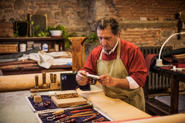
Posted: May 26, 2014 Filed under: Ambient, Case History, Design, Digital, Event, Installation, Italy | Tags: Leo Burnett, Made in Italy, Milan, samsung, Samsung Maestros Academy, Smart Bike Leave a commentItalian craftsmanship has long been considered a renowned art form. Now, in a time when younger generations are gravitating to smartphones rather than toolboxes, expertise is only reminiscent of a bygone era. With the help of Leo Burnett Milan, Samsung created the first-ever digital conservatory called Maestros Academy to foster the next generation of Italian artisans in order to preserve “Made In Italy” excellences.
To bring to life the Samsung strategic role of “enabler” in people’s life, we looked at the current social situation in Italy: the disappearance of great handcrafting excellences which once brought Italy to greatness. At the same time, unemployment rate among young people is dramatically growing and younger generations are yearning for new opportunities to discover and express their potential and talent. Our idea aims to deal with this Italian paradox, reconnecting two generations, preserving the future of “Made in Italy” and fostering a new generation of Italian artisans. We want to demonstrate the great results that people and technology can achieve together.
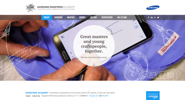
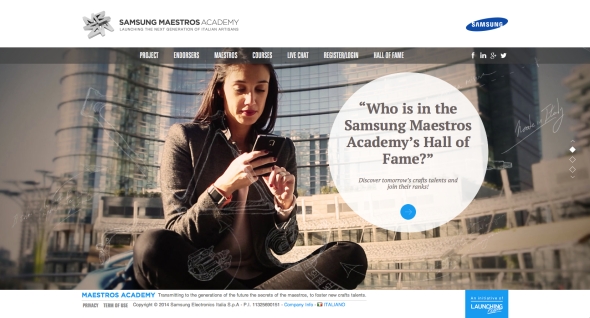
For this reason we created Samsung Maestros Academy: the first digital and integrated platform where young talents can learn the secrets of “Made in Italy” masters, through every kind of smart-device, inspiring the youngest to preserve and innovate the greatest Italian heritage.
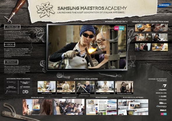
The idea of Samsung Maestros Academy was spread on digital channels (FB, Italian newspapers’ and lifestyle magazines websites, Confartigianato’s channels, LinkedIn, Twitter) to join the primary target of the initiative, digital natives, and drive them to the main platform, accessible from every consumer’s electronic device, such as smartphone, tablets, laptops and Smart-TV. The engagement platform consist in more than 40 video-lessons, full of invaluable ancient secrets, in-depth materials and live-interactive lessons, featured even on outdoor and digital-billboards in the major Italian squares, such as Duomo Square in Milan. A technology-enabled connection between two generations, that inspired Discovery Italia channels to produce a 12 episodes TV-series, telling our students’ best success, spread even thanks to Online and mobile TV channels platforms (Realtime.it, DMax.it, Discovery Italia digital platform). The project gained spontaneous echo on national newspapers, magazine and Tv-programs (Piazza Pulita) generating conversation even in the major Italian University.

Samsung Maestros Academy generated a great conversation on newspapers, social media and TV-programs, with more than 6 million TV-viewers, 1 million Youtube-views in few days, 4.5 million FB-users reached and 30 million media impressions -in Italy alone- becoming a big topic even in universities including “Università commerciale Luigi Bocconi”, “Università Cattolica del Sacro Cuore” in Milan, IED, “Università degli studi di Roma Tor Vergata” and even by Fashion Institute of Technology in New York.Thanks to an extensive network of touchpoints people learnt ancient crafts through every smart-device,empowering consumer-awareness on product-features and brand reputation.
During interactive-lessons, users asked very specific questions, proving a remarkable high user-engagement. Almost the 50% of live-lessons participants asked the Maestros to become an apprentice, exceeding the available positions by 300% on average. Maestros’ students produced with great success innovative design-items, inspiring even more young talents to preserve and innovate the greatest Italian heritage. After Maestro Pelizzoli’s course, Alice created a truly innovative bike, showcased with great success during the Milan Design Week event. Marina together with Maestro Siniscalchi tailored a shirt, featured on an important Italian newspaper, triggering even the curiosity of GQ. Anna and Valerio crafted a bag, immediately displayed by the prestigious “Flow” shop in Florence.The results achieved by many other students generated over 30 million media-impressions and reaching 4.5 million FB-users, on Italian market alone.

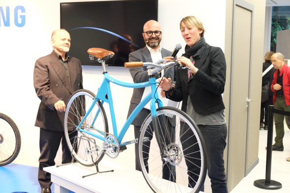
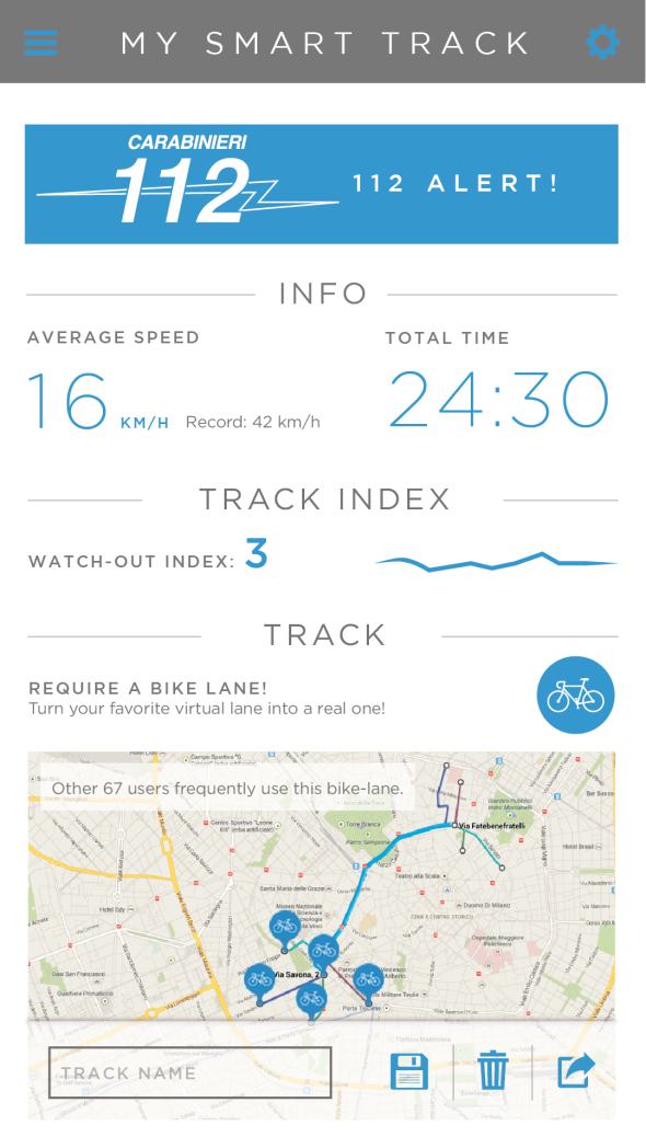
After few months, a student with her Maestro created Samsung Smart-Bike, the first safe-bicycle that protects the rider with its built-in smart-components, automatically activated through a Samsung smartphone. A responsive “safety-environment” that detects ambient-conditions and protects the driver in real-time. A concrete solution for the problem of bikes being the most “unsafe” way of moving in Italy and a real help to break the young people’s barrier with using appropriate safety-equipment.
The idea was to control a fixed-bike and its built-in smart components with a Samsung smartphone and a dedicated app, allowing the automatic control of four laser-beams, a safety-camera a GPS-tracking system, offering innovative safety-features. The first engineered bike and its paired app were presented to one of the greatest design fairs in the world: the Milan Design Week, with the endorsement of EXPO2015 representative of Urban Mobility capturing the interest of important journalists. Alice’s idea has been taken under consideration for applications according to EXPO scenarios, after being recognized as a big step-forward for urban-safety and sustainability.

Advertising Agency: Leo Burnett Italy
Executive Creative Directors: Francesco Bozza, Alessandro Antonini
Creative Director: Christopher Jones, Anna Meneguzzo, Cristiano Tonnarelli
Digital Creative Director: Paolo Boccardi
Copywriter: Alice Jasmine Crippa
Art Director: Alessia Casini, Gianluca Ignazzi
Creative Team: Cristina Bissanti, Felipe Iglesias, Alberto Lot, Lia Paganini
Project Manager: Andrea Castiglioni, Francesco Loprete
Producer: Riccardo Biancorosso, Gaia Fusaro
Art Buyer: Giada Cioffi
PR Coordinator: Maria Teresa Genovese
Managing Director: Niccolo Arletti
Brand Leader: Elena Korzhenevich
Account Supervisor: Luca Ruspini
Account Manager: Federica Giacomotti
Technical Director: Gianluca Mori
Production House: Magnolia
Advertising by Design (22 Brilliant Ideas)
Posted: July 15, 2013 Filed under: Ambient, Art, Awards, Cannes Lions, Case History, Design, Direct, France, Germany, Graphic Design, Installation | Tags: 22 brilliant ideas, advertising by design, Brazil, Cannes Lions, Case History, Coca-Cola, design, FIAT, Germany, Heineken, Jung von Matt, kit kat, Land Rover, Ogilvy, Red Bull 1 CommentTBWA/Hunt/Lascaris – We Sent Their Briefs Back


Although TBWA\Hunt\Lascaris is well established as an above-the-line agency, our clients were yet to be introduced to the wealth of talent that TBWA\ Design has to offer. So, to get our clients’ attention, we intercepted existing above-the-line briefs and used the physical advertising brief as our canvas. Instead of answering the brief in a traditional manner, we conceptualized various designs that captured the essence of the brands, then brought them to life using only the cardboard job bags and the briefs that were attached to them. We created intricate pieces of paper art, transforming our client’s briefs into multi-dimensional design pieces. We then sent our clients’ briefs back to them, proving that TBWA\ Design can do amazing things with their briefs. Our campaign was a huge success. The design studio received their first new brief from our client just 5 days later. Even more notably, new design work in the system rose by 450% within the first 6 weeks.
Advertising Agency: TBWA\Hunt\Lascaris, Johannesburg
Executive Creative Directors: Matthew Brink, Adam Livesey
Art Director: Jade Manning
Copywriter: Vincent Osmond
Creative Director: Sacha Traest, Mike Groenewald
Design: Sacha Traest, Leigh-anne Salonika, Katleho Mofolo, Graeme Van Jaarsveld, Ilze Venter, jason Fieldgate
Typographer: Hazel Buchan
Photographer: Graeme Borchers, Des Ellis
Year: 2013
——————————————————————————————————————————————————————————————————————————-
Coca-Cola – Sharing Can


Advertising Agency: Ogilvy & Mather, Paris/Ogilvy & Mather, Singapore
Chief Creative Officer: Chris Garbutt, Eugene Cheong,
Creative Director: David Raichman, Frederic Levron, Yvan Hiot
Copywriter: Xiao An Cheng
Designer: Martin Olivier, Olivier Brechon
Technical Partner : Capital Innovation
Year: 2013
——————————————————————————————————————————————————————————————————————————-
Land Rover – The Escape Key

Jaguar Land Rover MENA is promoting the Land Rover LR4 with “The Land Rover Escape Key”, a small icon designed to replace the ESC key on desktop computer. Sent out in three batches of 800 pieces, the keys are designed to remind people at the office that there’s way to escape the every day routine of indoor business. Test driving a Land Rover LR4 is the way to find life beyond the office cubicle. The number of queries almost tripled and test drives are up by 208%.
Advertising Agency: Y&R MENA
Chief Creative Officer: Shahir Zag
Creative Director: Joseph Bihag, William Mathovani
Year: 2013
——————————————————————————————————————————————————————————————————————————-
Kit Kat – The Pillow Book

Advertising Agency: JWT, Sao Paulo, Brazil
CCO: Ricardo John
Art Director: Brunno Cortez
Copywriter: Erick Mendonça
Creative Director: Ricardo John
Year: 2013
——————————————————————————————————————————————————————————————————————————-
Marionnaud – Memory Game

Marionnaud, one of Europe’s largest perfume retailers, celebrated “10 years’ expertise in fragrance”. For the jubilee we created a very special staff incentive: the first Memory game without pictures. The cards had been finished with a fragrance coating. When rubbed, the cards released the scent of ingredients used in perfume manufacture. Rub and sniff: that was the only way to identify the pairs – but no problem for Marionnaud professionals.
Advertising Agency: Wirz/BBDO, Zurich
Executive Creative Director: Philipp Skrabal
Art Director: Barbara Hartmann
Copywriter: Marietta Mügge
——————————————————————————————————————————————————————————————————————————-
FIAT – Hero Hug

Advertising Agency: Leo Burnett, São Paulo
Chief Creative Officer: Marcelo Reis
Executive Creative Director: Guilherme Jahara
Creative Director: Rodrigo Jatene
Copywriter: Caio Lekecinskas
Art Director: Rafa Oliveira
——————————————————————————————————————————————————————————————————————————-
Domino’s Pizza – Domino’s Pizza Disc

Advertising Agency: Artplan, Sao Paulo
Executive Creative Director: Roberto Vilhena
Creative Director: Rodrigo Moraes
Copywriter: Tiago Trindade, Rodrigo Sanches
Art Director: Diogo Barbosa, Guilherme Grotti
Graphic Production: Bruno Werner
——————————————————————————————————————————————————————————————————————————-
Megaman – Light Bulb Calendar

Advertising Agency: Grabarz und Partner, Germany
Executive Creative Director: Ralf Heuel
Creative Director: Andre Price, Jan-Florian Ege
Art Director: Andre Price, Jana Mehrgardt, Jan Riggert
Designer: Sönke Jansen
——————————————————————————————————————————————————————————————————————————-
Heineken – First Interactive Bottle


Heineken embraces the start-up culture of experimentation because it knows that invention never sleeps. The brand understands that the best ‘user experiences’ tap into existing consumer behaviors and push technology into the background.
The intent of the Heineken Ignite project was to develop an idea that would create a memorable Heineken experience unlocking the power and possibilities of mobile innovation and technology.
Heineken believes that mobile innovation could offer a much more rewarding experience than just an app and embraced the challenge to think about how the product could be leveraged as an interface to the brand experience.
A prototype of Heineken Ignite will be revealed on 9 April at Milan Design Week as part of Heineken’s Lounge of the Future concept. Heineken takes its promise to “open your world” even further with the Heineken Ignite project, enhancing the organic way in which the product is used based on social interaction between beer drinkers. This innovative approach lets people be a part of the party in a whole new way and opens up possibilities in social situations.
Advertising Agency: Tribal DDB, Amsterdam
——————————————————————————————————————————————————————————————————————————-
3M Earplugs – Volume Pack

The task was to develop an original promotional packaging solution that immediately conveyed the product value of 3M’s Solar Earplugs – a product targeted at end users frequently requiring effective noise protection (such as musicians and festival-goers). Solution: 3M turned the purpose of the earplugs – to reduce noise – into an original package design. The container’s cap looks like the volume knob of a hi-fi system; when opening it to reach the earplugs, one seems to be turning down the volume.
Advertising Agency: Scholz & Friends, Germany
Chief Creative Officer: Martin Pross
Executive Creative Director: Matthias Spaetgens
Creative Direction: Robert Krause, Wolf Schneider
Copy: Nils Tscharnke
Art Direction: Sebastian Frese, Ralf Schroeder
——————————————————————————————————————————————————————————————————————————-
Deutsche Bank – Anamorphic Mirror


Brief Explanation
The vestibule is a narrow room of 25sqm strongly limiting the possible size of the installation. Therefore, we decided to utilise light for a radiant impact, and to expand the process of reception by making use of the visitors’ movement while approaching the area via a short staircase. Going upstairs becomes part of the experience as visitors gain increasing insights to the entry with the installation. Its concept is based on the principle of anamorphosis: what you see alters as you change your position in space. The image only fully resolves itself when seen from a particular ‘sweet spot’.
Describe the brief from the client
The redesigned corporate headquarters of Deutsche Bank in Frankfurt am Main are now housing a brand and conference area. Parts of this section are public and can be accessed directly from the spacious atrium via a staircase. Deutsche Bank commissioned us to develop an installation that references the well-known company logo, originally designed by Anton Stankowski, for the vestibule of this area. The brief was to provide an atmospheric element that would be visible to customers, visitors and employees standing at reception, as well as on the bridge connecting the building’s 2 towers.
Description of how you arrived at the final design
‘Anamorphic Mirror’ consists of a faceted mirror and blue light projected onto the opposite wall. When viewed from the ‘sweet spot’ the mirror reflects the Bank’s logo. Standing at the bottom of the stairs, visitors see seemingly random blue reflections on the mirror’s facets. As they get closer, the blue reflections begin to take shape, until they resolve into the bank’s logo upon the visitors’ reaching the stairs’ top. In this manner, an animation is created from a static surface. While getting even closer to entering the conference area, visitors are themselves reflected in the mirror and thus take centre stage.
Indication of how successful the outcome was in the market:
Since the opening on April 6 more than 20,000 visitors came to see the public part of the brand area. Board members use the overall facilities to hold receptions, functions such as HR are using it for employee activities, bank managers invite partners and clients, the press department welcomes journalists. With unobtrusive means, the dynamic and yet poetic installation ‘Anamorphic Mirror’ creates an atmospheric element with space-encompassing impact, and attunes visitors to the brand from the very beginning.
Advertising Agency: ART+COM in Cooperation with COORDINATION, Berlin
Executive Creative Director: Joachim Sauter
Designer: Simon Häcker
Project Manager: Gert Monath
Senior Art Director: Eva Offenberg
Year: 2013
——————————————————————————————————————————————————————————————————————————-
The Hälssen & Lyon – The Tea Calendar


The Hälssen & Lyon tea calendar is the first calendar in the world to feature calendar days made from tea leaves. Finely flavoured and pressed until wafer-thin, the 365 calendar days can be individually detached and brewed directly in the cup with hot water. The tea calendar was sent exclusively to selected business partners.
Advertising Agency: Kolle Rebbe, Hamburg
Executive Creative Director: Sascha Hanke
Creative Director: Heiko Schmidt and Kay Eichner
Creative: Patrick Schroeder, Julia Meissner
Year: 2013
Gold Lion
——————————————————————————————————————————————————————————————————————————-
Hot Wheels – Don’t Drink and Drive Key Chains

Advertising Agency: Ogilvy, Mumbai, India
National Creative Directors: Abhijit Avasthi, Rajiv Rao
Senior Creative Director: Amitabh Agnihotri, Sameer Sojwal
Creative Group Head: Yogesh Pradhan
Year: 2012
——————————————————————————————————————————————————————————————————————————-
Greenpeace – Do Not Disturb

Advertising Agency: AlmapBBDO, São Paulo, Brazil
Chief Creative Officer: Marcello Serpa
Executive Creative Director: Marcello Serpa
Creative Director: Luiz Sanches
Art Director: Caio Tezoto
Year: 2012
——————————————————————————————————————————————————————————————————————————-
Coca-Cola FM – Magazine Amplifier


The piece consists in an exclusive insert for subscribers of the latest edition of the Capricho magazine which was created by JWT. Attached to the cover, the art allows readers to turn the magazine into an amplifier. Simply by rolling the magazine and inserting the iPhone tuned into the Coca-Cola FM application in the spot indicated. The final format allows the sound waves to travel in two different directions at the same time, intensifying the stereo effect created by the device. The next step is to enjoy the music.
Advertising Agency: JWT, Brazil
Year: 2012
——————————————————————————————————————————————————————————————————————————-
Red Bull – Portable Charger

We created Redbull-shaped portable charger. This Redbull-shaped charger will show its own recharging screen when they fit into the gadget And the mobile webpage of Redbull will be on the screen when it is unlocked.
Advertising Agency: Hallym University, Cheonan-si, South Korea
Copywriter: Heejo Sun, Dongkyun Yu
Art Director: Minseok Go
Year: 2012
——————————————————————————————————————————————————————————————————————————-
Land Rover – Edible Survival Guide

While Land Rover vehicles can take on any obstacles in the desert, it cannot be said the same of their owners. Scorching temperatures, deadly animals and sinkholes are just a few things they might encounter. And when they venture deep into it, even the most experienced drivers can quickly succumb to the harshness of the desert. We wanted to create something that would cut through the clutter and that these people would like to keep. So we created a survival guide, which explained the basics for staying alive in the Arabian Desert, and packaged it in a way that would spur the attention of our target audience.
We researched every indigenous animal and plant, people could encounter in the Arabian Desert and how they could be used to survive. We studied the topography of the region to guide people to safety. We used a reflective packaging similar to army rations, which could be used to signal for help, and bound the book with a metal spiral, which could be used for cooking. Finally, we even took an extra step so that in case of emergency, people could always EAT the book. It was made out of edible ink and paper, and it had a nutritional value close to that of a cheeseburger.
We sent the book to 5,000 existing customers, gave it away as a supplement to the cars’ manual and made it freely available in sports shops. The initial response was very positive. And the client was so happy with the concept that they asked us to include the book as an insert in the next edition of a car magazine, with a 70,000 circulation.
Advertising Agency: Y&R, Dubai, UAE
Chief Creative Officer: Shahir Zag
Creative Director/Copywriter: Shahir Zag
Creative Director/Art Director/Illustrator: Joseph Bihag
Copywriter: Guillaume Calmelet
Designer/Copywriter: Khaled Said
Year: 2012
——————————————————————————————————————————————————————————————————————————-
IBM – Outdoor as Utility


Advertising Agency: Ogilvy France
——————————————————————————————————————————————————————————————————————————-
Ricola – Ricola Music Edition


Ricola, a brand of cough drops and breath mints in Switzerland, is known for its traditional blend of thirteen natural herbs. The provision of instant relief, even to the most strained throats, is visualised with the help of the wrapping paper. The Music Edition, an illustrated release, turns the drops into the heads of suffering singers. Each and every throat appears to be constricted. However, when you unwrap a bonbon, the throat is relieved and all hoarseness disappears. Print advertising presented the five characters: Rockabilly, Pop star, Opera singer, Rapper and Punk Rocker, with the tag line, “Unwrap your voice”. The project won Gold for Package Design at the London International Awards this week.
Advertising Agency: Jung von Matt, Hamburg
——————————————————————————————————————————————————————————————————————————-
Camp Nectar – Fruit Boxes (Made from Real Fruit)


General Brands in Brazil ran a two-year experimental campaign in which fruit was grown in the shape of Camp Nectar fruit boxes to promote the claim, “Made from Real Fruit”. Customized juice box molds were placed around growing fruit on an orchard in Paranapanema, producing 1,123 oranges, lemons, guavas and passion fruit with the Camp Nectar box shape. The specially designed fruit, complete with brand imprint, straw and carton flaps, were placed in supermarkets and fairs to promote the juice range. The campaign won a Gold Outdoor Lion, a Bronze Direct Lion, a Silver and Bronze Promo & Activation Lion.
Advertising Agency: Age Isobar, Sao Paulo
——————————————————————————————————————————————————————————————————————————-
Sweet Enough – The Candy Room


Sweet Enough, an importer of sugar free candy products in Australia, has set up The Candy Room, a store in Melbourne designed to draw out the inner child in customers, connecting them with childhood, fantasy and fiction and of course, sweets. Black line artwork is applied on white space, supplemented with the bright colours of the sweets throughout the store.
Advertising Agency: Red Design Group
——————————————————————————————————————————————————————————————————————————-
Oreo – Oreo Crumb Case


Miami Ad School students have developed a tea bag enclosure for Oreo cookie crumbs to infuse milk with Oreo flavor. The Oreo Crumb Case, developed as a student project, could go a long way. Just shake together all the crumbs left in the Oreo packet, sprinkle them into the Crumb Case, and infuse the crumbs in your tumbler of milk.
Advertising Agency: Miami Ad School
Sponsored Heroes
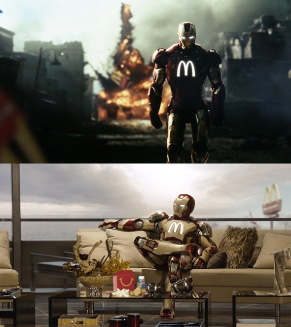
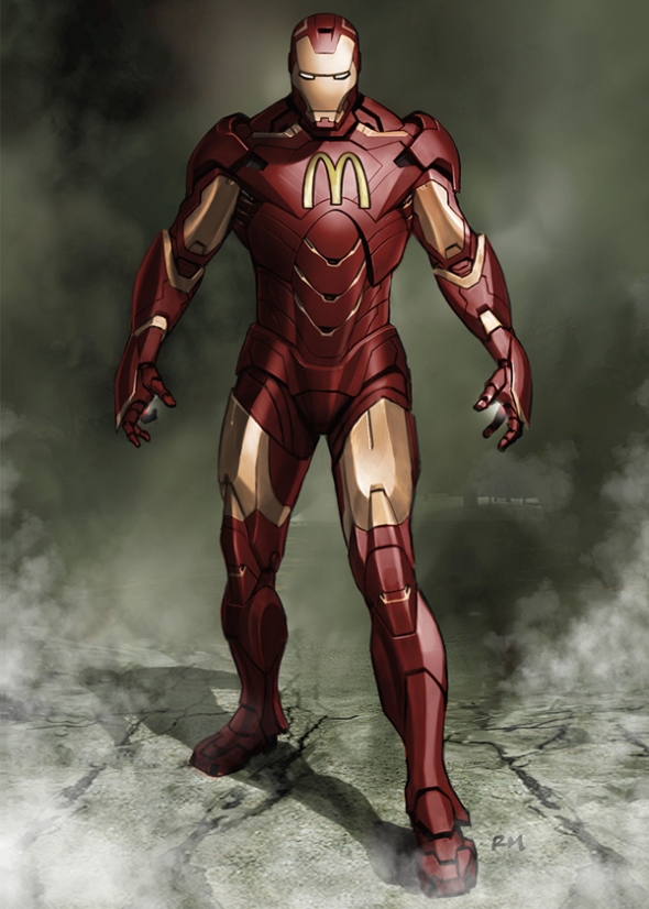
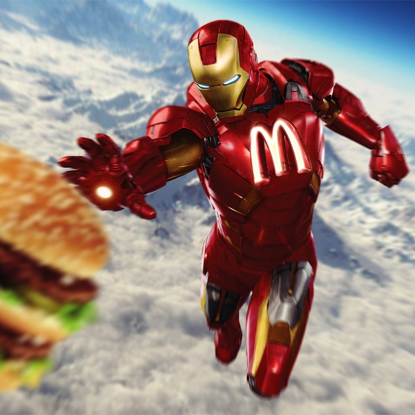
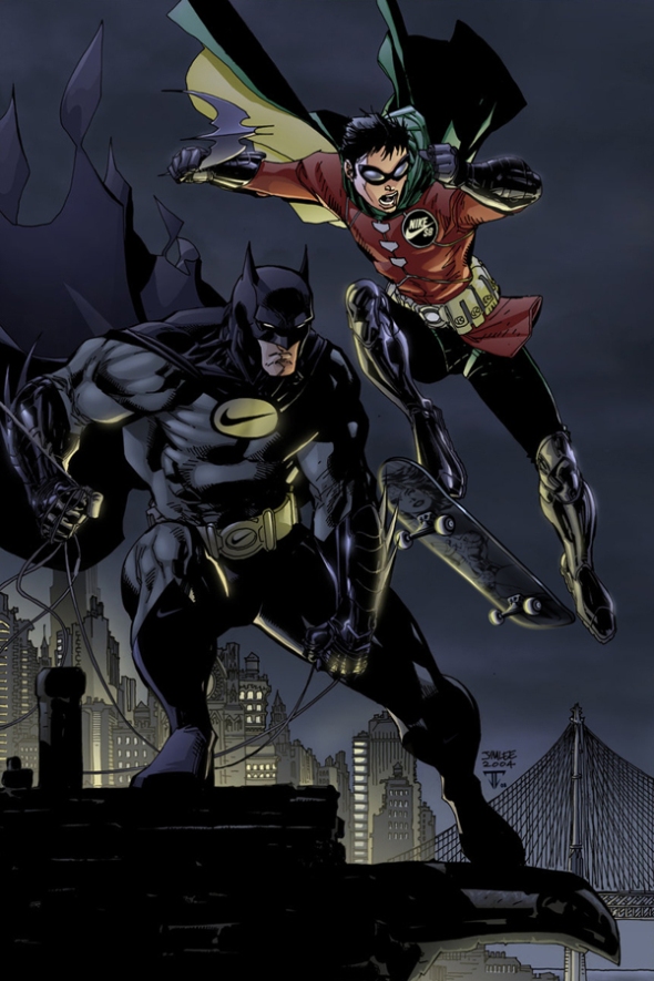
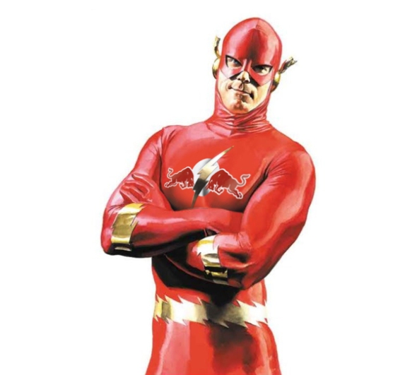
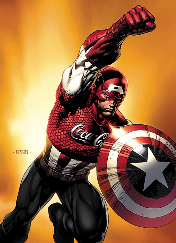
Posted: April 26, 2013 Filed under: Art, Coca-Cola, Design, Graphic, Graphic Design, Illustration, Italy, parody | Tags: adidas, Apple, Avengers, Batman, Burger King, captain america, Coca-Cola, Flash, funny, hulk, Iron Man, McDonald's, monster, Nike, Roberto Vergati Santos, sponsored heroes, superheroes, Superman, Wolverire Leave a comment“Imagine if one day capitalism reaches the point, where the big brands starts to sponsor the superheroes. How would this influence their images?”
Being a superhero doesn’t seem to be a lucrative gig, but what if it was? Brands sponsor athletes and celebrities all the time, and with the increasing popularity of superheroes, it’s not all that shocking to think that The Incredible Hulk could one day be rocking a massive Monster logo across his chest.
Italian graphic designer Roberto Vergati Santos imagined many of our favorite superheroes sponsored by our favorite brands. The aptly titled ‘Sponsored Heroes’ series sees characters from both the Marvel and DC Comics universe, and includes all the members of The Avengers, Batman, Wolverine, and many more. Batman can be seen sporting a Nike suit of armor, while Iron Man has been stamped with the golden arches of McDonald’s, and Captain America is seen holding a massive UPS shield. Check out some of the superheroes from the collection below.
IRON MAN – Sponsored by McDonald’s
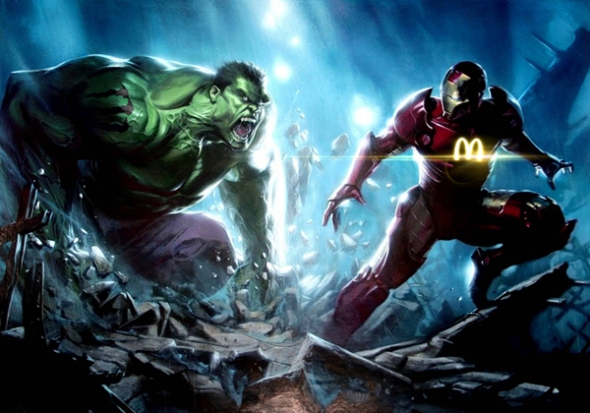
HULK – Sponsored by Monster Energy


WOLVERINE – Sponsored by Adidas


BATMAN – Sponsored by Nike


CAPTAIN AMERICA – Sponsored by UPS

FLASH – Sponsored by Red Bull


AVENGERS – Sponsored by Coca-Cola

SILVER SURFER- Sponsored by Apple


SUPERMAN – Sponsored by Giorgio Armani


IRON MAN (Sponsored by McDonald’s) vs CAPTAIN AMERICA (Sponsored by Burger King)

Thomas Lamadieu and the Sky Art
Posted: April 22, 2013 Filed under: Art, Design, Graphic, Graphic Design | Tags: design, Roots art, Sky Art, Thomas Lamadieu Leave a comment
French artist Thomas Lamadieu, also know as Roots Art, must really love looking at the sky, but for different reasons than you might think. Every time he looks up, Thomas sees a potential canvas where the building rooftops frame the sky. He photographs it and uses the odd sky shapes to create whimsical line drawings.
“My artistic aim is to show a different perception of urban architecture and the everyday environment around us, what we can construct with a boundless imagination,” says Thomas. Aren’t you just gonna see these creatures now every time you look up?


McCann Australia for Metro Trains Melbourne – Is “Dumb Ways To Die” the new “Chipotle”?
Posted: December 10, 2012 Filed under: Animation, Australia, Case History, Copywriting, Design, Digital, Graphic, Graphic Design, Illustration, Press/Outdoor, Social, Viral | Tags: Animation, be safe around trains, Case History, Chipotle, Digital, Dumb Ways to Die, Edward Gorey, funny, Is "Dumb Ways To Die" the new "Chipotle"?, John Mescall, Julian Frost, McCann Australia, Melbourne Metro, metro trains, Ollie McGill, The Gashlycrumb Tinies, Viral Leave a comment

“Dumb Ways to Die”, is an integrated advertising campaign designed to curb the number of train-related deaths in Victoria. The campaign is centred around a three-minute animated music video, highlighting the many dumb ways there are to die, with being hit by a train – a very preventable death – among them. The video and iTunes single are accessible online at DumbWaysToDie.com, with animated gifs being released on Tumblr, on radio, in posters on small and large space outdoor and throughout the Metro Trains network, with the lyrics to the song on the art work.

The Idea: Safety PSAs are gloomy and tedious and largely ignored by young people hardwired to resist them—except when they’re irresistibly fun and impossible not to share with friends. McCann Australia managed just such an evolution of the genre with “Dumb Ways to Die” its animated train-safety spot for the Melbourne Metro. The three-minute music video shows adorable blobs making the stupidest decisions ever—messing with animals, sticking forks in toasters, eating superglue, etc.—leading to all sorts of gruesome, fatal accidents. The dumbest way to die, the ad suggests at the end, is by being careless around trains. “The idea for a song started from a very simple premise: What if we disguised a worthy safety message inside something that didn’t feel at all like a safety message?” said McCann executive creative director John Mescall. “So we thought about what the complete opposite of a serious safety message would be and came to the conclusion it was an insanely happy and cute song.” With more than 30 million YouTube views, it seems happy, cute and grisly was the way to go.
The Song: The song begins, “Set fire to your hair/Poke a stick at a grizzly bear/Eat medicine that’s out of date/Use your private parts as piranha bait,” before the chorus repeats the two lines, “Dumb ways to die/So many dumb ways to die.” Mescall wrote most of the lyrics in one night at the agency. “It then took a few weeks of finessing,” he said, “getting rid of a few lines that weren’t funny enough and replacing them with new ones.” The line “Sell both your kidneys on the Internet” was a late inclusion. “I’m glad it’s there. It’s my favorite,” he said.

Australian musician Ollie McGill from the band The Cat Empire wrote the music. “We basically gave him the lyrics and told him to set it to the catchiest nonadvertising type music he could,” said Mescall. McGill delivered something almost unbearably catchy. “The melody is easy to remember and sing along to, the lyrics are fun, bite-sized chunks of naughtiness, and the vocals have just the right amount of knowing innocence,” Mescall said. “It’s a song that you want to hate for living in your head, but you can’t bring yourself to hate it because it’s also so bloody likable.” The singer is Emily Lubitz of another Australian band, Tinpan Orange. (The song is credited to Tangerine Kitty, which is a mashup of the two band names.) “Emily brought a great combination of innocence, playfulness and vocal integrity,” Mescall said. “She brings a level of vocal quality you don’t normally get on a video about cartoon death.”
The Art Direction: Australian designer Julian Frost did the animation. “We gave him the most open brief we could: Just make it really funny and really awesome and do it to please yourself,” said Mescall. The visual reference points ranged from Edward Gorey’s The Gashlycrumb Tinies to Monty Python’s “Always Look on the Bright Side of Life” (which showed men singing while being crucified) to “any number of hokey indie music-video flash mobs you see on YouTube,” said Mescall.


“Julian was keen to contrast the extreme situations described in the lyrics with the simplest animation possible. Otherwise it would become just too much.” After the spot blew up online, Frost wrote on his website: “Well, the Internet likes dead things waaay more than I expected. Hooray, my childish sense of humor pays off at last.”


The spot lives online, in short bursts on music TV, and may reach cinemas. The campaign is also running in radio, print and outdoor. The song is on iTunes, where it reached the top 10. The agency is also producing a book as well as a smartphone game that should be ready by Christmas.
Advertising Agency: McCann, Melbourne
Executive Creative Director: John Mescall
Creative Team: John Mescall, Pat Baron
Animation: Julian Frost
Digital Team: Huey Groves, Christian Stocker
Year: 2012
Scholz & Friends for Fresh’N’Friends – Fruit Figures
Posted: November 30, 2012 Filed under: Ambient, Case History, Design, Digital, Direct, Event, Germany, Graphic Design, Installation, Promotion | Tags: Alexander Doepel, Ambient, Bjoern Kernspeckt, Case History, Direct, Florian Schwalme, Fresh`N´Friends, Fruit Figures, Germany, Jinhi Kim, Loic Sattler, Martin Pross, Mathias Rebmann, Matthias Spaetgens, organic supermarket, Promotion, René Gebhardt, Sandra Krebs, Scholz & Friends, Wolf Schneider Leave a comment

All adults know: healthy eating is important. The organic supermarket chain Fresh`N´Friends benefits from that situation. There is just one small problem: kids hate healthy food but they love sweets. Actually, that´s even a big problem. In Germany every fifth child is overweight. “Instead of calling attention to that problem with a traditional ad campaign we chose to solve the problem.”
The solution was a new product: fruit figures. “To make fruits as appealing as sweets for kids we designed fruit arrangements that suit children. Boring fruits were designed in shape of teddy bears, kittens, flowers – all the things kids love.” Just like ordinary fruit salads the fruit figures were sealed, put in a tray and sold in Fresh´N´Friends stores.


Additionally, they were promoted with advertising specifically targeted at parents and their kids – direct mailings, email newsletters and posters. In order to involve the kids directly in the campaign a contest was started. We placed cut-out sheets in every package. So the kids could make their own fruit figures by hand. They also could design them digitally on the Fresh`N´Friends website. All ideas were published and judged online. The figure with the most votes was added to the product range. Over 3,500 designs from children were submitted. The rabbit figure of five-year-old Dario got the most votes and was therefore added to the product range.


Advertising Agency: Scholz & Friends, Berlin, Germany
Creative Director: Martin Pross, Matthias Spaetgens, Wolf Schneider, Mathias Rebmann, Florian Schwalme
Art Director: Alexander Doepel, Sandra Krebs, Bjoern Kernspeckt, René Gebhardt, Loic Sattler, Jinhi Kim
Photographer: Attila Hartwig
Graphics: Peter Schoenherr, Simon Rossow
Year: 2012
I Amsterdam – The campaign to re-brand Amsterdam
Posted: November 5, 2012 Filed under: Ambient, Art, Case History, Design, Event, Graphic, Graphic Design, Installation, Promotion, The Nederlands | Tags: A Portrait of a City and its People, Amsterdam logo, Amsterdam Partners, FOAM, I Amsterdam, installation, Kesselskramer, Promotion, sign 7 Comments
 I Amsterdam was a photography exhibition devised by tha ad agency Kesselskramer (in conjunction with Amsterdam Partners) as a promotion for the city of Amsterdam. Twenty well-known photographers, who were either Amsterdammers or Amsterdam-based, were commissioned to capture the city from their own perspectives, resulting in a personal and diverse portrait of contemporary Amsterdam. The exhibition opened initially at the FOAM photography museum in Amsterdam before travelling the world, proving a subtle promotion for the city as a place to live and work. A 308-page book of exhibition was also published, and the motto “I Amsterdam” has continued to be used in promotion of the city.
From “Changing the Tide: The campaign to re-brand Amsterdam.”
By M. Kavaratzis & G. J. Ashworth Urban and Regional Studies Institute University of Groningen Netherlands
The re-branding of places whose existing brand image has become for various reasons inappropriate or ineffective poses particular challenges to the marketing of major multifunctional cities. The position of Amsterdam as the national cultural capital and major international cultural centre has for some time been threatened by a sharpening of competition from other cities both within and outside the Netherlands and by social and economic trends within the city that have seriously undermined the previously successfully promoted brand image. Furthermore, one of the main elements of the city’s international image associated with the liberal attitude towards soft drugs and prostitution is now seen as inappropriate for the city, as it overshadows other more desirable aspects of the city’s aspirations. This has focussed official thinking and led to a serious and fundamental attempt at strategic re-branding involving a far-reaching examination of stakeholders, goals and competitive positioning. The main tangible result so far, is the recent launching of the ‘I amsterdam’ brand. This paper first elaborate on the context of the intensifying inter-urban competition expressed through the re-branding of cities. In this context, the process of developing the brand and the ‘I amsterdam’ campaign that has followed is described and explained and its likely success is assessed.
Introduction
The environment in which European cities operate has significantly changed in recent years. The process of European Integration and the transition to a knowledge-intensive society are only two basic trends that prescribe new characteristics to the urban system of Europe and pose challenges to individual cities within it. According to Kotler et al. (1999), the main challenges European cities are facing are the accelerating pace of change in the global economic, political and technological environment, the growing number of competitors in their efforts to attract scarce resources and the increasing dependence on their own local resources to face growing competition. Van den Berg et al (1990) further identify the growing importance of the quality of the living and location environment as a determinant of economic growth, the fast intensifying spatial interaction among European towns, with respect to goods transport as well as business, leisure and social traffic and, finally, the diminishing influence of national governments and growing influence of regional and supranational governments. In order to secure development and growth, localities or individual cities now have to offer even more inducements to capital, whether a refashioning of the city’s economic attractiveness (e.g. tax abatements, property and transport facilities) or alterations to the city’s image through manipulation of its physical form and/or its soft infrastructure (e.g. cultural and leisure amenities) (Gospodini, 2002: 61).Within this environment, city marketing has become an increasingly popular practice across Europe. It has been developed in most cases as a response to the new conditions that the above economic, political and social changes pose to cities and their operational environment. Its use has been accelerated in an attempt for cities to position themselves strongly within the fierce competition between them for finite and increasingly mobile resources, whether investment capital, relocation of companies or recreational and business visitors.
The concept and methods of city branding have also been employed by cities in order to reinforce and manage perceptions of the cities held by relevant target audiences. The topic has also drawn scholarly attention from various disciplines (e.g. Kavaratzis and Ashworth, 2005; Trueman et al, 2004; Evans, 2003; Hauben et al, 2002). City branding is an approach that centres on the conceptualization of the city as a brand; and a brand is a multidimensional construct, consisting of functional, emotional, relational and strategic elements that collectively generate a unique set of associations in the public mind (Kavaratzis and Ashworth, 2005). This construct is what should provide guidance for all marketing efforts, in order to achieve consistency in the messages sent and in such a way that the ‘stories’ told about the city by the brand are built in the city (Kavaratzis, 2004). As Hankinson (2004) suggests, the brand lies at the centre of marketing activities and the focus of branding activities extends “beyond communications to include behaviours; a focus of considerable relevance to place branding” (Hankinson, 2004:111).
Amsterdam and its brand image
Official place marketing programmes are all too often a response to a crisis driven by political considerations. City league tables play a major role in creating and defining this sense of crisis. Although the relevance and accuracy of such rankings can be questioned and the importance attached to them by city residents or tourists has not been demonstrated, local officials and politicians in most cities all over the world take them seriously (Ashworth and Voogd 1990) and Amsterdam is no exception to this.
Metropolitan cities have been retaining their predominance by constantly attracting corporate headquarters, international finance houses, producer services, research and development, high-level public administration, internationally dominant institutions and arts and media industries (Gospodini, 2002: 62). Amsterdam has been scoring well in many of these sectors but with the competition increasing, it is precisely in this context that the city decided to develop a new marketing strategy and specifically attempt the re-branding examined in this paper.
Problems became evident in the early 1980s as Amsterdam began to slip down the various league tables of European cities in the face of competition from cities such as Brussels, Barcelona and Munich (Ashworth and Tunbridge, 1990). In the DATAR lists of European cities in 1989 Amsterdam was still 5th in art gallery visits and 10th in international congresses but did not appear in the European top 10 for international organisations, headquarters of international companies, cultural performances, or foreign visitor nights. More recently research undertaken by the city itself indicated that Amsterdam’s position had continued to weaken in a number of respects (for example hosting international conferences) and that even in the areas of relative competitive strength (e.g. as a business location) competition was increasingly sharply (City of Amsterdam 2004). Even on the national stage Amsterdam was increasingly seen as a city of problems rather than opportunities. Explanations of the weakening of the competitive position of Amsterdam have generally focussed upon the perceptions of the city held by various actual and potential users whether national or foreign and thus it is not surprising that place branding has been enthusiastically embraced as the solution to the problem.
The image problems of Amsterdam can be traced back forty years and are to some extent a consequence of earlier highly successful branding long before the term itself was in use. The image formed in the 1960s was composed of two dominant elements. First, there was the urban tourism image of ‘Vermeer townscapes and tightly packed canal side building’ (Ashworth & Tunbridge, 1990), which has become so established as to lock the city into a single historic period and single morphological product. Secondly, together with London and Copenhagen, Amsterdam acquired an international status as ‘swinging’ youth centre based upon sexual liberation and narcotic indulgence. The intrinsic problems of these images stem in part from their very strength. The established image made product diversification difficult and the tourism image of the capital was sharply discordant with the official nationally projected ‘Holland waterland’ image (NBT, 1987), and the popular ‘clogs windmills and tulips’ foreign image of the Netherlands. In part however it can be attributed to fashion changing faster than brand image. In addition, ‘… an easygoing tolerance slipped effortlessly into personal insecurity and public disorder. Acceptance of soft drugs and of sexual variations became a serious hard drugs problem and a sordid commercial sex district on the ‘Wallen’ and the city’s continuing polycentric vitality as a focus for homosexual tourism is equivocal for its general tourism promotion’ (Ashworth and Tunbridge, 2000: 221).
Vandalism, graffiti, antisocial behaviour, personal insecurity and a lack of public order became firmly established in the international as well as national psyche (VVV Amsterdam, 1987) reinforced by the 1982 public disorders at the royal inauguration and failure, partly as a consequence, of the bid to stage the Olympic games. The ‘T’ shirt slogan, ‘I went to Amsterdam and survived’ evoked a certain local pride in resilience among residents but was hardly conducive to attracting more tourists, investors or enterprises. Current ‘Easyjet’ promotion of its Amsterdam flights aims quite explicitly at a youth party market (especially ‘stag and hen’ parties) stressing the advantages of cheap alcohol, possible sexual encounters and indulgent policing.
There were a number of attempts to analyse and correct the increasingly unfavourable city image (Binnenstad Amsterdam, 1987: KPMG, 1993) but these tended to founder on a lack of official coordination and indeed political will, in a social democratic city whose interests lay in social provision for residents rather than attracting exogenous economic enterprise. However by the first decade of the twenty- first century, the necessity for re-branding had become quite evident and impossible to ignore.
Re-branding the city
Over recent years Amsterdam has had many brands promoted by diverse public agencies often for a specific purpose. The remains of some of these (for example, ‘Amsterdam Has It’, ‘Amsterdam Capital of Inspiration’, ‘Capital of Sports’, ‘Small City, Big Business’ and ‘Cool City’, ‘Amsterdam: living city’) can still be found in promotional material. However the need for long-term continuity and consistency determined that a more through approach was required.
A first step was the commissioning of a comparative study of current city marketing practice in 4 other European cities (Berlin, Dublin, Barcelona and Rotterdam). The choice of these cities was somewhat arbitrary: only Dublin and Barcelona were competitors on the European scale while Rotterdam although to some extent a competitor in some domestic markets is a city with a quite different set of functions and perceptions. This survey focused on two main subjects, namely how the marketing effort was organized in the selected cities in terms of specific organizations involved in marketing each city and on how these organisations cooperate and coordinate their actions. The general conclusion of this benchmark study was that Amsterdam compared unfavourably in both these respects. In particular, compared with the other cities, there was the lack of a clear ultimate responsibility for the Amsterdam brand, which remained muddled and muted. Five rather general lessons were drawn. There was a need for, a coherent long-term vision, a selection of priorities, a realistic promoted image, a powerful brand, and a balance in the roles of the public and private sectors (Gemeente Amsterdam, 2003). None of these were very surprising or indeed very helpful in framing policy.
Who brands Amsterdam and to whom?
The main coordinator of the whole marketing effort of Amsterdam is a newly established organisation called Amsterdam Partners. This is run by an Advisory Board, of which the chairman is the city’s burgemeester, and by a Management Board. The main executive functions within the organisation are managed by a ‘City Marketing Manager’, an ‘Events and Festivals Manager’ and a ‘Corporate Affairs Manager’. The partners in this organisation include, seven departments of the municipality, representatives from several large private companies (such as, ABN AMRO bank, Heineken, ING, KLM, Phillips and the Schiphol Airport Authority), organisations concerned with travel and tourism (such as Amsterdam Uitburo, Amsterdam Tourism and Convention Board, AMS Cruiseport, Amports, Topsport AMS) and representatives from the seven neighbouring municipalities. The specific tasks of Amsterdam Partners were defined as branding, positioning and merchandising; assisting, supporting and advising on marketing festivals and events; encouraging the existence of a supportive business climate; relations with national and international media; creating a new approach to hospitality; and research and monitoring
Three primary target groups were identified, which can be summarised as businesses, residents and tourists. The first focuses especially upon business decision makers, especially of international enterprises with their head offices in the Amsterdam area, the ‘creative’ and ‘knowledge’ sectors. The second ‘active city dwellers’ that is, residents attracted by the special atmosphere of Amsterdam (such as empty nesters, two income couples, homosexual couples, young professionals and students). The third are international visitors and congress participants.
There are many questions raised by this selection. The search for ‘creative’ and ‘knowledge based’ enterprises is currently fashionable amongst urban managers but remains vaguely defined in terms of both what these are and which locations they favour. Equally, the elements of the urban ‘atmosphere’ attractive to specified groups of residents remain undefined. There is a clear tendency to being all-inclusive and it should be remembered that in place as opposed to other product marketing it is very difficult to distinguish between the various groups of users and cities are not in a position to exclude groups of users, for reasons of social justice, political balance or future security and sustainability. There is, however, a consensus that a fundamental objective of the marketing effort and a necessary precondition for its success is to make residents believe in the core values of the city, ‘feel’ the city’s brand and be proud of their city.
“I amsterdam”
The main idea behind the new branding campaign, launched in September 2004, was that previously the Amsterdam brand had been badly managed. There had been little consistency of brand usage, uniformity of style and availability of image material. Both the city and the region needed a tangible new positioning; a new brand that would typify the city’s benefits and values. To this end an advertising agency developed a new logo, which was approved by the city. In the new approach, the slogan is intended to serve as an umbrella in both a practical and intrinsic sense, to be versatile without being implicit and to clearly stand for Amsterdam’s main benefits and values. They eschewed the choice of one or two dimensions, thereby excluding the rest. Amsterdam’s strengths are thought to lie in the combination of associations, the versatile city, and thus the effort was made to profile the entire range of dimensions as strongly as possible.
‘I amsterdam’ is the new slogan for the city and the region and will be the ‘flag’ on city marketing plans. The choice of the specific slogan was based on the assessment that it is clear, short, powerful and memorable. Brand usage is coordinated under the supervision of Amsterdam Partners, who especially initially while the brand is becoming established, will carefully consider how it is used, by whom, and for what purpose. The city expects to gain significant benefits in income, visitor numbers, investment, market position in the world, and general image from the new brand. These ‘returns on the brand’, are summarised in three mutually supportive components. These are the subjective mental position of an increase in familiarity and preference, a measurable increase in actual visitors, investment and purchasing behaviour, and a more general improvement in market position on the relevant international lists. The chosen slogan, ‘I amsterdam’, is certainly inclusive and all can identify with it. The parallel disadvantage is its non-specificity and also that it relies heavily on a single linguistic association in a language foreign to the city’s residents and many visitors. However, in a preliminary review Amsterdam occupied the 6th position in the world’s most successfully recognised city brands (Anholt City Brands Index 2005).
The branding is to be supported by a range of other policy measures. These include the promotion of festivals and events, which are powerful vehicles for profiling the city. Tourism will be encouraged through the ‘Hospitality’ programme which is a combination of improved information, activity and facility coordination and a campaign for hospitable reception of visitors. Marketing is to be linked to a series of continuing infrastructural planning projects, the so-called ‘pearl projects’, including the ‘Zuidas’ plans, which link image with visible development
The brand image vs. the product?
In Amsterdam the research and preparation work that was done before initiating the campaign was extensive and involved significant conceptual development, which is not common in the practice of city marketing which too often sees the marketing effort as just a promotional campaign. The chosen organization is also strong and coordination, although still not perfect, is proceeding with a broad consensus on strategy. All participants in the research and all reports on the marketing effort of the city agree that city marketing and especially city branding is a long-term activity, which needs a long time to establish both within the city and beyond. Similarly the translation of the chosen strategy into specific, feasible projects clearly demonstrate that the city has adopted a wide view of marketing and integrated it into broader city policies.
However, branding in Amsterdam is being used mainly as a promotional tool, something exemplified in the disproportionate amount of significance attributed to the merchandising that displays the logo. Furthermore there is some confusion in the meaning of the terms image, brand and logo, a confusion that extends to much of the literature of city marketing (Ashworth and Voogd, 1994). An evident distinction in the marketing and branding effort in the city of Amsterdam is between the content of policies, projects and actions and the ‘visibility of the brand’. This distinction in itself leads to the confusion of the brand and the logo chosen to ‘carry’ the brand.
The slogan, ‘I amsterdam’ has advantages over other approaches which would exclude markets and possibilities. It has the potential to address multiple audiences. However, a brand that tries to associate with everything, is risking association with nothing. The connection of the slogan with the chosen priority dimensions or the core values of creativity, innovation and spirit of commerce is also not clear.
A certain point of criticism can be concentrated on the early stage of the process when the sixteen dimensions of the city were transformed first into three core values and then to one slogan. It is not clear exactly whose choice these dimensions were and how the three core values were deduced from them. It is also not evident how the slogan ‘I amsterdam’ expresses the core values. The seven selected target groups are vague and the apparent effort to be all-inclusive, might lead to problems of ill-defined target groups and therefore confusion in actions and messages addressed to them. This, of course, seems to be an almost intrinsic characteristic of much city marketing in general, simply because of the lack of understanding of the peculiar nature of a city. Unlike commercial companies, a city is not in a position to exclude groups of users.
Finally, if city branding is a way of thinking about city management that centres on the conceptualisation of the city as a brand then the Amsterdam brand is unhelpful in this respect. Much of the strategic thinking seems to miss all the important issues. The image of dirt and disorder, of cheap beer, drugs and pornography is rooted in enough reality to make product improvement a priority over product promotion. While other European cities have invested in spectacular new cultural, tourism and infrastructural facilities, Amsterdam has done virtually nothing for 30 years. The branding effort of Amsterdam is vulnerable to the accusation of being used as a crisis-solving mechanism to provide immediate solutions to urgent problems when it should be used as a long term, consistent and proactive strategy. If the new brand developed for Amsterdam is really intended to work as “a source of orientation, identification and order” (Mommaas, 2002:36), then a redirection of efforts is needed.
![]()
From “The Making of I Amsterdam”
Analysis of carriers of the Amsterdam brand
Over recent years Amsterdam has had many brand ‘carriers’; remains of old brands can be found in promotional material. ‘Amsterdam has it’, ‘Amsterdam Capital of Inspiration’, ‘Capi- tal of Sports’, ‘Small City, Big Business’ and ‘Cool City’ are some of the examples of slogans we continue to run into. But Amsterdam needs continuity, slogans need time to be recog- nised and become effective. Slogans from the past do not provide an umbrella for Amsterdam’s key values and benefits. They tend to cover but a single dimension, or focus on a sin- gle target group.
The Amsterdam brand has also been badly managed. There were few if any agreements on brand usage, uniformity of style and availability of image material. The idea of combining slogans attracted few.
With which rules should brand carriers comply? An intrinsic descriptive brand name is recognisable yet less distinctive and specific for the brand it refers to: there are several artistic cities in the world so ‘Amsterdam city of art’ or ‘Amsterdam the art metropolis’ are neither unique nor distinctive in the communication war between cities. The same goes for a process-based descriptive brand name: a slogan such as ‘Amsterdam has it’ does not say much about Amsterdam’s identity. In the brave new world of brands and identities it calls up an image of total lack of colour rather than a distinc- tive profile. This does not mean that intrinsic and process-ori- ented slogans cannot work well in certain areas of city mar- keting. Slogans such as ‘Amsterdam Airport Area – nerve cen- ter of your European business’ is effective for the logistics sector. So carriers should also provide specific sectors the possibility to build on these slogans.
Mokum is an example of an imaginary brand name (although it has a historical foundation). An imaginary brand name is cre- ative, surprising and makes a unique link to the brand. The disadvantage, however, is that recognition might cause prob- lems as the imaginary brand name only means something when combined with the brand. These terms often come up in an unguided way. Inventing them involves a lot of energy when they need to be conveyed to the market. Unique carri- ers such as Big Apple and the City of Light lead instantly to associations and are recognised by all. These are loaded imaginary brand names which have developed a huge mean- ing.
Both the city and the region need a ‘tangible’ new position- ing; a new brand that will typify the city’s benefits and values. Organisations are willing to link their brand names to a new brand. This means the brand has to meet conditions; for instance it has to be useable for any organisation and also effective beyond national frontiers.
A new brand
In the new approach, Amsterdam Partners has opted for a slogan which will serve as umbrella in both a practical and intrinsic sense, will be versatile without being implicit and will stand for Amsterdam’s main benefits and values. I amsterdam is the new slogan for the city and region. It will be the flag on city marketing plans. It will be one of the instruments used to establish Amsterdam’s name on the world map. Why we chose for I amsterdam? It is clear, short and powerful. I ams- terdam is easy to remember and an appealing slogan accord- ing to research thusfar. I amsterdam starts in Amsterdam and its region and over time will travel the world. The concept was developed by Kessels Kramer.
The idea behind and mission of I amsterdam has been described in the manifesto. The starting point is the Amster- dammer, city ambassador. I amsterdam is the slogan for both people and area. I amsterdam allows the people to voice their pride and confidence while expressing support and love for their city. I amsterdam can be used in many ways, but must always come from the people; this is the slogans true power. The people who live here, the people who work here, the people who study here, the people who visit here and the people who come to Amsterdam seeking a better future are, in the end, the best evidence for why Amsterdam is a city of choice. I amsterdam should embody the spirit of Amsterdam, and therefore its use will create a city brand recognized the world over.
Many organisations, institutions, companies and events will be able to benefit from the new brand, however not in an unre- stricted manner and and not in any form desired. Brand usage will be coordinated under the supervision of Amsterdam Part- ners. Especially in the beginning, when the brand is still vul- nerable, Amsterdam Partners will carefully consider how it is used, by whom, for what etc.
From the brand manual
The way in which the slogan should be used has been described in the manual by Kessels Kramer. The manual specifically limits usage. This document contains the following parts:
I amsterdam conclusion form
I amsterdam applied form
I amsterdam mission statement I amsterdam slogan & proportions
I amsterdam font + colour specifications
I amsterdam pure form
I amsterdam forward I amsterdam downloads
I amsterdam legal guidelines.
A number of forms as to usage of I amsterdam are described and illustrated. I amsterdam in combination with photography is the basis for the I amsterdam campaign. Here I amsterdam shows the human face and the human story of Amsterdam.
I amsterdam also means a clear choice. I amsterdam is an active statement that can be used as an answer. Therefore, I amsterdam is a conclusion. So, use I amsterdam to answer specific questions about who, what, where and why in choices for Amsterdam. The questions themselves should be the same size and typeface as the answer: I amsterdam. Always place I amsterdam on a separate line from the question. This creates a spatial heartbeat giving I amsterdam an appropriate finality and strength. If there is more information, include the logos of partners in a separate space from the question and I amsterdam. This cues the reader to register the further sup- port and partnership for Amsterdam in the specific area in question, and maximizes the call of the City of Amsterdam overall. Where do I find inspiration? I amsterdam.
The 23rd of September marked the beginning of the ‘I ams- terdam’ campaign. Representatives from the business com- munity, cultural institutions and promotional organisations, amongst others, got acquainted with the campaign in the ele- gance and old charm of the Amsterdam Concert Hall. The book ‘I amsterdam’, showing photographs of the city, its sur- rounding area and local residents represents the first tangible result. The book will be exhibited in the Amsterdam Museum of Photography for a month, and subsequently included in a travelling exhibition, Japan to be the first destination in autumn 2004. We expressly say the start of the campaign, in spite of all the preparatory work undertaken and results already achieved. From the slogan launch we must give body to what the brand stands for. It will need time to grow, may- be 8 or 12 years, Therèse van Schie, director of the Amster- dam Uitburo, correctly commented. That is why a slogan has been chosen that can and should last for many years to come.
What has thus far been achieved was demonstrated by the testimonies of many captains of industry, creative entrepre- neurs, regional mayors and directors of cultural institutions. All of them, from Tony Ruys of Heineken to the ‘magician of Amsterdam’, Hans Klok, from the mayor of Haarlemmermeer, Fons Hertog to Duncan Stutterheim of ID&T, feel closely bound to Amsterdam. Personally, because they live and work there, and more formally as representatives of their organisa- tions. They all acknowledge the mutual interest between their organisations and the city, and hope both sides will benefit from the joint city marketing efforts. That all these partners are eager to back Amsterdam and ‘I amsterdam’ is thanks to the work undertaken over the past year and a half.
All parties clearly understand what we want to achieve. The Amsterdam ‘product’ is good, says Economics Alderman Frits Huffnagel, but could also be improved where necessary which will happen with help from other committed parties con- cerned. The city marketing and the specific campaign linked to it will benefit city, region and partners. The result will be more visitors, more companies and more residents. According to mayor Cohen the first step is for current resi- dents to feel committed to ‘I amsterdam’ and proudly carry and disseminate the slogan. Thus his appeal to all present and all people and lovers of Amsterdam – “Spread the word.”
H-57 Milan/Life in Five Seconds: Over 200 Stories for Those With No Time to Waste
Posted: October 31, 2012 Filed under: Animation, Art, Design, Digital, Graphic, Graphic Design, Illustration, Italy, Promotion, Viral | Tags: Gianmarco Milesi, H 57, H-57 Creative Station, Life in 5 seconds, Matteo Civaschi, over 200 stories for those with no time to waste, Quercus 2 Comments
 “In our jet-fuelled, caffeine-induced, celebrity-a-minute world, who actually has the time to learn a thing or two? C’mon, let’s face it, life’s too bloody short. What you need is instant knowledge. Life in Five Seconds takes 200 world events, inventions, great lives, places, animals and cultural icons that you really need to know about, and then, hey presto!, cuts away all the useless details. The Last Supper, Lady Gaga, the moon landings, the Mona Lisa, the invention of electricity, Ikea, the Berlin Wall, celebrity chefs and everything in-between. This is the perfect gift for anyone with a sense of humour…”
It is true that the “information overload syndrome” (infobesity) often pushes us to the limit of complex thinking …
To cope with this phenomenon, a concept has recently taken up the challenge of simplicity, with a book entitled “Life in 5 seconds” and directed by agency H-57 Milan (Matteo Civaschi & Gianmarco Milesi). A super simplified storytelling to narrate the life of fictional characters, historical figures, or even social phenomena in less than 5 seconds. The result is pretty funny.
“We want to create many of them to give our point of view on the most famous world stories. Unfortunately, the ones with tragic ending are the funniest and most interesting.” H-57


Here’s one of our awesome stories from “Life in Five Seconds” brought to life by our Quercus Eye app. Select Quercus books have pages that spring to life. All you need is a web enabled mobile phone or tablet and to download the free app now available on Android or Apple platforms.


You will have to wait until November 8 for for the book’s publication, but a preview is already available on the official website: http://www.lifeinfiveseconds.com
Adidas: Adicolor Project – United Colors of adidas
Posted: October 24, 2012 Filed under: Animation, Art, Case History, Design, Digital, Graphic, Graphic Design, Illustration, Promotion, Sportwear, Testimonial, USA, Viral | Tags: adicolor, adidas, Animation, black, Case History, colour, costomization, Digital, green, Happy, idealogue, Neill Blomkamp, personal expression, pink, Psyop, red, Roman Coppola and Andy Bruntel, Saimon Chow and Charlie White, Tronic, USA, Viral, white, yellow Leave a comment
The adicolor podcast is a series of seven short films created for adidas to celebrate “colour, costomization and personal expression”. The films were created to be specifically viewed on iPods, PSPs and online, which was still a fairly revolutionary proposition back in 2006 when the films were made. A team of excellent directors was put together, with Neill Blomkamp, Psyop, Happy, Tronic, Roman Coppola and Andy Bruntel, Saimon Chow and Charlie White each given an entirely open brief to create a film based on their emotional response to a particular colour. The podcasts related to the adicolor global digital campaign for which adidas had asked 20 artists to design a shoe based on their response to a colour. The films feature such surreal scenes as an orgiastic dinner party involving green paintball splashes and a pink-loving teenager’s transformation into a bejewelled figurine. With an original goal of achieving one million views globally, the campaign actually achieved over 25 million views in just seven weeks.

Adicolor BLACK
Stills from Saiman Chow’s film for the colour BLACK. The film is a surreal tale about a lonely, crazed panda.
Adicolor PINK
Charlie White directed the adicolor PINK film, which sees a teenager turn into a bewelled figurine while her pink teddy looks on helplessly.
Adicolor BLUE
Psyop is behind the adicolor blue film, where New York City is turned black and white, apart from the odd splashes of blue.
Adicolor GREEN
Adicolor green by Happy shows a space-age dinner party where everything gets a little out of hand after some green treats are consumed.
Adicolor WHITE
Adicolor WHITE was directed by Tronic and sees Jenna Jameson enthusiastically playing a funfair game.
Adicolor YELLOW
Neil Blomkamp directed the adicolor YELLOW film, a gripping tale about robots and artificial life.
Adicolor RED
Roman Coppola and Andy Bruntel created this animated history of the colour red for the adicolor RED film.
Advertising Agency: Idealogue, New York
Year: 2006
26 Movie Opening Sequence with a Great Idea
Posted: October 11, 2012 Filed under: Animation, Art, Design, parody, Typography | Tags: 26 Movie Opening Sequence with a Great Idea, Alfred Hitchcock, catch me if you can, david fincher, dawn of the dead, guy ritchie, jcdv, juno, lord of war, opening sequence, opening titles, panic room, psycho, saul bass, seven, shatf, stanley kubrick, the warriors, vertigo, watchmen, zack snyder, zombieland 6 CommentsThe first impressions are important, right? Well, the same goes for film. The opening title sequence of a film is that film’s opportunity to make a good first impression on you, the viewer. A well-crafted title sequence introduces the audience to the tone and theme of the film as well as the cast and crew.
This list is for your enjoyment and inspiration. I have chosen some of our favorite selections from all eras and genres.
1. “Se7en” (1995) – Directed by David Fincher

A credits sequence that has itself been credited with reviving the great tradition of elaborate credits sequences, the indelible, unsettling opening titles of “Se7en,” David Fincher’s meticulously tailored serial killer procedural, have prompted many grubby, psycho-chic imitators over the years. Fincher hired a designer named Kyle Cooper to take on the sequence, but he was very much involved in its conception and execution. Cooper watched the film numerous times then set out to create a mood piece that would engage with the theme and plot of the film in both abstract and concrete ways. Capturing the insular, obsessive quality of the killer at the center of “Se7en” was the driving aesthetic force: distant, mechanical beats clang and squeak on the soundtrack — the song is Nine Inch Nails’ “Closer” re-mixed by Coil and Danny Hyde — as though rising up from some dank, isolated cellar. Preceded by an image of a sleepless Morgan Freeman’s detective setting a metronome ticking, the credits suggest the X-ray opposite of a morally ordered mind. Fingers are shaved of their prints and then the nasty, bandaged versions scribble out a psychotic’s manifesto in nightmare flashes alternated with the actual titles, which were hand-scratched onto the film stock and then edited together in layers to pulse with jittery light. Even the names seem like fragments recovered from some unspeakably dark corner of the subconscious. The sequence took two days to shoot and five weeks to edit (those stubby fingers don’t belong to Kevin Spacey, either, a choice that upset Fincher at first). Artisan work, not animation, achieved the texture and impact of this sequence; the grime of that toil feels embedded in the film itself.
2. “Watchmen” (2009) – Directed by Zack Snyder

Regardless of one’s feelings towards Zack Snyder’s ambitious mounting of Alan Moore’s tale of outcast superheroes, the one thing everyone could agree upon when “Watchmen” hit theaters back in March of 2009 was its incredible opening title sequence. At six minutes, the scene may run long by conventional film standards, but what it accomplishes — condensing this alternate world history into a comparatively tiny package — is nearly impossible. The sequence wasn’t an easy one to pull off — the “300” director had to fit bits and pieces of the shots into his busy shooting schedule while design firm yU + co was brought in to create 3D credits that playfully interacted with scenes like the recreation of the Last Supper at Sally Jupiter’s retirement dinner or Dr. Manhattan’s meeting with President Kennedy at the White House. The sequence is wordless but we can tell, even without Bob Dylan singing it, that “The Times They Are a’Changin’.”
3. “Saturday Night Fever” (1977) – Directed by John Badham

Without a single line of pertinent dialogue, the opening of “Saturday Night Fever” perfectly demonstrates the disconnect between Tony Manero’s glamorous dreams and unglamorous reality. The sequence opens with symbolic shots of New York’s Brooklyn and Verrazano Bridges and then zooms in to an elevated subway train pulling into the station in Bay Ridge, foreshadowing Tony’s climactic subway ride after his final dance contest late in the film. Down to the street level we meet Tony (John Travolta), walking with a can of paint. The Bee Gee’s disco anthem “Staying Alive” blasts on the soundtrack, but only Tony walks in perfect time with its beat, a choice that emphasizes his importance within the film and his powerful connection with music. Tony’s gorgeous polyester clothes and syncopated strut suggest he’s a big shot, but no big shot sneaks slices of pizza while running errands for a hardware store or puts five bucks on a shirt for layaway. Tony’s walk hints at his desire for freedom while his ultimate destination, back at his dead-end job, emphasizes the fact that wherever he goes, whatever he does, he can’t escape his provincial Brooklyn home. Excitement lay just over those bridges in Manhattan. But you can’t get there by walking.
4. “Catch Me If You Can” (2002) – Directed by Steven Spielberg

A stand-alone graphic sequence reminiscent of those prefacing 1960s capers like “Charade” and the “Pink Panther” films, the opening titles of Steven Spielberg’s “Catch Me If You Can” are a startling blend of style and narrative invention. Designed by the crazy hip Paris-based duo of Oliver Kuntzel and Florence Deygas, the sequence blends hand-stamp and computer animation for an atmospheric look that situates the story to come — that of the notorious mid-century con man Frank Abagnale and the FBI agent on his tail — in its native era. Stylized, silhouetted figures of Abagnale and Agent Hanratty interact with the titles themselves, which are stretched and pulled into backdrop duty for the cleverly detailed scenarios. Those scenarios anticipate the film’s story: Abagnale is depicted as a pilot, then a doctor, then a businessman, and in each brief sequence Hanratty is shown in pursuit and gaining ground. Kuntzel and Deygas create a sense of forward movement by giving the chase a left-to-right trajectory, with Abagnale slipping down corridors, passing through transformative walls and at one point using the elongated stem of a ‘p’ as an escape rope. Conducting the entire exercise are the hushed, tip-toe syncopations of longtime Spielberg collaborator John Williams’s score.
5. “Dawn of the Dead” (2004) – Directed by Zack Snyder

To remake a genre classic is to court fanboys’ immediate ire. But Zack Snyder quickly won many over with the intro to his re-do of George A. Romero’s beloved zombie saga, kickstarting the action with a balls-to-the-wall opening that culminates with a hood-of-the-car POV shot of a suburban apocalypse. When Sarah Polly’s car crashes into the ditch and the screen goes black, it’s like a gunshot exclamation point, and leads immediately to a montage that blends credits (smearily wiped away like blood), schizo verité footage of mass unrest and hysteria, staged images of zombie madness, and a fictional TV press conference in which an official claims not to know anything helpful about the zombie outbreak. Cue Johnny Cash’s “The Man Who Comes Around,” an unforgettably beautiful song of biblical desolation and apocalyptic hopelessness that’s so chilling and so apt for an end-of-the-world saga that it transforms the sequence into the high watermark of the entire film.
6. “The Warriors” (1979) – Directed by Walter Hill

The distant neon lights of Coney Island’s Wonder Wheel introduce us “The Warriors,” which updates the ancient story “Anabasis” by the Greek author Xenophon to 1970s New York City. In that context, the Wonder Wheel is something of a modern day rota fortunae, one which is about to spin in a rather unlucky direction for our heroes. A charismatic gang leader has invited all the biggest gangs of New York City to a meeting in Queens so the Warriors from Coney reluctantly board a B train to head uptown. Little by little the tension mounts: Barry De Vorzon’s electronic score pulsates, angry and violent, as point-of-view shots from the front of the subway suggest the Warriors are being unwillingly ferried toward a dark and uncertain future. As the train passes more neighborhoods, more gangs are introduced, like the mime-faced Hi-Hats of Soho and the purple-clad Boppers of Harlem. The titles themselves are designed to resemble graffiti sprayed in the Warriors’ signature crimson, which their war chief Cleon (Dorsey) instructs their resident artist Rembrandt (Marcelino Sanchez) to use liberally. “I want you to hit everything in sight,” Cleon tells him. “I want everybody to know The Warriors were there.” Thirty years later, this sequence is a big reason why the Warriors haven’t been forgotten.
7. “The Naked Gun: From the Files of Police Squad!” (1988) – Directed by David Zucker

For the film adaptation of their cult TV show “Police Squad!” David Zucker, Jim Abrahams and Jerry Zucker (ZAZ) carried over the big-band theme song by Ira Newborn, but radically altered the credit sequence. “Police Squad!” began with a brief shot of a police siren underneath the title followed by a mock-serious rundown of the actors. The movie expands that opening shot into three minutes of jokes. ZAZ fixed the camera behind the siren, and rode it through an increasingly outrageous series of locations. It begins on the cop movie cliché of rain soaked streets, but soon it veers onto the sidewalk, stops off for a car wash, goes on a tour of a McMansion, sexually harasses a woman’s locker room, speeds down a roller coaster, and finally rolls to a stop in front of a donut shop. It’s the perfect introduction to ZAZ’s gift of gag.
8. “Lord of War” (2005) – Directed by Andrew Niccol

“There are times when people work for nothing on a movie,” “Lord of War” director Andrew Niccol says on the film’s DVD commentary. “In this case, people actually paid the production to work on this sequence.” Although he was referring to the fact that he had to “beg” for additional funds four months after production wrapped for this brilliant sequence, it is the rare opening credits good enough for some sequence designers to waive their fee to work on. Ultimately, French visual effects specialist Yann Blondel did the heavy lifting, creating the bullet we follow from factory to AK-47 out of CGI, as well as much of the machinery that creates it; Niccol shot the rest in three days in South Africa with cinematographer Amir Mokri operating his own motion control camera. The result is a perfectly executed preface that sets up the reality of the film immediately (in terms of detailing the process, if not necessarily the overly pixilated bullet) while employing Buffalo Springfield’s anti-war “For What It’s Worth” as a tongue-in-cheek nod to what’s to come.
9. “Psycho” (1960) – Directed by Alfred Hitchcock

Saul Bass is one of the cinema’s great unsung giants, and his opening credit sequence for “Psycho” remains one of his true masterpieces, a striking work of abstraction that, when combined with Bernard Herrmann’s iconic violin-dominant theme, captures the essence of the film. Bass’s titles race onto the screen from the left and right amidst rectangular lines that shove, push and splinter the text, creating visual tension and anxiety from the outset by moving in harmony with Herrmann’s music. Then the film’s actual title appears, and it fragments, a gorgeous expression of Norman Bates’ fractured psyche. Barreling forward with frantic rapidity, the scene suggests the film’s bifurcated structure in its use of symmetrical lines in addition to reflecting the formal control of Hitchcock’s forthcoming direction. When the lines finally give way to the famous wide-to-tight aerial shots of Phoenix, one’s nerves are already thoroughly rattled.
10. “JCDV” (2008) – Directed by Mabrouk El Meckri

By the time he made 2008′s “JCVD” Jean-Claude Van Damme was a joke. Relegated to the straight-to-video ghetto, he was cranking out one forgettable programmer after another with titles that seemed to poke cruel fun at the moribund state of his career (“Derailed,” “Until Death,” et. al.). Before he could even attempt to convince audiences to take him seriously as an actor he had to first reassure them they should still take him seriously as an action star, hence the thrilling three-and-a-half minute action-packed sequence which kicks off “JCVD,” wherein our titular hero kicks, spins, stabs, shoots, tosses grenades, and evades explosions, all in a single, incredible take. The whole thing culminates with a great joke, as Van Damme survives this insane gauntlet of choreography and stunts, only to see the shot ruined by a clumsy extra. That means the star has to go begging his director — a young kid throws darts at a picture of the Hollywood sign — to ease up on him. He’s 47-years-old, he reminds him, and this stuff isn’t as easy for him anymore. Which makes what he does in “JCVD” that much more impressive.
11. “Shaft” (1971) – Directed by Gordon Parks

Everyone knows the titles to “Shaft” — Richard Roundtree walking to his office in Times Square to the sounds of Isaac Hayes’ supremely funky title song. That wakka-cha-wakka beat, Roundtree’s brown leather trenchcoat, his middle finger to the cab that tries to cut him off in a crosswalk, it’s a familiar classic. But most miss the richness of the sequence’s details: in particular, the clever way director Gordon Parks uses the Deuce’s grindhouse marquees to comment upon Shaft’s status as one of Hollywood’s first black action heroes. In one take, Roudntree walks toward the camera from deep in the background along a bustling sidewalk; the top right of the frame is filled with a marquee, but most of the writing on it is obscured by a subway entrance lamppost. The only words we can make out are “NEW POLICY,” as in, the fact that “Shaft” even exists represents an exciting new policy for studio filmmaking. A few shots later Shaft pushes his way through a crowd of protesters beneath another marquee. This part of this one that we can make out reads “All Color.” The significance is clear again, for those who can dig it.
12. “The Man With the Golden Arm” (1955) – Directed by Otto Preminger

Given that Saul Bass is widely thought of as the greatest title sequence designer of all time and that dramas about drug use have proliferated significantly since “The Man With the Golden Arm” was produced in 1955, it’s easy to forget the daunting challenge Bass faced with Otto Preminger’s drama about Frank Sinatra as a heroin addict trying to kick his habit. There was no template for what Bass did with just some little white lines and a brassy score from Elmer Bernstein, either in terms of tackling the issue of drug abuse so starkly or of film credits’ design, which up until then had mostly been reduced to lists in cursive fonts. The MPAA never approved the film, but Bass made it so they couldn’t have taken any issue with how it was presented, only implying with the white lines that manifested out of every corner of the frame the sensation of shooting up and the craving for more. When Preminger’s name finally is presented with the craggy arm at the end, the same that was at the center of the film’s entire advertising campaign, it’s the audience that’s hooked.
13. “The Graduate” (1967) – Directed by Mike Nichols

he’s on the same belt as his suitcase.” The sequence has been imitated and plundered numerous times — Quentin Tarantino’s “Jackie Brown” slyly updated it by suggesting Pam Grier was at a similar crossroads later in life to the score of “Across 110th Street” — but its power has yet to be replicated, capturing the fears and ambivalence of that moment when you don’t know where life is going to take you.
14. “Austin Powers: The Spy Who Shagged Me” (1999) – Directed by Jay Roach

Everything about the “Austin Powers” aesthetic got bigger in the 1999 sequel to Mike Myers’s spy-spoofing paisley juggernaut. References — known and private — drove the original film’s parodic humor: James Bond’s sober silliness, abysmal punning, cartoon villains, and pneumatic women are played against Benny Hill body humor and Myers’s antic, inventive mania. For Austin Powers’s theme, Myers chose a song familiar to many of his fellow Canadians: “Soul Bossa Nova,” a 1962 number by Quincy Jones that was also the theme song of “Definition,” a popular Canadian game show in the 1970s and ‘80s. The song accompanies the title sequences of all three “Austin Powers” movies, a reference within a reference that now refers chiefly to Austin Powers himself. “The Spy Who Shagged Me” begins with a prelude in which Dr. Evil plots to steal Austin’s mojo and Austin’s beloved Vanessa self-destructs in a tragic Fembot incident. He mourns for a moment, then realizes he’s single again: Cue the soundtrack! The elaborate visual joke of the opening sequence is actually an extension of one of the funniest bits in the first film. If you smirked twice during the previous sentence, you were probably also broken up by the scene in which Austin moves about an apartment stark naked, with various objects and implements ingeniously covering up his naughty bits. For the titles sequence of the sequel Austin is cavorting about a posh hotel in the raw, covered only by a vulgar thatch of chest hair. He flashes the lobby, meets and greets in the dining room, then dashes out to the pool for a little synchronized swimming, all by way of saying: Welcome back, baby!
15. “Dr. Strangelove or: How I Learned to Stop Worrying and Love the Bomb” (1964) – Directed by Stanley Kubrick

The brilliant opener to “Dr. Strangelove” is a deadpan depiction of airplane intercourse. A refueling tanker dips its wick into the small fighter plane below it, gently bouncing up and down as the strainingly romantic tune of “Try A Little Tenderness” plays over their union. A jittery and unprecedentedly huge font lists the credits in between the steel thrustings.This short piece nails the macho self-aggrandizement of the military industrial complex in under two minutes. Stanley Kubrick drafted Cuban-born graphic designer Pablo Ferro to craft this title sequence, and also endorsed his hand-drawn font that itself acts as a caricature of straight Hollywood text. Ferro had made his name in commercials with a quick cut style, but “Strangelove” launched a long career in film, including work on the title sequences for everything from “A Clockwork Orange” to “L.A. Confidential.” This might be his crowning achievement though, with the most elegant dick joke ever filmed.
16. “Life of Brian” (1979) – Directed by Terry Jones

Monty Python’s “Life of Brian” takes direct aim at faith, organized religion and true believers, so what better way to start than with a credit sequence that demolishes, literally, old-world totems? Terry Gilliam’s irreverently animated sequence is awash in classical Roman architecture and sculptures, all of which crumble and collapse while attempting to be constructed by faceless workers, a motif that subtly conveys the film’s overriding aim of cheeky biblical reconstruction. With a ridiculousness befitting a Python effort, the sequence offers up the titular Brian as a baby plummeting down a cavern, people being crushed beneath frontages, and a winged angel who, while ascending to Heaven, is burnt by the sun. The real coup de grace, however, is the scene’s grand theme song, which — with lyrics about the titular faux-holy man such as, “And he started to shave, and have one off the wrist, and want to see girls, and go out and get pissed” — encapsulates the entire endeavor’s impertinent absurdity.
17. “Kiss Kiss Bang Bang” (2005) – Directed by Shane Black

Even though Danny Yount has credited Saul Bass as an inspiration for the design of the opening titles for Shane Black’s murder mystery “Kiss Kiss Bang Bang,” the sequence is a true original. Yount’s job — striking the right tone somewhere between classic and contemporary — had to be intimidating. But he managed to hit that perfect note of retro cool, and his creation bursts at the seams with affection for the crime genre, honoring every element of detective story lore from blood splatters to jail breaks to the promise of guns and curvy femme fatales. Yount’s abstract imagery — expressionless figures and undefined locations — and composer John Ottman’s nimble score build anticipation for a great mystery while allowing the film that follows to pay it off. According to WatchTheTitles.com, producer Joel Silver had planned to commission just a fraction of what ultimately made it into the film before being impressed enough by Yount’s ‘60s-style concept to extend the sequence. The impression it left on moviegoers who saw this underrated gem lasted even longer.
18. “Snatch” (2000) – Directed by Guy Ritchie

Opening credits for actors are commonplace, obviously, but opening credits for characters are comparatively rare. Rather than name Dennis Farina, Brad Pitt, and Benicio Del Toro, guys we’re all quite familiar with anyway, the titles for “Snatch” introduce us to the men they’re playing: Cousin Avi, Mickey, and Franky Four Fingers, respectively. This technique is particularly welcome in a film like “Snatch” which contains so many plot threads featuring so many characters, all of whom speak with incoherently thick British accents. Director Guy Ritchie also gets bonus style points for fluidity. The transitions between characters are insanely clever: The camera zooms in on the enormous diamond in Franky’s four fingered hand and when it zooms out, it’s in the mitts of Cousin Avi. He puts the diamond in his safe, and the camera pans through the wall to another room, where Sol (Lennie James) is pulling some cash from his safe. He tosses the cash into the air and it lands on a table in front of Mickey, and so on. Ritchie isn’t just introducing us to all the characters, he’s introducing us to the connections between them, and preparing us for the idea that the plot of this movie can careen off in a new direction at any moment.
19. “Vertigo” (1958) – Directed by Alfred Hitchcock

Saul Bass’ brilliant opening titles for “Vertigo,” our pick for the finest ever made, distill the film’s 128 minutes into 156 visceral seconds. Bass designed everything to reflect the film to follow. James Stewart’s credit appears over an extreme closeup of a woman’s face, just above its enormous pair of lips; idt won’t be the last time Stewart asserts his influence on a woman’s appearance in the film. The camera pans up to the anonymous woman’s eyes, which dart left and right and then stare straight ahead as Kim Novak’s name materializes, suggesting her character’s discomfort under Stewart’s controlling gaze. Voyeurism plays a key role in the film, and so we zoom in on a single eye and the screen turns red — symbolizing the blood (or perhaps the passion) to follow. The title appears from the depths of woman’s pupil followed by the a series of spiraling geometric shapes. Bass’ Spirograph-style images, set to the repetitive rise and fall of Bernard Hermann’s lush string loops, gives us the disorienting sensation that we are falling even as we’re sitting in our theater seat — a small taste of Stewart’s character’s titular affliction. By the time we return to the woman’s face for Alfred Hitchcock’s credit — which also comes, appropriately, from the depths of an eye — the film’s mood is perfectly established: mystery and menace, exhilaration and madness. The combination of imagery and sound suggests horror, but also the allure of horror, our secret desire to learn what lurks in the dark recesses of each others’ minds. Bass’ great sequence does to the viewer what the sight of Novak does to Stewart: freaks him out and turns him on.
20. “Juno” (2007) – Directed by Jason Reitman

The combination of live action and animation used for the opening credits in Jason Reitman’s Juno meshed well with the theme of a teenage girl who is forced to grow up. Reitman is clearly a fan of cool opening credits…
21. “The Incredibles” (2004) – Directed by Brad Bird

Only the creative folks at Pixar would think to open a CG animated movie with some stylish 2D animated titles. Awesome.
22. “Zombieland” (2009) – Directed by Ruben Fleischer

Featuring the second best use of classic Metallica (the first being Joe Berlinger and Bruce Sinofsky’s Paradise Lost: The Child Murders at Robin Hood Hills) the title sequence to Zombieland does not back down. Flashes of jarring death slathered with slow speed splatter document a kinetic finality that does not force its humor. We see every black bauble of biohazardous blood upsurge and dot the landscape of a crippled Earth.
23. “Panic Room” (2002) – Directed by David Fincher

I may get some crap for this one but I don’t care. I always loved the simplicity of this sequence. David Fincher clearly loves his title sequences. Subtle yet cold with Howard Shore’s danger-brewing score. What makes this sequence stand out is how real and right-there the titles look. They float against skyscrapers and downtown churches as if they belonged. At first glance you’re not even sure whether or not they’re really there.
24. “Thank You for Smoking” (2005) – Directed by Jason Reitman

A very clever title sequence with the credits written on vintage cigarette packaging.
25. “Delicatessen” (1991) – Directed by Marc Caro & Jean Pierre Jeunet

The picture above depicts what type of film Delicatessen is, through the colours used and how they are presented. The pig in the top left suggests there is going to be a butcher character within the main characters. Also the shots that are used allow there to be a use of the title along the differnet items that appear in the shots. This technique is good and effective, i think that this is the sort of thing that i wish to do within my film introduction. This title sequence also shows the importance of the title, probably more important than fully setting out a story. This is because it starts the film as a slow build up to the story. The continous shot is almost like a montage of item waitng to be used for the titles, which i think is an effective way of presenting your opening titles. The music within the sequence also creates an atmospheric feel to the opening, which is important in displaying the genre to the audience. In this case it is a French sounding music, which links in to the fact that the French are famous for food and the film is about a butcher. Automatically it is giving of the right signals for the understanding of what it is going to be about.
26. “Music & Lyrics” (2007) – Directed by Marc Lawrence

A perfect 80’s music video parody…
