26 Movie Opening Sequence with a Great Idea
Posted: October 11, 2012 Filed under: Animation, Art, Design, parody, Typography | Tags: 26 Movie Opening Sequence with a Great Idea, Alfred Hitchcock, catch me if you can, david fincher, dawn of the dead, guy ritchie, jcdv, juno, lord of war, opening sequence, opening titles, panic room, psycho, saul bass, seven, shatf, stanley kubrick, the warriors, vertigo, watchmen, zack snyder, zombieland 6 CommentsThe first impressions are important, right? Well, the same goes for film. The opening title sequence of a film is that film’s opportunity to make a good first impression on you, the viewer. A well-crafted title sequence introduces the audience to the tone and theme of the film as well as the cast and crew.
This list is for your enjoyment and inspiration. I have chosen some of our favorite selections from all eras and genres.
1. “Se7en” (1995) – Directed by David Fincher
A credits sequence that has itself been credited with reviving the great tradition of elaborate credits sequences, the indelible, unsettling opening titles of “Se7en,” David Fincher’s meticulously tailored serial killer procedural, have prompted many grubby, psycho-chic imitators over the years. Fincher hired a designer named Kyle Cooper to take on the sequence, but he was very much involved in its conception and execution. Cooper watched the film numerous times then set out to create a mood piece that would engage with the theme and plot of the film in both abstract and concrete ways. Capturing the insular, obsessive quality of the killer at the center of “Se7en” was the driving aesthetic force: distant, mechanical beats clang and squeak on the soundtrack — the song is Nine Inch Nails’ “Closer” re-mixed by Coil and Danny Hyde — as though rising up from some dank, isolated cellar. Preceded by an image of a sleepless Morgan Freeman’s detective setting a metronome ticking, the credits suggest the X-ray opposite of a morally ordered mind. Fingers are shaved of their prints and then the nasty, bandaged versions scribble out a psychotic’s manifesto in nightmare flashes alternated with the actual titles, which were hand-scratched onto the film stock and then edited together in layers to pulse with jittery light. Even the names seem like fragments recovered from some unspeakably dark corner of the subconscious. The sequence took two days to shoot and five weeks to edit (those stubby fingers don’t belong to Kevin Spacey, either, a choice that upset Fincher at first). Artisan work, not animation, achieved the texture and impact of this sequence; the grime of that toil feels embedded in the film itself.
2. “Watchmen” (2009) – Directed by Zack Snyder
Regardless of one’s feelings towards Zack Snyder’s ambitious mounting of Alan Moore’s tale of outcast superheroes, the one thing everyone could agree upon when “Watchmen” hit theaters back in March of 2009 was its incredible opening title sequence. At six minutes, the scene may run long by conventional film standards, but what it accomplishes — condensing this alternate world history into a comparatively tiny package — is nearly impossible. The sequence wasn’t an easy one to pull off — the “300” director had to fit bits and pieces of the shots into his busy shooting schedule while design firm yU + co was brought in to create 3D credits that playfully interacted with scenes like the recreation of the Last Supper at Sally Jupiter’s retirement dinner or Dr. Manhattan’s meeting with President Kennedy at the White House. The sequence is wordless but we can tell, even without Bob Dylan singing it, that “The Times They Are a’Changin’.”
3. “Saturday Night Fever” (1977) – Directed by John Badham
Without a single line of pertinent dialogue, the opening of “Saturday Night Fever” perfectly demonstrates the disconnect between Tony Manero’s glamorous dreams and unglamorous reality. The sequence opens with symbolic shots of New York’s Brooklyn and Verrazano Bridges and then zooms in to an elevated subway train pulling into the station in Bay Ridge, foreshadowing Tony’s climactic subway ride after his final dance contest late in the film. Down to the street level we meet Tony (John Travolta), walking with a can of paint. The Bee Gee’s disco anthem “Staying Alive” blasts on the soundtrack, but only Tony walks in perfect time with its beat, a choice that emphasizes his importance within the film and his powerful connection with music. Tony’s gorgeous polyester clothes and syncopated strut suggest he’s a big shot, but no big shot sneaks slices of pizza while running errands for a hardware store or puts five bucks on a shirt for layaway. Tony’s walk hints at his desire for freedom while his ultimate destination, back at his dead-end job, emphasizes the fact that wherever he goes, whatever he does, he can’t escape his provincial Brooklyn home. Excitement lay just over those bridges in Manhattan. But you can’t get there by walking.
4. “Catch Me If You Can” (2002) – Directed by Steven Spielberg
A stand-alone graphic sequence reminiscent of those prefacing 1960s capers like “Charade” and the “Pink Panther” films, the opening titles of Steven Spielberg’s “Catch Me If You Can” are a startling blend of style and narrative invention. Designed by the crazy hip Paris-based duo of Oliver Kuntzel and Florence Deygas, the sequence blends hand-stamp and computer animation for an atmospheric look that situates the story to come — that of the notorious mid-century con man Frank Abagnale and the FBI agent on his tail — in its native era. Stylized, silhouetted figures of Abagnale and Agent Hanratty interact with the titles themselves, which are stretched and pulled into backdrop duty for the cleverly detailed scenarios. Those scenarios anticipate the film’s story: Abagnale is depicted as a pilot, then a doctor, then a businessman, and in each brief sequence Hanratty is shown in pursuit and gaining ground. Kuntzel and Deygas create a sense of forward movement by giving the chase a left-to-right trajectory, with Abagnale slipping down corridors, passing through transformative walls and at one point using the elongated stem of a ‘p’ as an escape rope. Conducting the entire exercise are the hushed, tip-toe syncopations of longtime Spielberg collaborator John Williams’s score.
5. “Dawn of the Dead” (2004) – Directed by Zack Snyder
To remake a genre classic is to court fanboys’ immediate ire. But Zack Snyder quickly won many over with the intro to his re-do of George A. Romero’s beloved zombie saga, kickstarting the action with a balls-to-the-wall opening that culminates with a hood-of-the-car POV shot of a suburban apocalypse. When Sarah Polly’s car crashes into the ditch and the screen goes black, it’s like a gunshot exclamation point, and leads immediately to a montage that blends credits (smearily wiped away like blood), schizo verité footage of mass unrest and hysteria, staged images of zombie madness, and a fictional TV press conference in which an official claims not to know anything helpful about the zombie outbreak. Cue Johnny Cash’s “The Man Who Comes Around,” an unforgettably beautiful song of biblical desolation and apocalyptic hopelessness that’s so chilling and so apt for an end-of-the-world saga that it transforms the sequence into the high watermark of the entire film.
6. “The Warriors” (1979) – Directed by Walter Hill
The distant neon lights of Coney Island’s Wonder Wheel introduce us “The Warriors,” which updates the ancient story “Anabasis” by the Greek author Xenophon to 1970s New York City. In that context, the Wonder Wheel is something of a modern day rota fortunae, one which is about to spin in a rather unlucky direction for our heroes. A charismatic gang leader has invited all the biggest gangs of New York City to a meeting in Queens so the Warriors from Coney reluctantly board a B train to head uptown. Little by little the tension mounts: Barry De Vorzon’s electronic score pulsates, angry and violent, as point-of-view shots from the front of the subway suggest the Warriors are being unwillingly ferried toward a dark and uncertain future. As the train passes more neighborhoods, more gangs are introduced, like the mime-faced Hi-Hats of Soho and the purple-clad Boppers of Harlem. The titles themselves are designed to resemble graffiti sprayed in the Warriors’ signature crimson, which their war chief Cleon (Dorsey) instructs their resident artist Rembrandt (Marcelino Sanchez) to use liberally. “I want you to hit everything in sight,” Cleon tells him. “I want everybody to know The Warriors were there.” Thirty years later, this sequence is a big reason why the Warriors haven’t been forgotten.
7. “The Naked Gun: From the Files of Police Squad!” (1988) – Directed by David Zucker
For the film adaptation of their cult TV show “Police Squad!” David Zucker, Jim Abrahams and Jerry Zucker (ZAZ) carried over the big-band theme song by Ira Newborn, but radically altered the credit sequence. “Police Squad!” began with a brief shot of a police siren underneath the title followed by a mock-serious rundown of the actors. The movie expands that opening shot into three minutes of jokes. ZAZ fixed the camera behind the siren, and rode it through an increasingly outrageous series of locations. It begins on the cop movie cliché of rain soaked streets, but soon it veers onto the sidewalk, stops off for a car wash, goes on a tour of a McMansion, sexually harasses a woman’s locker room, speeds down a roller coaster, and finally rolls to a stop in front of a donut shop. It’s the perfect introduction to ZAZ’s gift of gag.
8. “Lord of War” (2005) – Directed by Andrew Niccol
“There are times when people work for nothing on a movie,” “Lord of War” director Andrew Niccol says on the film’s DVD commentary. “In this case, people actually paid the production to work on this sequence.” Although he was referring to the fact that he had to “beg” for additional funds four months after production wrapped for this brilliant sequence, it is the rare opening credits good enough for some sequence designers to waive their fee to work on. Ultimately, French visual effects specialist Yann Blondel did the heavy lifting, creating the bullet we follow from factory to AK-47 out of CGI, as well as much of the machinery that creates it; Niccol shot the rest in three days in South Africa with cinematographer Amir Mokri operating his own motion control camera. The result is a perfectly executed preface that sets up the reality of the film immediately (in terms of detailing the process, if not necessarily the overly pixilated bullet) while employing Buffalo Springfield’s anti-war “For What It’s Worth” as a tongue-in-cheek nod to what’s to come.
9. “Psycho” (1960) – Directed by Alfred Hitchcock
Saul Bass is one of the cinema’s great unsung giants, and his opening credit sequence for “Psycho” remains one of his true masterpieces, a striking work of abstraction that, when combined with Bernard Herrmann’s iconic violin-dominant theme, captures the essence of the film. Bass’s titles race onto the screen from the left and right amidst rectangular lines that shove, push and splinter the text, creating visual tension and anxiety from the outset by moving in harmony with Herrmann’s music. Then the film’s actual title appears, and it fragments, a gorgeous expression of Norman Bates’ fractured psyche. Barreling forward with frantic rapidity, the scene suggests the film’s bifurcated structure in its use of symmetrical lines in addition to reflecting the formal control of Hitchcock’s forthcoming direction. When the lines finally give way to the famous wide-to-tight aerial shots of Phoenix, one’s nerves are already thoroughly rattled.
10. “JCDV” (2008) – Directed by Mabrouk El Meckri
By the time he made 2008′s “JCVD” Jean-Claude Van Damme was a joke. Relegated to the straight-to-video ghetto, he was cranking out one forgettable programmer after another with titles that seemed to poke cruel fun at the moribund state of his career (“Derailed,” “Until Death,” et. al.). Before he could even attempt to convince audiences to take him seriously as an actor he had to first reassure them they should still take him seriously as an action star, hence the thrilling three-and-a-half minute action-packed sequence which kicks off “JCVD,” wherein our titular hero kicks, spins, stabs, shoots, tosses grenades, and evades explosions, all in a single, incredible take. The whole thing culminates with a great joke, as Van Damme survives this insane gauntlet of choreography and stunts, only to see the shot ruined by a clumsy extra. That means the star has to go begging his director — a young kid throws darts at a picture of the Hollywood sign — to ease up on him. He’s 47-years-old, he reminds him, and this stuff isn’t as easy for him anymore. Which makes what he does in “JCVD” that much more impressive.
11. “Shaft” (1971) – Directed by Gordon Parks
Everyone knows the titles to “Shaft” — Richard Roundtree walking to his office in Times Square to the sounds of Isaac Hayes’ supremely funky title song. That wakka-cha-wakka beat, Roundtree’s brown leather trenchcoat, his middle finger to the cab that tries to cut him off in a crosswalk, it’s a familiar classic. But most miss the richness of the sequence’s details: in particular, the clever way director Gordon Parks uses the Deuce’s grindhouse marquees to comment upon Shaft’s status as one of Hollywood’s first black action heroes. In one take, Roudntree walks toward the camera from deep in the background along a bustling sidewalk; the top right of the frame is filled with a marquee, but most of the writing on it is obscured by a subway entrance lamppost. The only words we can make out are “NEW POLICY,” as in, the fact that “Shaft” even exists represents an exciting new policy for studio filmmaking. A few shots later Shaft pushes his way through a crowd of protesters beneath another marquee. This part of this one that we can make out reads “All Color.” The significance is clear again, for those who can dig it.
12. “The Man With the Golden Arm” (1955) – Directed by Otto Preminger
Given that Saul Bass is widely thought of as the greatest title sequence designer of all time and that dramas about drug use have proliferated significantly since “The Man With the Golden Arm” was produced in 1955, it’s easy to forget the daunting challenge Bass faced with Otto Preminger’s drama about Frank Sinatra as a heroin addict trying to kick his habit. There was no template for what Bass did with just some little white lines and a brassy score from Elmer Bernstein, either in terms of tackling the issue of drug abuse so starkly or of film credits’ design, which up until then had mostly been reduced to lists in cursive fonts. The MPAA never approved the film, but Bass made it so they couldn’t have taken any issue with how it was presented, only implying with the white lines that manifested out of every corner of the frame the sensation of shooting up and the craving for more. When Preminger’s name finally is presented with the craggy arm at the end, the same that was at the center of the film’s entire advertising campaign, it’s the audience that’s hooked.
13. “The Graduate” (1967) – Directed by Mike Nichols
he’s on the same belt as his suitcase.” The sequence has been imitated and plundered numerous times — Quentin Tarantino’s “Jackie Brown” slyly updated it by suggesting Pam Grier was at a similar crossroads later in life to the score of “Across 110th Street” — but its power has yet to be replicated, capturing the fears and ambivalence of that moment when you don’t know where life is going to take you.
14. “Austin Powers: The Spy Who Shagged Me” (1999) – Directed by Jay Roach
Everything about the “Austin Powers” aesthetic got bigger in the 1999 sequel to Mike Myers’s spy-spoofing paisley juggernaut. References — known and private — drove the original film’s parodic humor: James Bond’s sober silliness, abysmal punning, cartoon villains, and pneumatic women are played against Benny Hill body humor and Myers’s antic, inventive mania. For Austin Powers’s theme, Myers chose a song familiar to many of his fellow Canadians: “Soul Bossa Nova,” a 1962 number by Quincy Jones that was also the theme song of “Definition,” a popular Canadian game show in the 1970s and ‘80s. The song accompanies the title sequences of all three “Austin Powers” movies, a reference within a reference that now refers chiefly to Austin Powers himself. “The Spy Who Shagged Me” begins with a prelude in which Dr. Evil plots to steal Austin’s mojo and Austin’s beloved Vanessa self-destructs in a tragic Fembot incident. He mourns for a moment, then realizes he’s single again: Cue the soundtrack! The elaborate visual joke of the opening sequence is actually an extension of one of the funniest bits in the first film. If you smirked twice during the previous sentence, you were probably also broken up by the scene in which Austin moves about an apartment stark naked, with various objects and implements ingeniously covering up his naughty bits. For the titles sequence of the sequel Austin is cavorting about a posh hotel in the raw, covered only by a vulgar thatch of chest hair. He flashes the lobby, meets and greets in the dining room, then dashes out to the pool for a little synchronized swimming, all by way of saying: Welcome back, baby!
15. “Dr. Strangelove or: How I Learned to Stop Worrying and Love the Bomb” (1964) – Directed by Stanley Kubrick
The brilliant opener to “Dr. Strangelove” is a deadpan depiction of airplane intercourse. A refueling tanker dips its wick into the small fighter plane below it, gently bouncing up and down as the strainingly romantic tune of “Try A Little Tenderness” plays over their union. A jittery and unprecedentedly huge font lists the credits in between the steel thrustings.This short piece nails the macho self-aggrandizement of the military industrial complex in under two minutes. Stanley Kubrick drafted Cuban-born graphic designer Pablo Ferro to craft this title sequence, and also endorsed his hand-drawn font that itself acts as a caricature of straight Hollywood text. Ferro had made his name in commercials with a quick cut style, but “Strangelove” launched a long career in film, including work on the title sequences for everything from “A Clockwork Orange” to “L.A. Confidential.” This might be his crowning achievement though, with the most elegant dick joke ever filmed.
16. “Life of Brian” (1979) – Directed by Terry Jones
Monty Python’s “Life of Brian” takes direct aim at faith, organized religion and true believers, so what better way to start than with a credit sequence that demolishes, literally, old-world totems? Terry Gilliam’s irreverently animated sequence is awash in classical Roman architecture and sculptures, all of which crumble and collapse while attempting to be constructed by faceless workers, a motif that subtly conveys the film’s overriding aim of cheeky biblical reconstruction. With a ridiculousness befitting a Python effort, the sequence offers up the titular Brian as a baby plummeting down a cavern, people being crushed beneath frontages, and a winged angel who, while ascending to Heaven, is burnt by the sun. The real coup de grace, however, is the scene’s grand theme song, which — with lyrics about the titular faux-holy man such as, “And he started to shave, and have one off the wrist, and want to see girls, and go out and get pissed” — encapsulates the entire endeavor’s impertinent absurdity.
17. “Kiss Kiss Bang Bang” (2005) – Directed by Shane Black
Even though Danny Yount has credited Saul Bass as an inspiration for the design of the opening titles for Shane Black’s murder mystery “Kiss Kiss Bang Bang,” the sequence is a true original. Yount’s job — striking the right tone somewhere between classic and contemporary — had to be intimidating. But he managed to hit that perfect note of retro cool, and his creation bursts at the seams with affection for the crime genre, honoring every element of detective story lore from blood splatters to jail breaks to the promise of guns and curvy femme fatales. Yount’s abstract imagery — expressionless figures and undefined locations — and composer John Ottman’s nimble score build anticipation for a great mystery while allowing the film that follows to pay it off. According to WatchTheTitles.com, producer Joel Silver had planned to commission just a fraction of what ultimately made it into the film before being impressed enough by Yount’s ‘60s-style concept to extend the sequence. The impression it left on moviegoers who saw this underrated gem lasted even longer.
18. “Snatch” (2000) – Directed by Guy Ritchie
Opening credits for actors are commonplace, obviously, but opening credits for characters are comparatively rare. Rather than name Dennis Farina, Brad Pitt, and Benicio Del Toro, guys we’re all quite familiar with anyway, the titles for “Snatch” introduce us to the men they’re playing: Cousin Avi, Mickey, and Franky Four Fingers, respectively. This technique is particularly welcome in a film like “Snatch” which contains so many plot threads featuring so many characters, all of whom speak with incoherently thick British accents. Director Guy Ritchie also gets bonus style points for fluidity. The transitions between characters are insanely clever: The camera zooms in on the enormous diamond in Franky’s four fingered hand and when it zooms out, it’s in the mitts of Cousin Avi. He puts the diamond in his safe, and the camera pans through the wall to another room, where Sol (Lennie James) is pulling some cash from his safe. He tosses the cash into the air and it lands on a table in front of Mickey, and so on. Ritchie isn’t just introducing us to all the characters, he’s introducing us to the connections between them, and preparing us for the idea that the plot of this movie can careen off in a new direction at any moment.
19. “Vertigo” (1958) – Directed by Alfred Hitchcock
Saul Bass’ brilliant opening titles for “Vertigo,” our pick for the finest ever made, distill the film’s 128 minutes into 156 visceral seconds. Bass designed everything to reflect the film to follow. James Stewart’s credit appears over an extreme closeup of a woman’s face, just above its enormous pair of lips; idt won’t be the last time Stewart asserts his influence on a woman’s appearance in the film. The camera pans up to the anonymous woman’s eyes, which dart left and right and then stare straight ahead as Kim Novak’s name materializes, suggesting her character’s discomfort under Stewart’s controlling gaze. Voyeurism plays a key role in the film, and so we zoom in on a single eye and the screen turns red — symbolizing the blood (or perhaps the passion) to follow. The title appears from the depths of woman’s pupil followed by the a series of spiraling geometric shapes. Bass’ Spirograph-style images, set to the repetitive rise and fall of Bernard Hermann’s lush string loops, gives us the disorienting sensation that we are falling even as we’re sitting in our theater seat — a small taste of Stewart’s character’s titular affliction. By the time we return to the woman’s face for Alfred Hitchcock’s credit — which also comes, appropriately, from the depths of an eye — the film’s mood is perfectly established: mystery and menace, exhilaration and madness. The combination of imagery and sound suggests horror, but also the allure of horror, our secret desire to learn what lurks in the dark recesses of each others’ minds. Bass’ great sequence does to the viewer what the sight of Novak does to Stewart: freaks him out and turns him on.
20. “Juno” (2007) – Directed by Jason Reitman
The combination of live action and animation used for the opening credits in Jason Reitman’s Juno meshed well with the theme of a teenage girl who is forced to grow up. Reitman is clearly a fan of cool opening credits…
21. “The Incredibles” (2004) – Directed by Brad Bird
Only the creative folks at Pixar would think to open a CG animated movie with some stylish 2D animated titles. Awesome.
22. “Zombieland” (2009) – Directed by Ruben Fleischer
Featuring the second best use of classic Metallica (the first being Joe Berlinger and Bruce Sinofsky’s Paradise Lost: The Child Murders at Robin Hood Hills) the title sequence to Zombieland does not back down. Flashes of jarring death slathered with slow speed splatter document a kinetic finality that does not force its humor. We see every black bauble of biohazardous blood upsurge and dot the landscape of a crippled Earth.
23. “Panic Room” (2002) – Directed by David Fincher
I may get some crap for this one but I don’t care. I always loved the simplicity of this sequence. David Fincher clearly loves his title sequences. Subtle yet cold with Howard Shore’s danger-brewing score. What makes this sequence stand out is how real and right-there the titles look. They float against skyscrapers and downtown churches as if they belonged. At first glance you’re not even sure whether or not they’re really there.
24. “Thank You for Smoking” (2005) – Directed by Jason Reitman
A very clever title sequence with the credits written on vintage cigarette packaging.
25. “Delicatessen” (1991) – Directed by Marc Caro & Jean Pierre Jeunet
The picture above depicts what type of film Delicatessen is, through the colours used and how they are presented. The pig in the top left suggests there is going to be a butcher character within the main characters. Also the shots that are used allow there to be a use of the title along the differnet items that appear in the shots. This technique is good and effective, i think that this is the sort of thing that i wish to do within my film introduction. This title sequence also shows the importance of the title, probably more important than fully setting out a story. This is because it starts the film as a slow build up to the story. The continous shot is almost like a montage of item waitng to be used for the titles, which i think is an effective way of presenting your opening titles. The music within the sequence also creates an atmospheric feel to the opening, which is important in displaying the genre to the audience. In this case it is a French sounding music, which links in to the fact that the French are famous for food and the film is about a butcher. Automatically it is giving of the right signals for the understanding of what it is going to be about.
26. “Music & Lyrics” (2007) – Directed by Marc Lawrence
A perfect 80’s music video parody…
Apple – Think Different
Posted: September 5, 2011 Filed under: Cannes Lions, Case History, Copywriting, Legendary, Press/Outdoor, TV/Film, USA | Tags: Albert Einstein, Alfred Hitchcock, Apple, Bob Dylan, Case History, Craig Tanimoto, Jennifer Golub, Jerry Seinfeld, John Lennon, Lee Clow, Mahatma Gandhi, Martin Luther King Jr, Mohammed Ali, Picasso, Steve Jobs, TBWA/Chiat/Day, Think Different, TV/Film, USA, yoko ono 2 CommentsThis is the story of one of the most successful campaigns in the history of advertising.
In August 1997 Jobs, who had cofounded Apple Computer in his garage 20 years earlier, returned to the company to become its interim chief executive officer. At that time Apple was in the midst of a crisis. Its share of the computer market had plummeted from a peak of 14 percent in 1993 to below 3 percent four years later. ‘‘The company was in a death spiral…’’ its chief financial officer, Fred Anderson, told Newsweek in 1998. Jobs set out to address the problems. He believed that Apple’s difficulties stemmed from the company’s incoherent agenda, which consisted of efforts to move various products without a clearly defined purpose or method. Jobs attempted to redefine the company’s strategy by concentrating on Apple’s key markets: design and publishing, education, and consumers who purchased personal computers for use in the home. He also cut Apple’s product line from 14 to 4. Jobs took charge of Apple’s image-making process as well. When he arrived back at the company, Apple was running more than 25 different advertising campaigns. The company’s domestic and international sales offices advertised independently from, and were often not coordinated with, the campaigns conducted from Apple’s headquarters in California.
Apple’s advertising agency during this period, BBDO, had opted to focus its advertisements on specific Apple products and the technological features of Apple computers. These efforts did nothing to allay consumers’ fears that Apple’s demise was imminent. ‘‘The talk of Apple going under was the worst thing for the company…’’ said Jessica Schulman, the TBWA\Chiat\Day art director for the ‘‘Think Different’’ campaign. ‘‘People won’t buy computer equipment that they think won’t be around in the next year.’’
Jobs invited three ad agency reps to present new ideas. Lee Clow, now the creative director for Chiat/Day, was one of them. On August 3, 1997, he presented a new slogan and aesthetic for Apple’s ads: Think Different (perhaps a reference to IBM’s famous “THINK” slogan) and montages of artists and creative professionals using the Mac. In an interview with Electric Escape, Clow said that he wanted to feature filmmakers at Dreamworks SKG working on their Macs. Jobs was enamored with the concept, though now using anonymous figures. And instead of Dreamworks filmmakers, he wanted to use celebrities and thinkers. Jobs had long been a fan of black and white portraits and prints. NeXT’s offices were decorated (expensively) with poster-sized prints from Ansel Adams, and Jobs’ manse in Los Gatos was decorated with black and white portraits of his heroes, including Albert Einstein. He began brainstorming on the spot. Chiat/Day was reinstated as the chief advertising agency, and Lee Clow became a regular presence on the Apple Campus. Although the ad was produced entirely by Chiat/Day staff (on Macs, of course), Jobs (sometimes with marketing staffers) reviewed revisions at every step of the process. He used a satellite uplink between City Center 3 and Chiat/Day’s Venice offices to review the clips in full video instead of relying on the mail or compressed files.
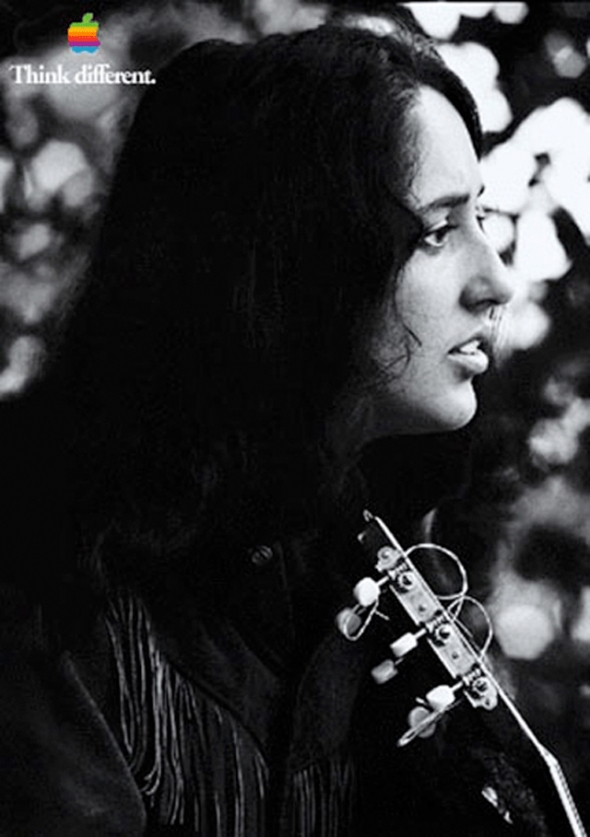
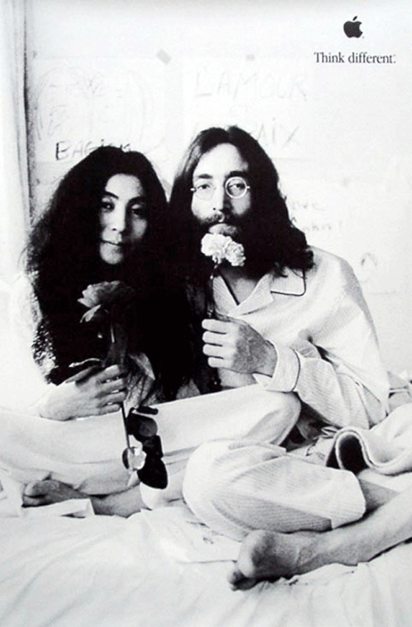
Chiat/Day used a totally computer based creative environment. Jobs gave the group 17 days after approval to complete the entire campaign. That included the television commercial and billboards for major markets such as Los Angeles and New York. An ordinary campaign for a more obscure client (or even Apple under Amelio) would have taken much longer just to get rights to the images. Jobs was particularly useful when Clow and his team needed to get usage rights from celebrities including Joan Baez (Jobs’ ex-girlfriend) and Yoko Ono (once a neighbor near Central Park when Jobs lived in the San Remo and Yoko in the Dakota). If Clow had approached these people’s publicists, he would be another adman. When Jobs called, he was a friend and a cult-figure in computer history.
The television commercial was produced using an Avid 4000 system on a Macintosh with Adobe AfterEffects. Jennifer Gulab, who worked on the television commercial, worked very closely with Jobs via satellite link. The two were in contact daily, working out which images would be used (a choice largely based on the availability of images and permissions), the music, and the narration, which was done by Richard Dreyfus. Dreyfus read a free-verse poem, “Here’s to the Crazy Ones”, written by a Chiat/Day copywriter, Craig Tanimoto. This was used extensively throughout the entire campaign. Rumours say that Steve Jobs wrote the original text, for this spot it’s been changed a little.
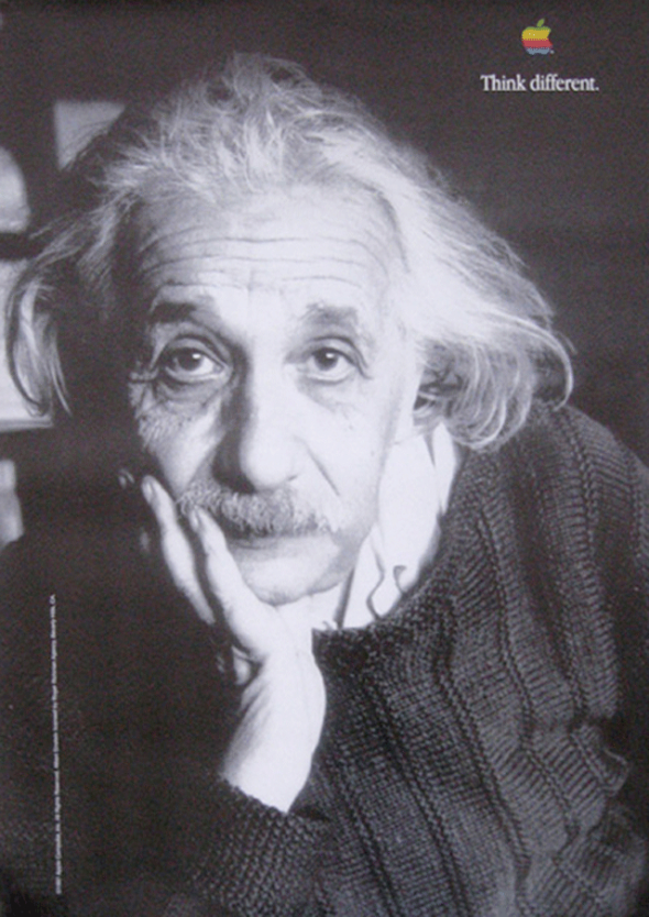
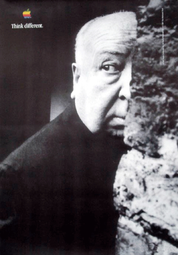
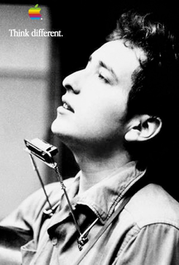
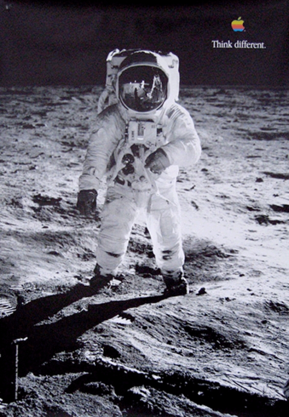
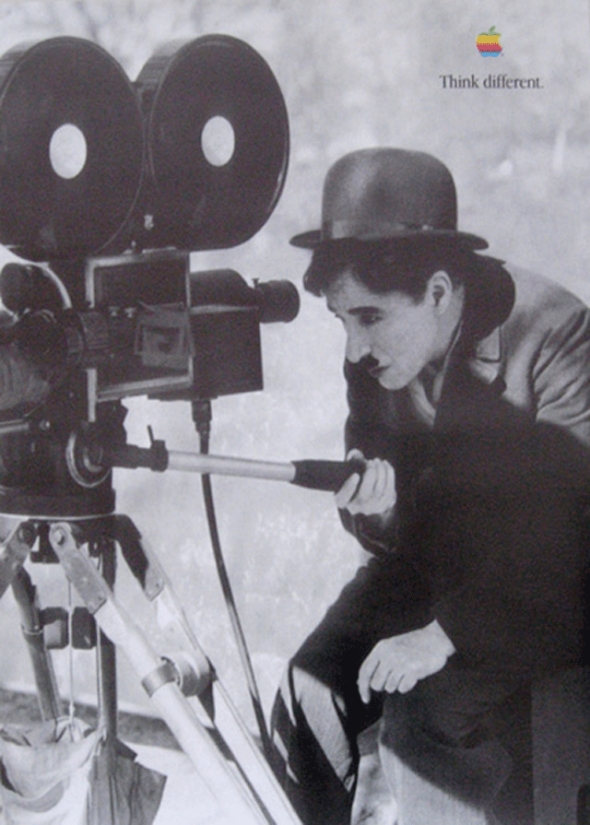
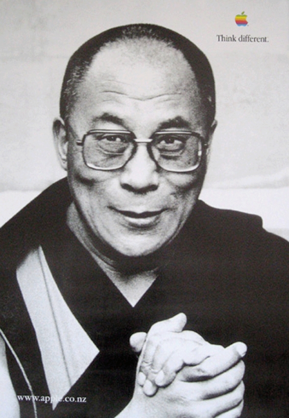
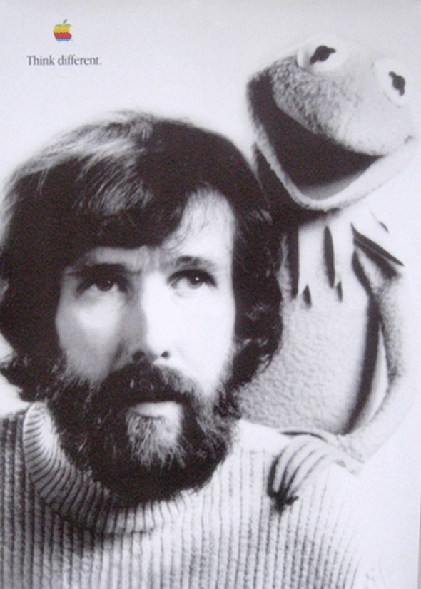
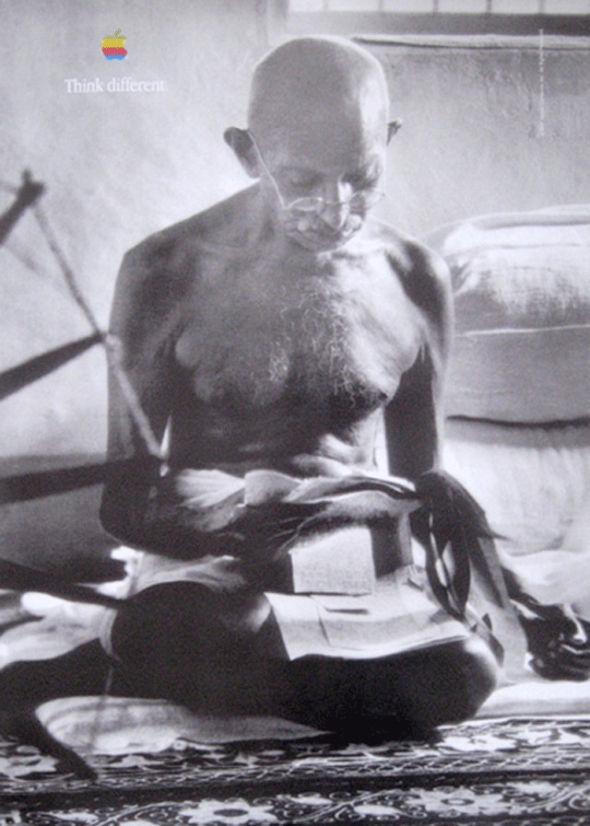
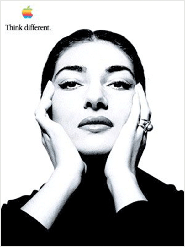
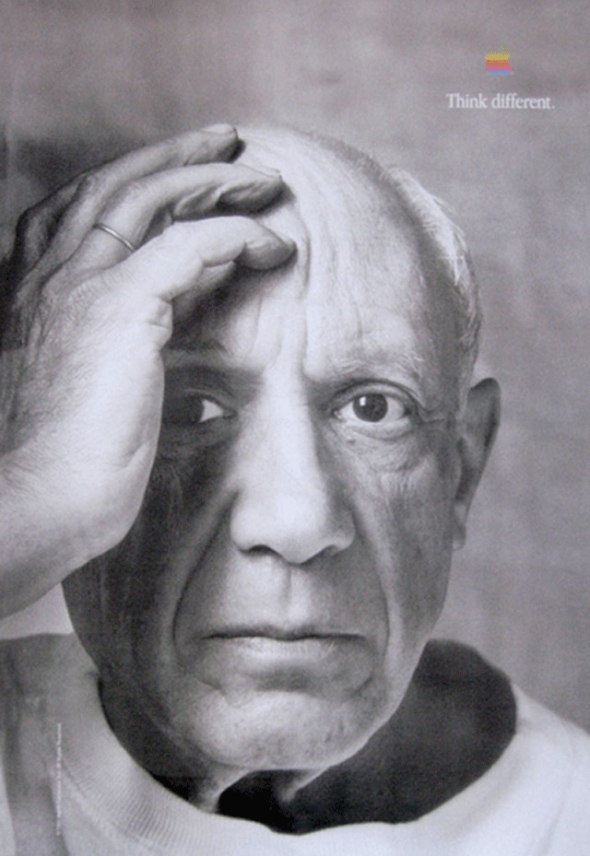
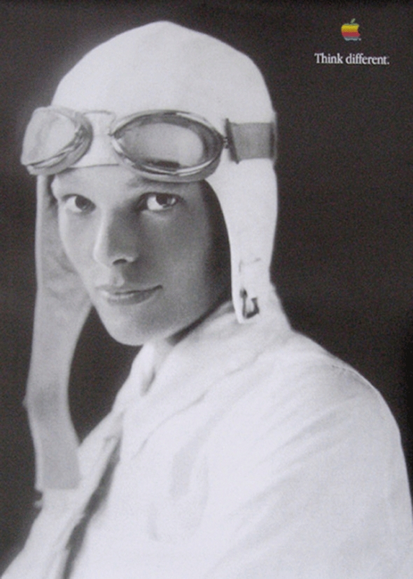
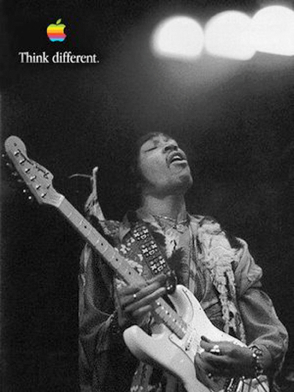
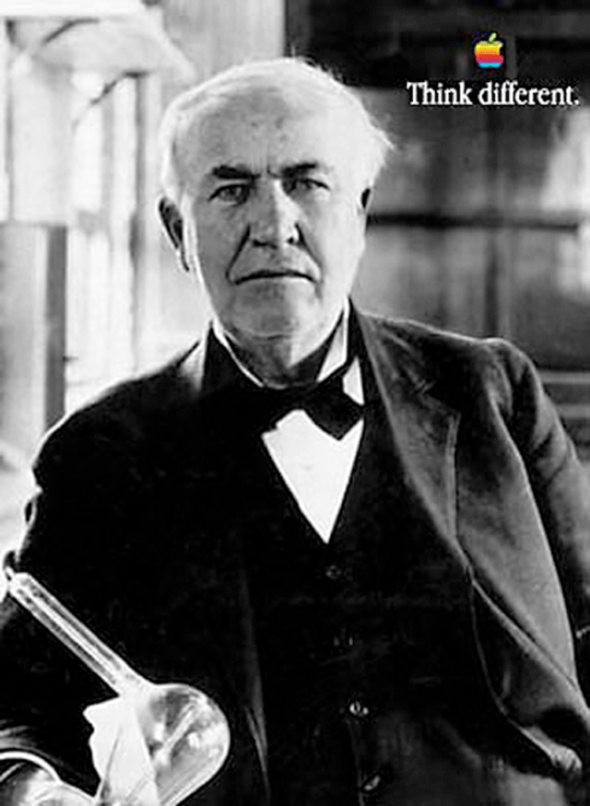
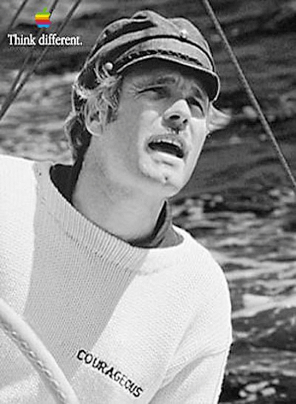
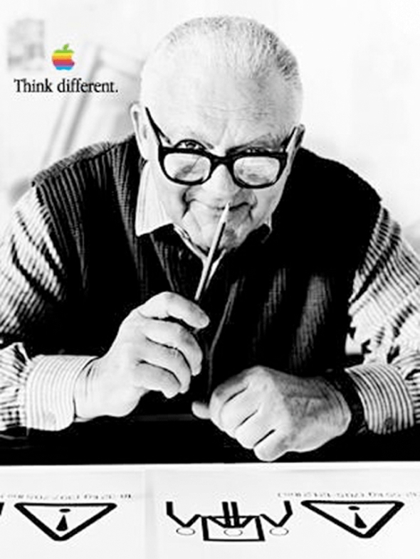
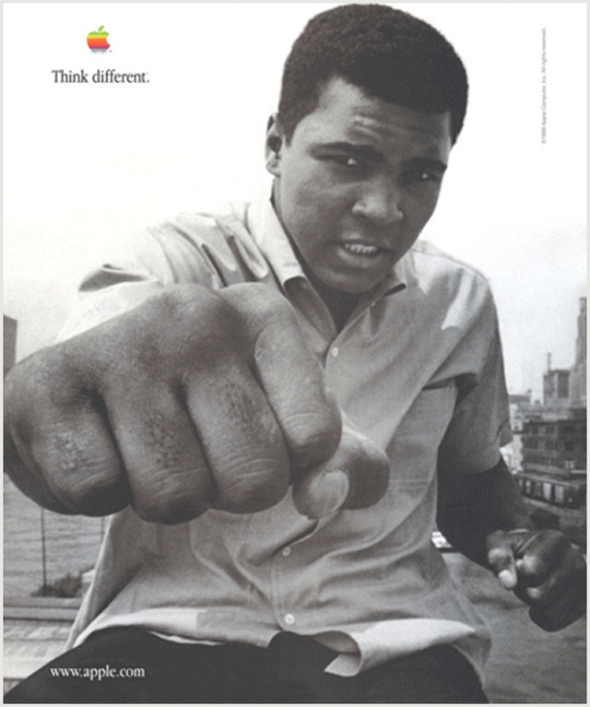
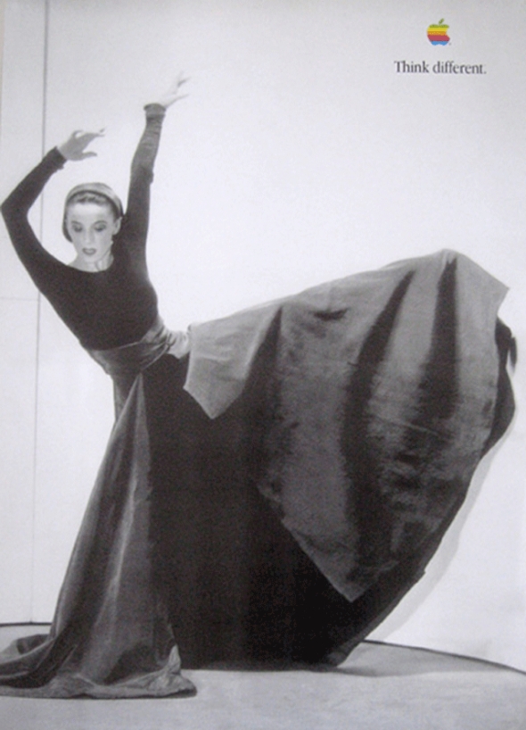
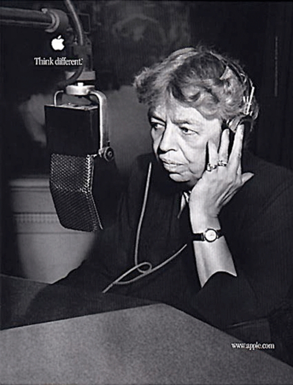
The commercial consisted of the blackand-white images of the 12 visionary thinkers including (in order) Albert Einstein, Bob Dylan, Martin Luther King, Jr.,Richard Branson, John Lennon (with Yoko Ono), R. Buckminster Fuller, Thomas Edison, Muhammad Ali, Ted Turner, Maria Callas, Mahatma Gandhi, Amelia Earhart, Alfred Hitchcock, Martha Graham, Jim Henson (with Kermit the Frog), Frank Lloyd Wright and Pablo Picasso and the reading of a manifesto read by actor Dreyfuss. ‘‘Here’s to the crazy ones,’’ began the voice-over. ‘‘The misfits. The rebels. The troublemakers. The round pegs in square holes. The ones who see things differently. They’re not fond of rules. And they have no respect for the status quo. You can quote them, disagree with them, glorify or vilify them. About the only thing you can’t do is ignore them. Because they change things. They push the human race forward. And while some may see them as the crazy ones, we see genius. Because the people who are crazy enough to think they can change the world are the ones who do.’’ The commercial ends with an image of a young girl, Shaan Sahota, opening her closed eyes, as if to see the possibilities before her.
‘‘Think Different” celebrates the soul of the Apple brand—that creative people with passion can change the world for the better,’’ Jobs told the Wall Street Journal Europe in April 1998. Apple wanted to kick off the campaign in dramatic fashion and decided that the first advertisement should run on television during the September 28, 1997, network television premiere of A Toy Story on ABC. Although difficulties in obtaining the rights to use and publish the photographs of the subjects of the campaign nearly caused Apple to miss its target, the 60-second spot aired as planned.
A shorter version was also produced. It used many of the people above, but closed with Jerry Seinfeld, instead of the young girl. This commercial aired only once, during the series finale of Seinfeld.
The first rule of the campaign was that there would be no products in the ads. Clow and the rest of the creative team were very concerned with appearing to exploit the artists who’s images they used. Instead of being paid, all of the participants (or their estates) were given money and computer equipment to be donated to the charities or non-profits of their choice.
To reinforce the message of the television commercials, Apple conducted a brief second phase of the campaign and ran print ads in major newspapers, including the New York Times and the Wall Street Journal, that consisted of the text of the manifesto and some of the images from the television campaign.

The choice of the tagline ‘‘Think Different’’ rather than ‘‘Think Differently’’ was deliberate. Even though ‘‘Think Different’’ drew public flak for not being grammatically correct, Apple settled on the line because it ‘‘conveyed a total change in the whole body of what you think about,’’ said Jessica Schulman, art director at TBWA\Chiat\Day. ‘‘Instead of thinking in your everyday way, ‘Think Different.’’’
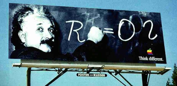
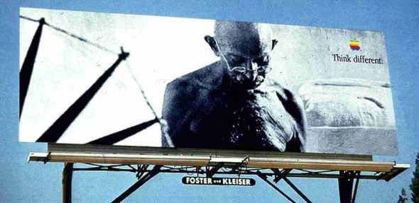
The print and billboard ads were also unique.
Instead of sticking to Mac and general computing magazines, Apple bought space in popular magazines and fashion magazines. Outside advertisements were practically unheard of in the computer industry, but Chiat/Day rented hundreds of major spaces in New York and Los Angeles – and still does.
Since they had little time, instead of making full scale replicas of posters for bus stations or billboards in major cities, Jessica Schulman just imposed her mockups onto street scenes to give her colleagues an idea how her designs would look. She also collaborated with Jobs, exchanging images on the Internet and making constant revisions.
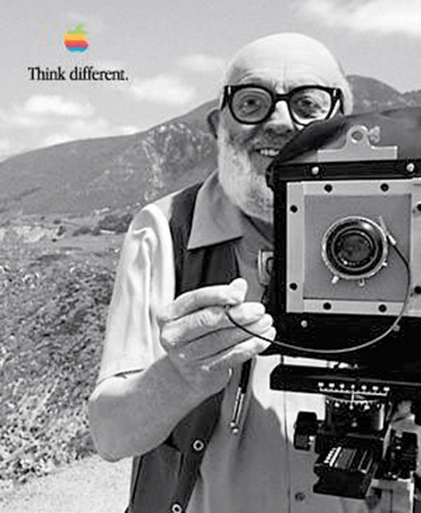
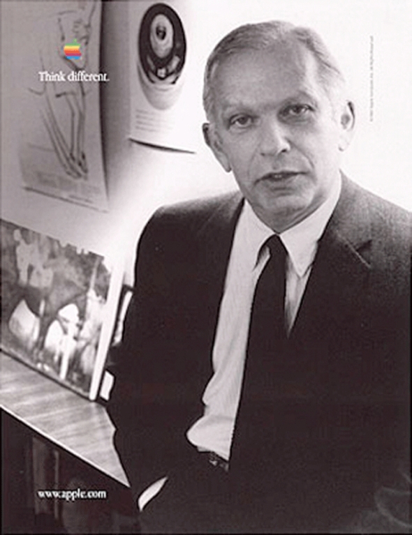
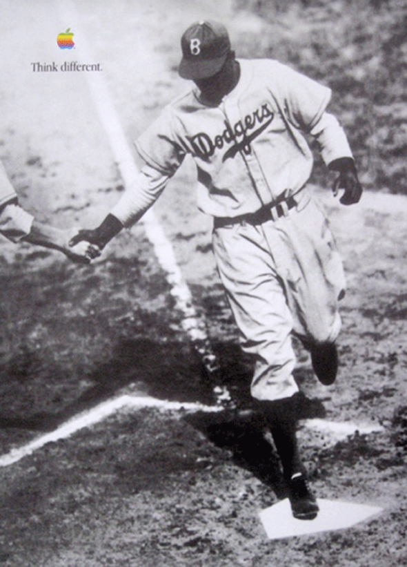
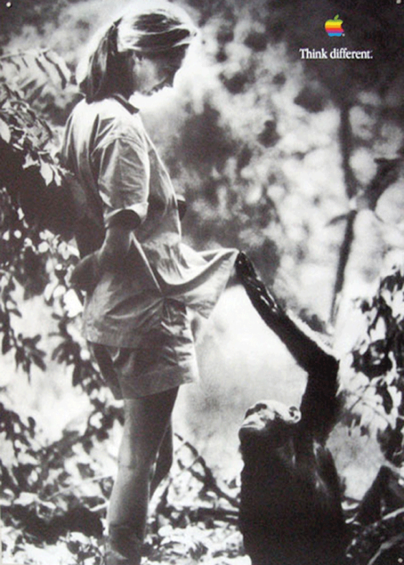
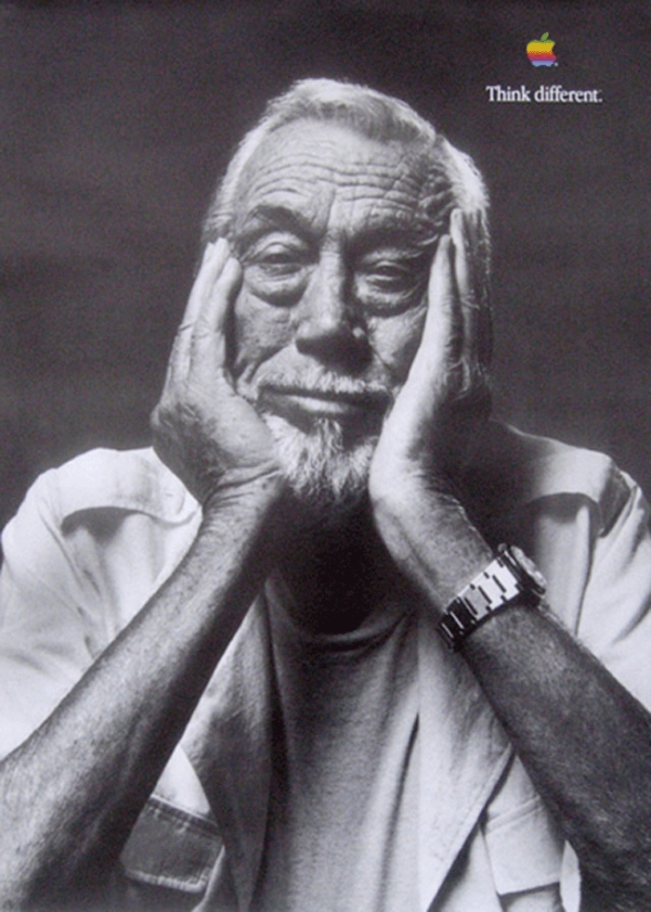
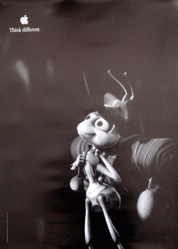
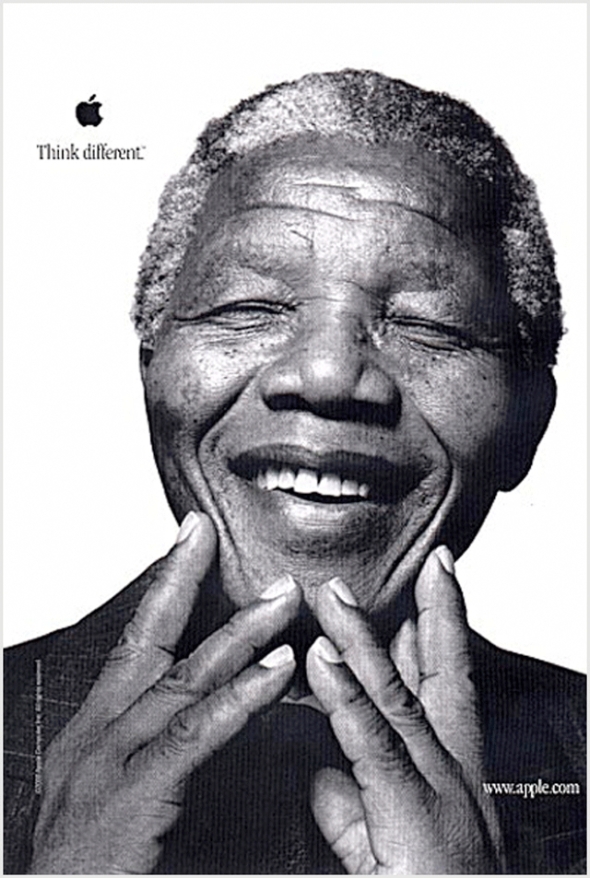
The print campaign was much more elaborate than the television commercial. Over the years there have been dozens of different personalities on the posters. In the end it has become difficult to say which images are original, and which are fake. After the first campaign, Apple started sending complimentary posters to public schools across the nation featuring different celebrities (including Pablo Picasso, Jane Goodall, and Ron Howard) to hang in classrooms. The complete packets now sell for hundreds of dollars on some websites.
The ‘‘Think Different’’ ads reached out to what Apple termed its ‘‘installed base,’’ those consumers who had purchased Apple computer equipment in the past.
Apple consistently performed well in three core markets: designers and desktop publishers, educators and students, and home users. It was these groups that were most likely to have bought Apple products and who were keeping the company afloat during its downturn. But with the publicized record of Apple’s financial troubles, many of them were not purchasing new Apple systems for fear that the company would soon fold, leaving them with obsolete machines. ‘‘Our number one priority was to make people realize that we were still here and still fighting for this brand,’’ said Rhona Hamilton, a marketing representative for Apple. In order to appeal to these users, the campaign stressed the creative roots of the Apple brand. The people who were selected to appear in the ‘‘Think Different’’ campaign were bold thinkers, men and women who were not merely great in a certain field but who were also innovative and independent and who had changed the worlds in which they moved. By aligning itself with the likes of Muhammad Ali, Bob Dylan, and Albert Einstein, Apple clearly strove to deliver a message about itself and its products. ‘‘After talking to a lot of consumers and Macintosh enthusiasts, our strategic direction was to stop acting like a computer company and start acting like a company dedicated to creative thinking,’’ said Schulman. The ‘‘Think Different’’ ads stressed that Apple was an innovative company that, with its creative users, could change the world. With these images and themes, Apple hoped to appeal to its core markets, people who as artists, illustrators, designers, and students valued their own creativity and who viewed themselves as being somewhat outside the mainstream. As Brandweek noted, ‘‘‘Think Different’ [was] clear that it [was] not targeting its message to everyone.’’

The ‘‘Think Different’’ campaign elicited an outpouring of opinions. Apple’s headquarters was inundated with letters, faxes, phone calls, and E-mails commenting on the campaign. Some questioned the cast of innovative thinkers included in the ads, others were perplexed by the message, and still others were delighted with Apple’s attempt to pay tribute to its heroes. People formed websites spontaneously, discussing who the individuals were, whether the phrase ‘‘Think Different’’ was grammatically correct, and why Apple’s ad campaign would focus on a group of people who for the most part had never touched a computer. Apple and TBWA\Chiat\Day considered the attention paid to the campaign to be a sign of its impact.
At first the advertising industry praised the ‘‘Think Different’’ campaign. The December 15, 1997, edition of USA Today listed Apple’s ‘‘bolder’’ ads as one of the year’s best campaigns. As reported in the same article, ad agency creative directors ranked the campaign as the second best of the year. On May 18, 1998, Advertising Age also voiced its approval: ‘‘The decision to celebrate the kind of independent thinking that has always typified Mac users seems now to make total sense.’’ In fact, the article stated, ‘‘the shots of heroes, geniuses, wildmen, and iconoclasts assembled here makes a strong emotional statement for Apple’s underdog role.’’
Not everyone loved ‘‘Think Different,’’ however. At first Apple had to contend with criticism for launching a ‘‘campaign of dead people.’’ Apple marketing representative Rhona Hamilton spoke of having to educate consumers about what the campaign was attempting to convey. CMP Techwire reported that the company was drawing bad press for undertaking an expensive marketing effort during a period of financial losses. A USA Today Ad Track survey revealed that consumers preferred Intel’s ‘‘Bunny People’’ spots, which were ranked as the most popular technology-industry commercial of 1997.
The campaign had a positive effect on Apple’s bottom line. In April 1998 Apple reported its second straight profitable quarter after nearly two years and $2 billion in losses. Apple attributed the increasing sales to the ‘‘Think Different’’ campaign. ‘‘It let people know that we’re still around and not going anywhere, so that they can feel good about buying the product,’’ said Hamilton. Apple’s market share rose to 4.1 percent. Unfortunately for Apple, the computer maker’s American market share hovered at about 5 percent for the campaign’s final four years. Advertising critics began discrediting ‘‘Think Different’’ for limiting the Apple brand to the small minority of ‘‘revolutionaries’’ that used computers. ‘‘For years, the Apple brand has been associated with artists, writers and designers,’’ Sandra Garcia wrote in the August 2, 2002, issue of Shoot, an ad-industry magazine. ‘‘The so-called ‘creative types’ who seemingly belonged to this secret society of Mac users while the rest of the working public toiled in a clunky PC world.’’
The ads won a slew of awards and developed a cult-following. In 1998 the television spot won the second annual primetime Emmy Award for best commercial from the Academy of Television Arts & Sciences (ATAS). The ad also won a Belding, a Silver Lion and a Gold Lion at Cannes. The long-term campaign won an Effie award for marketing effectiveness. After the first campaign, Apple started sending complimentary posters to public schools across the nation featuring different celebrities (including Pablo Picasso, Jane Goodall, and Ron Howard) to hang in classrooms. The complete packets now sell for hundreds of dollars on some websites.
The campaign ended in 2002.
Advertising Agency: TBWA/CHIAT/DAY, Los Angeles
Chief Creative Officer: Lee Clow
Creative Directors: Ken Segall/Rob Siltanen/Eric Grunbaum/Amy Moorman
Art director: Jennifer Golub/Jessica Schulman/Margaret Midgett,/Ken Younglieb/Bob Kuperman/Yvonne Smith/Susan Alinsangan
Copywriter: Craig Tanimoto


