Samsung eMotion Project/Leo Burnett Italy
Posted: April 24, 2015 Filed under: Digital, Direct, Italy, TV/Film, Viral | Tags: eMotion Project, Leo Burnett, samsung, Samsung Gear VR Leave a comment
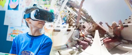
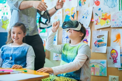
The aim of eMotion Project is to help hospitalized children to face recovery in a whole new way, bringing the light-heartedness typical of childhood back into their lives.
With the collaboration of Samsung Italia, the potential of Samsung Gear VR has been put at the disposal of the pediatric department of Santa Maria Goretti hospital in Latina, to offer little patients an unforgettable visit to “Movieland”, near Lake Garda.
The experience proved to be a valuable way of providing genuine emotional support, turning around not only the mood of the little patients, but also their whole approach to recovery.
Learn more about Samsung Gear VR at http://spr.ly/_GearVR
#eMotionProejct
Agency: Leo Burnett
Executive Creative Director: Francesco Bozza, Alessandro Antonini
Creative Director: Christopher Jones
Copywriter: Nicoletta Zanterino
Art Director: Alessandro Polia
Creative team: Alice Jasmine Crippa, Federica Rebuzzini
Social Media Manager: Raffaella Ramondetti
Project Manager: Andrea Castiglioni
Managing Director: Niccolò Arletti
Account Director: Viktoria Ovtcharenko
Account Manager: Federica Giacomotti
Producer: Isabella Guazzone
Regista: Claudio Gallinella
Casa di produzione: Bedeschi Film
Advertising by Design (22 Brilliant Ideas)
Posted: July 15, 2013 Filed under: Ambient, Art, Awards, Cannes Lions, Case History, Design, Direct, France, Germany, Graphic Design, Installation | Tags: 22 brilliant ideas, advertising by design, Brazil, Cannes Lions, Case History, Coca-Cola, design, FIAT, Germany, Heineken, Jung von Matt, kit kat, Land Rover, Ogilvy, Red Bull 1 CommentTBWA/Hunt/Lascaris – We Sent Their Briefs Back


Although TBWA\Hunt\Lascaris is well established as an above-the-line agency, our clients were yet to be introduced to the wealth of talent that TBWA\ Design has to offer. So, to get our clients’ attention, we intercepted existing above-the-line briefs and used the physical advertising brief as our canvas. Instead of answering the brief in a traditional manner, we conceptualized various designs that captured the essence of the brands, then brought them to life using only the cardboard job bags and the briefs that were attached to them. We created intricate pieces of paper art, transforming our client’s briefs into multi-dimensional design pieces. We then sent our clients’ briefs back to them, proving that TBWA\ Design can do amazing things with their briefs. Our campaign was a huge success. The design studio received their first new brief from our client just 5 days later. Even more notably, new design work in the system rose by 450% within the first 6 weeks.
Advertising Agency: TBWA\Hunt\Lascaris, Johannesburg
Executive Creative Directors: Matthew Brink, Adam Livesey
Art Director: Jade Manning
Copywriter: Vincent Osmond
Creative Director: Sacha Traest, Mike Groenewald
Design: Sacha Traest, Leigh-anne Salonika, Katleho Mofolo, Graeme Van Jaarsveld, Ilze Venter, jason Fieldgate
Typographer: Hazel Buchan
Photographer: Graeme Borchers, Des Ellis
Year: 2013
——————————————————————————————————————————————————————————————————————————-
Coca-Cola – Sharing Can


Advertising Agency: Ogilvy & Mather, Paris/Ogilvy & Mather, Singapore
Chief Creative Officer: Chris Garbutt, Eugene Cheong,
Creative Director: David Raichman, Frederic Levron, Yvan Hiot
Copywriter: Xiao An Cheng
Designer: Martin Olivier, Olivier Brechon
Technical Partner : Capital Innovation
Year: 2013
——————————————————————————————————————————————————————————————————————————-
Land Rover – The Escape Key

Jaguar Land Rover MENA is promoting the Land Rover LR4 with “The Land Rover Escape Key”, a small icon designed to replace the ESC key on desktop computer. Sent out in three batches of 800 pieces, the keys are designed to remind people at the office that there’s way to escape the every day routine of indoor business. Test driving a Land Rover LR4 is the way to find life beyond the office cubicle. The number of queries almost tripled and test drives are up by 208%.
Advertising Agency: Y&R MENA
Chief Creative Officer: Shahir Zag
Creative Director: Joseph Bihag, William Mathovani
Year: 2013
——————————————————————————————————————————————————————————————————————————-
Kit Kat – The Pillow Book

Advertising Agency: JWT, Sao Paulo, Brazil
CCO: Ricardo John
Art Director: Brunno Cortez
Copywriter: Erick Mendonça
Creative Director: Ricardo John
Year: 2013
——————————————————————————————————————————————————————————————————————————-
Marionnaud – Memory Game

Marionnaud, one of Europe’s largest perfume retailers, celebrated “10 years’ expertise in fragrance”. For the jubilee we created a very special staff incentive: the first Memory game without pictures. The cards had been finished with a fragrance coating. When rubbed, the cards released the scent of ingredients used in perfume manufacture. Rub and sniff: that was the only way to identify the pairs – but no problem for Marionnaud professionals.
Advertising Agency: Wirz/BBDO, Zurich
Executive Creative Director: Philipp Skrabal
Art Director: Barbara Hartmann
Copywriter: Marietta Mügge
——————————————————————————————————————————————————————————————————————————-
FIAT – Hero Hug

Advertising Agency: Leo Burnett, São Paulo
Chief Creative Officer: Marcelo Reis
Executive Creative Director: Guilherme Jahara
Creative Director: Rodrigo Jatene
Copywriter: Caio Lekecinskas
Art Director: Rafa Oliveira
——————————————————————————————————————————————————————————————————————————-
Domino’s Pizza – Domino’s Pizza Disc

Advertising Agency: Artplan, Sao Paulo
Executive Creative Director: Roberto Vilhena
Creative Director: Rodrigo Moraes
Copywriter: Tiago Trindade, Rodrigo Sanches
Art Director: Diogo Barbosa, Guilherme Grotti
Graphic Production: Bruno Werner
——————————————————————————————————————————————————————————————————————————-
Megaman – Light Bulb Calendar

Advertising Agency: Grabarz und Partner, Germany
Executive Creative Director: Ralf Heuel
Creative Director: Andre Price, Jan-Florian Ege
Art Director: Andre Price, Jana Mehrgardt, Jan Riggert
Designer: Sönke Jansen
——————————————————————————————————————————————————————————————————————————-
Heineken – First Interactive Bottle


Heineken embraces the start-up culture of experimentation because it knows that invention never sleeps. The brand understands that the best ‘user experiences’ tap into existing consumer behaviors and push technology into the background.
The intent of the Heineken Ignite project was to develop an idea that would create a memorable Heineken experience unlocking the power and possibilities of mobile innovation and technology.
Heineken believes that mobile innovation could offer a much more rewarding experience than just an app and embraced the challenge to think about how the product could be leveraged as an interface to the brand experience.
A prototype of Heineken Ignite will be revealed on 9 April at Milan Design Week as part of Heineken’s Lounge of the Future concept. Heineken takes its promise to “open your world” even further with the Heineken Ignite project, enhancing the organic way in which the product is used based on social interaction between beer drinkers. This innovative approach lets people be a part of the party in a whole new way and opens up possibilities in social situations.
Advertising Agency: Tribal DDB, Amsterdam
——————————————————————————————————————————————————————————————————————————-
3M Earplugs – Volume Pack

The task was to develop an original promotional packaging solution that immediately conveyed the product value of 3M’s Solar Earplugs – a product targeted at end users frequently requiring effective noise protection (such as musicians and festival-goers). Solution: 3M turned the purpose of the earplugs – to reduce noise – into an original package design. The container’s cap looks like the volume knob of a hi-fi system; when opening it to reach the earplugs, one seems to be turning down the volume.
Advertising Agency: Scholz & Friends, Germany
Chief Creative Officer: Martin Pross
Executive Creative Director: Matthias Spaetgens
Creative Direction: Robert Krause, Wolf Schneider
Copy: Nils Tscharnke
Art Direction: Sebastian Frese, Ralf Schroeder
——————————————————————————————————————————————————————————————————————————-
Deutsche Bank – Anamorphic Mirror


Brief Explanation
The vestibule is a narrow room of 25sqm strongly limiting the possible size of the installation. Therefore, we decided to utilise light for a radiant impact, and to expand the process of reception by making use of the visitors’ movement while approaching the area via a short staircase. Going upstairs becomes part of the experience as visitors gain increasing insights to the entry with the installation. Its concept is based on the principle of anamorphosis: what you see alters as you change your position in space. The image only fully resolves itself when seen from a particular ‘sweet spot’.
Describe the brief from the client
The redesigned corporate headquarters of Deutsche Bank in Frankfurt am Main are now housing a brand and conference area. Parts of this section are public and can be accessed directly from the spacious atrium via a staircase. Deutsche Bank commissioned us to develop an installation that references the well-known company logo, originally designed by Anton Stankowski, for the vestibule of this area. The brief was to provide an atmospheric element that would be visible to customers, visitors and employees standing at reception, as well as on the bridge connecting the building’s 2 towers.
Description of how you arrived at the final design
‘Anamorphic Mirror’ consists of a faceted mirror and blue light projected onto the opposite wall. When viewed from the ‘sweet spot’ the mirror reflects the Bank’s logo. Standing at the bottom of the stairs, visitors see seemingly random blue reflections on the mirror’s facets. As they get closer, the blue reflections begin to take shape, until they resolve into the bank’s logo upon the visitors’ reaching the stairs’ top. In this manner, an animation is created from a static surface. While getting even closer to entering the conference area, visitors are themselves reflected in the mirror and thus take centre stage.
Indication of how successful the outcome was in the market:
Since the opening on April 6 more than 20,000 visitors came to see the public part of the brand area. Board members use the overall facilities to hold receptions, functions such as HR are using it for employee activities, bank managers invite partners and clients, the press department welcomes journalists. With unobtrusive means, the dynamic and yet poetic installation ‘Anamorphic Mirror’ creates an atmospheric element with space-encompassing impact, and attunes visitors to the brand from the very beginning.
Advertising Agency: ART+COM in Cooperation with COORDINATION, Berlin
Executive Creative Director: Joachim Sauter
Designer: Simon Häcker
Project Manager: Gert Monath
Senior Art Director: Eva Offenberg
Year: 2013
——————————————————————————————————————————————————————————————————————————-
The Hälssen & Lyon – The Tea Calendar


The Hälssen & Lyon tea calendar is the first calendar in the world to feature calendar days made from tea leaves. Finely flavoured and pressed until wafer-thin, the 365 calendar days can be individually detached and brewed directly in the cup with hot water. The tea calendar was sent exclusively to selected business partners.
Advertising Agency: Kolle Rebbe, Hamburg
Executive Creative Director: Sascha Hanke
Creative Director: Heiko Schmidt and Kay Eichner
Creative: Patrick Schroeder, Julia Meissner
Year: 2013
Gold Lion
——————————————————————————————————————————————————————————————————————————-
Hot Wheels – Don’t Drink and Drive Key Chains

Advertising Agency: Ogilvy, Mumbai, India
National Creative Directors: Abhijit Avasthi, Rajiv Rao
Senior Creative Director: Amitabh Agnihotri, Sameer Sojwal
Creative Group Head: Yogesh Pradhan
Year: 2012
——————————————————————————————————————————————————————————————————————————-
Greenpeace – Do Not Disturb

Advertising Agency: AlmapBBDO, São Paulo, Brazil
Chief Creative Officer: Marcello Serpa
Executive Creative Director: Marcello Serpa
Creative Director: Luiz Sanches
Art Director: Caio Tezoto
Year: 2012
——————————————————————————————————————————————————————————————————————————-
Coca-Cola FM – Magazine Amplifier


The piece consists in an exclusive insert for subscribers of the latest edition of the Capricho magazine which was created by JWT. Attached to the cover, the art allows readers to turn the magazine into an amplifier. Simply by rolling the magazine and inserting the iPhone tuned into the Coca-Cola FM application in the spot indicated. The final format allows the sound waves to travel in two different directions at the same time, intensifying the stereo effect created by the device. The next step is to enjoy the music.
Advertising Agency: JWT, Brazil
Year: 2012
——————————————————————————————————————————————————————————————————————————-
Red Bull – Portable Charger

We created Redbull-shaped portable charger. This Redbull-shaped charger will show its own recharging screen when they fit into the gadget And the mobile webpage of Redbull will be on the screen when it is unlocked.
Advertising Agency: Hallym University, Cheonan-si, South Korea
Copywriter: Heejo Sun, Dongkyun Yu
Art Director: Minseok Go
Year: 2012
——————————————————————————————————————————————————————————————————————————-
Land Rover – Edible Survival Guide

While Land Rover vehicles can take on any obstacles in the desert, it cannot be said the same of their owners. Scorching temperatures, deadly animals and sinkholes are just a few things they might encounter. And when they venture deep into it, even the most experienced drivers can quickly succumb to the harshness of the desert. We wanted to create something that would cut through the clutter and that these people would like to keep. So we created a survival guide, which explained the basics for staying alive in the Arabian Desert, and packaged it in a way that would spur the attention of our target audience.
We researched every indigenous animal and plant, people could encounter in the Arabian Desert and how they could be used to survive. We studied the topography of the region to guide people to safety. We used a reflective packaging similar to army rations, which could be used to signal for help, and bound the book with a metal spiral, which could be used for cooking. Finally, we even took an extra step so that in case of emergency, people could always EAT the book. It was made out of edible ink and paper, and it had a nutritional value close to that of a cheeseburger.
We sent the book to 5,000 existing customers, gave it away as a supplement to the cars’ manual and made it freely available in sports shops. The initial response was very positive. And the client was so happy with the concept that they asked us to include the book as an insert in the next edition of a car magazine, with a 70,000 circulation.
Advertising Agency: Y&R, Dubai, UAE
Chief Creative Officer: Shahir Zag
Creative Director/Copywriter: Shahir Zag
Creative Director/Art Director/Illustrator: Joseph Bihag
Copywriter: Guillaume Calmelet
Designer/Copywriter: Khaled Said
Year: 2012
——————————————————————————————————————————————————————————————————————————-
IBM – Outdoor as Utility


Advertising Agency: Ogilvy France
——————————————————————————————————————————————————————————————————————————-
Ricola – Ricola Music Edition


Ricola, a brand of cough drops and breath mints in Switzerland, is known for its traditional blend of thirteen natural herbs. The provision of instant relief, even to the most strained throats, is visualised with the help of the wrapping paper. The Music Edition, an illustrated release, turns the drops into the heads of suffering singers. Each and every throat appears to be constricted. However, when you unwrap a bonbon, the throat is relieved and all hoarseness disappears. Print advertising presented the five characters: Rockabilly, Pop star, Opera singer, Rapper and Punk Rocker, with the tag line, “Unwrap your voice”. The project won Gold for Package Design at the London International Awards this week.
Advertising Agency: Jung von Matt, Hamburg
——————————————————————————————————————————————————————————————————————————-
Camp Nectar – Fruit Boxes (Made from Real Fruit)


General Brands in Brazil ran a two-year experimental campaign in which fruit was grown in the shape of Camp Nectar fruit boxes to promote the claim, “Made from Real Fruit”. Customized juice box molds were placed around growing fruit on an orchard in Paranapanema, producing 1,123 oranges, lemons, guavas and passion fruit with the Camp Nectar box shape. The specially designed fruit, complete with brand imprint, straw and carton flaps, were placed in supermarkets and fairs to promote the juice range. The campaign won a Gold Outdoor Lion, a Bronze Direct Lion, a Silver and Bronze Promo & Activation Lion.
Advertising Agency: Age Isobar, Sao Paulo
——————————————————————————————————————————————————————————————————————————-
Sweet Enough – The Candy Room


Sweet Enough, an importer of sugar free candy products in Australia, has set up The Candy Room, a store in Melbourne designed to draw out the inner child in customers, connecting them with childhood, fantasy and fiction and of course, sweets. Black line artwork is applied on white space, supplemented with the bright colours of the sweets throughout the store.
Advertising Agency: Red Design Group
——————————————————————————————————————————————————————————————————————————-
Oreo – Oreo Crumb Case


Miami Ad School students have developed a tea bag enclosure for Oreo cookie crumbs to infuse milk with Oreo flavor. The Oreo Crumb Case, developed as a student project, could go a long way. Just shake together all the crumbs left in the Oreo packet, sprinkle them into the Crumb Case, and infuse the crumbs in your tumbler of milk.
Advertising Agency: Miami Ad School
CoorDown – #DammiPiùVoce (Saatchi & Saatchi Italy strikes back)
Posted: May 24, 2013 Filed under: Case History, Digital, Direct, Italy, Social, Testimonial, Viral | Tags: #dammipiùvoce, Alessandro Orlandi, Case History, Coordown, Digital, Jovanotti, Luca Lorenzini, Luca Pannese, Saatchi & Saatchi, Sharon Stone, Turn up my voice Leave a comment
Background
In Italy, due to prejudice, the basic rights of people with Down syndrome are still too often denied. With more funds available it would be possible to defend their rights.

Idea
On launch day, on the site CoorDown.it, 50 people with Down Syndrome each appeared on video appealing to 50 celebrities for a donation. But not of money: they asked them to donate a video. A video in which they, the celebrities, asked for the money to support people with Down syndrome, amplifying their voices. A video, which if then shared via the celebrities’ social networks, would have more chance of being listened to.
——————————————————————————————————————————————————————————-
Spartaco & Jovanotti
Andrea & Sharon Stone
Federico & Castrogiovanni
——————————————————————————————————————————————————————————-
Results
50 out of 50 celebrities donated a video and shared it on their social networks, including the singers Tiziano Ferro andJovanotti; the footballers Totti, Materazzi and Zanetti; the rugby player Castrogiovanni; the star chef Carlo Cracco; the Real Madrid coach Jose Mourinho and the actress Sharon Stone.
Thanks to the social networks shares and all the media coverage, the campaign reached almost 30 million people, half of the italian population. And donations were up 700%, compared to Coordown’s previous fundraising campaign.
Advertising Agency: Saatchi & Saatchi, Italy
Creative Directors: Alessandro Orlandi, Luca Lorenzini, Luca Pannese
Art Director: Luca Pannese
Copywriter: Luca Lorenzini
Social Network specialist: Flavia Pipola
Head of Interactive Production: Silvio Coco
Web Developer: Dario Cataldi
Producer: Erica Lora-Lamia
Head of TV: Raffaella Scarpetti
Editor: Fulvio Rossetti
Social Media Partner: Ambito 5
Website development: Logicweb
Partners: Top Digital, Flipper Music, Luca Bottale, H-Films, Getty Images, Google, Akita
Year: 2013
From Coke to Mikado – Don’t Underestimate the Power of a Red Button
Posted: March 13, 2013 Filed under: Ambient, Australia, Awards, Belgium, Beverages, Brazil, Cannes Lions, Case History, Cliché, Direct, Event, France, Installation, Press/Outdoor, Promotion, TV/Film, USA, Viral | Tags: Ambient, Belgium, Buzzman, Cannes Lions, Case History, Clemenger BBDO, Coca-Cola, Duval Guillaume, fantastic delites, France, funny, Happiness Truck, installation, Mikado, push the red button, push to add drama, resistence test, TNT Tv Channel, USA, Viral Leave a comment
Mikado – Resistance Test
Advertising Agency: Buzzman, Paris, France
CEO / Creative Director: Georges Mohammed-Chérif
Art Director: Louis Audard
Copywriter: Tristan Daltroff
Art Director Assistant: Clément Séchet
Year: 2013
TNT TV Channel – Dramatic surprise on an ice-cold day
Advertising Agency: Duval Guillaume Modem, Brussels
Creative Director: Geoffrey Hantson, Katrien Bottez
Copywriter: Dieter De Ridder
Art Director: Ad Van Ongeval
Production Company: Czar
Director: Koen Mortier
Year: 2013
Fantastic Delites – How Far Would You Go?
The Delite-o-matic is an interactive vending machine that dispenses free packs of Fantastic Delites simply by pushing a button hundreds of times or by performing challenges. The Delite-o-matic was put out on the streets to prove that because Fantastic Delites taste so good, people will go to incredible lengths to get their hands on them.
Advertising Agency: Clemenger BBDO, Australia
Creative Director: Karl Fleet
Digital Creative / Art Director: Oliver Prenton
Digital Creative / Copywriter: Matt O’Grady
Year: 2012
TNT TV Channel – Big Red Push Button
To launch the high quality TV channel TNT in Belgium we placed a big red push button on an average Flemish square of an average Flemish town. A sign with the text “Push to add drama” invited people to use the button.
Advertising Agency: Duval Guillaume Modem, Brussels
Creative Director: Geoffrey Hantson, Katrien Bottez
Copywriter: Dieter De Ridder
Art Director: Ad Van Ongeval
Production Company: Czar
Director: Koen Mortier
Year: 2012
Coca-Cola – Happiness Truck
A Coca-Cola delivery truck is converted into a happiness machine on wheels delivering “doses” of happiness in the streets of Rio De Janeiro, Brazil. Where will happiness strike next?
Advertising Agency: Definition 6, Atlanta
Year: 2011
Droga Give Me 5 (from Underground Creative School, Buenos Aires)
Posted: February 26, 2013 Filed under: Argentina, Case History, Digital, Direct, Event | Tags: Argentina, David Droga, Diego Rubio, Digital, Droga Give Me 5, Droga5, Promotion, Underground Creative School Leave a comment

They are a group of 25 digital creative students of Underground, a creative school in Buenos Aires. All of them wanted to accomplish our studies and get a job but with such a huge competitive scenario we needed to find somehow, a way to stand out. That´s how they came out with an idea: they had to work for the best creative in the world. If they could get his attention we would be able to get anyone’s.


Advertising School: Underground Creative School, Buenos Aires, Argentina
Creative Director: Diego Rubio
Creatives: María Paula Castaño Cadena, Lucas Kraglievich, Sandra Lopez, Josefina Salgado, Laura Perez Millan, Camilo Rodríguez, Fede Green, Jorge Anastasiu, Sebastian Merino Luque, Jaime Vanegas Restrepo, Mario Anchorena Aitken, Jorge Garcia, Oscar Andrés Rincón, Maye Duarte, Nau Pintos, Manuel Torres Gere, Felipe Arenas, Angela Binimelis, Aye Piru, Andrea Saturno, Bruno Waldbaum, Nat Os, Leandro Baca, César Bené Guerrero
Photographer: Martín Levi
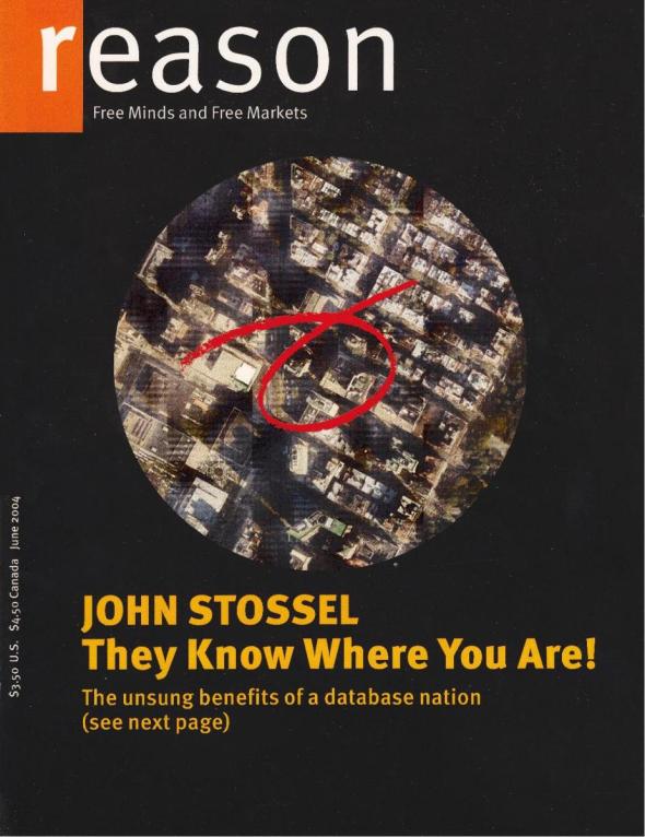
Reason Magazine – 40,000 Readers on a Cover
Posted: February 15, 2013 Filed under: Best Use of Print, Case History, Direct, USA | Tags: cover, Direct, free minds free markets, Nick Gillespie, Promotion, readers on a cover, Reason Magazine, satellite photo, USA Leave a comment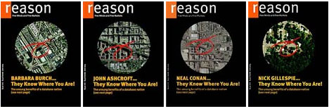
“This represents an unprecedented experiment in hiper-individualizing a commercial print publication”
Nick Gillespie, Editor-in-Chief of Reason, in the June 2004 issue
Monthly libertarian magazine Reason pulled off the ultimate in customized publishing when its 40.000 subscribers received their June 2004 copy with a satellite photo of their own neighbourhood on the cover and their house circled in red. On the back cover readers found adverts customized to them and their neighbourhood. The stunt accompanied the magazine’s cover article about the power and importance of databases to customize information.
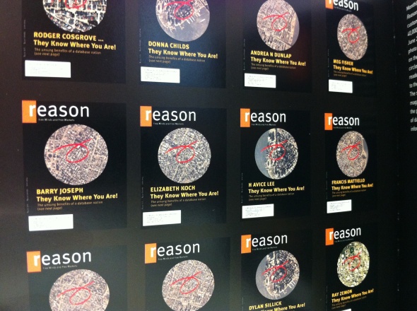
When the 40,000 subscribers to Reason, the monthly libertarian magazine, receive a copy of the June issue, they will see on the cover a satellite photo of a neighborhood – their own neighborhood. And their house will be graphically circled.
On one level, the project, sort of the ultimate in customized publishing, is unsurprising: of course a magazine knows where its subscribers live. But it is still a remarkable demonstration of the growing number of ways databases can be harnessed. Apart from the cover image, several advertisements are customized to reflect the recipient’s particulars.
Nick Gillespie, editor in chief of Reason, said the magazine, with an editorial mission of “Free Minds, Free Markets,” used the stunt to illustrate the cover article about the power and importance of databases.
“Our story is man bites dog,” Mr. Gillespie said. “Everybody, including our magazine, has been harping on the erosion of privacy and the fears of a database nation. It is a totally legit fear. But they make our lives unbelievably easier as well, in terms of commercial transactions, credit, you name it.”
Rodger Cosgrove, president of Entremedia, a direct marketing firm and a member of Reason’s board, assisted in coming up with a program that allows the subscriber list to be integrated with satellite photographs. He also worked with Xeikon, the manufacturer of the printer that made the endless customization possible.
“They were interested in showing what this technology could do,” he said, “and we were interested in demonstrating the power of databases to customize information.”
The cover article, written by Declan McCullagh, suggests that while databases can lead to breaches in privacy, it allows Dell to provide instant credit to computer buyers, grocery stores to stock goods that their customers want, and mortgage lenders to keep their rates down.
“It’s obvious that databases provide enormous benefits to modern life,” said Marc Rotenberg, president of the Electronic Privacy Information Center. “We could no more operate without computer databases than we could without electricity.”
“That doesn’t mean that there aren’t still some serious debates to have about government databases,” he added, “including the monitoring of the general American public under John Poindexter’s Total Information Awareness program and the passenger profiling that has gone on.”
In some respects, Reason’s cover stunt is less Big Brother than one more demonstration that micromarketing is here to stay. “My son gets sports catalogs where his name is imprinted on the jerseys that are on the cover,” Mr. Rotenberg said. “He thinks that’s very cool.”
In his editor’s note describing the magazine’s database package, Mr. Gillispie left open three spots – commuting time, educational attainment and percentage of children living with grandparents – so he could adapt his message to individual readers. Mr. Gillespie said that the parlor trick could have profound implications as database and printing capabilities grow.
“What if you received a magazine that only had stories and ads that you were interested in and pertained to you?” he asked. “That would be a magazine that everyone would want to read.”
Agency: Entremedia, USA
Year: 2004
Scholz & Friends for Fresh’N’Friends – Fruit Figures
Posted: November 30, 2012 Filed under: Ambient, Case History, Design, Digital, Direct, Event, Germany, Graphic Design, Installation, Promotion | Tags: Alexander Doepel, Ambient, Bjoern Kernspeckt, Case History, Direct, Florian Schwalme, Fresh`N´Friends, Fruit Figures, Germany, Jinhi Kim, Loic Sattler, Martin Pross, Mathias Rebmann, Matthias Spaetgens, organic supermarket, Promotion, René Gebhardt, Sandra Krebs, Scholz & Friends, Wolf Schneider Leave a comment

All adults know: healthy eating is important. The organic supermarket chain Fresh`N´Friends benefits from that situation. There is just one small problem: kids hate healthy food but they love sweets. Actually, that´s even a big problem. In Germany every fifth child is overweight. “Instead of calling attention to that problem with a traditional ad campaign we chose to solve the problem.”
The solution was a new product: fruit figures. “To make fruits as appealing as sweets for kids we designed fruit arrangements that suit children. Boring fruits were designed in shape of teddy bears, kittens, flowers – all the things kids love.” Just like ordinary fruit salads the fruit figures were sealed, put in a tray and sold in Fresh´N´Friends stores.


Additionally, they were promoted with advertising specifically targeted at parents and their kids – direct mailings, email newsletters and posters. In order to involve the kids directly in the campaign a contest was started. We placed cut-out sheets in every package. So the kids could make their own fruit figures by hand. They also could design them digitally on the Fresh`N´Friends website. All ideas were published and judged online. The figure with the most votes was added to the product range. Over 3,500 designs from children were submitted. The rabbit figure of five-year-old Dario got the most votes and was therefore added to the product range.


Advertising Agency: Scholz & Friends, Berlin, Germany
Creative Director: Martin Pross, Matthias Spaetgens, Wolf Schneider, Mathias Rebmann, Florian Schwalme
Art Director: Alexander Doepel, Sandra Krebs, Bjoern Kernspeckt, René Gebhardt, Loic Sattler, Jinhi Kim
Photographer: Attila Hartwig
Graphics: Peter Schoenherr, Simon Rossow
Year: 2012
BETC Euro RSCG for Sci Fi Channel – Adopt Sci Fi (Integrated Campaign)
Posted: October 26, 2012 Filed under: Agency, Ambient, Awards, Case History, Digital, Direct, France, Guerilla, Press/Outdoor, TV/Film | Tags: adopt sci fi, advertising, alien, Ambient, BETC Euro RSCG, Case History, Digital, France, orphanage, perdu, Promotion, Sci Fi Channel, toys, treasure hunt, TV/Film 1 Comment


 In 2008 BETC Euro RSCG created this integrated campaign, which incorporated ambient, radio, press, film and on-line elements, to raise awareness of the Sci Fi Channel in France. The campaign was based around ten alien “children” toys that were placed in different locations acros eight French cities. Fans were then encouraged to search for them by following clues found on a website and in radio ads. Posters were also displayed around towns to advertise the website. The intention was to create an emotional link between the Brand and people who were not already fans of science fiction. Each alien found earned its rescuer a reward of 500 euros. When nine of the figures had been located it was revealed that the tenth had been placed in an orphanage, where it could be interacted with via a website and a page on Facebook.
The treasure hunt apect of the campaign appealed to fans of the Sci Fi Channel, while also attracting new viewers to the brand.

Advertising Agency: BETC Euro RSCG, Paris
Year: 2008
McDonald’s Canada – Our Food. Your Questions.
Posted: October 25, 2012 Filed under: Canada, Case History, Digital, Direct, Testimonial, TV/Film | Tags: Behind the scenes at a McDonald's photo shoot, Big Mac, Canada, Case History, conversation, Digital, Direct, fries, hamburger, Joel Yashinsky, John Betts, McDonald's, mcnugget, Our Food Your Questions, pure beef, trasparent, Tribal DDB 1 Comment
After fielding roughly 6,000 questions online about its food, McDonald’s Canada is taking the conversation “offline” with a new advertising campaign.
In June, McDonald’s Canada launched an interactive digital platform, “Our Food. Your Questions.” in an effort to be more transparent with consumers about where its food comes from and how it’s made. Consumers asked everything from calorie counts of certain menu items to why McDonald’s burgers and fries don’t rot when left out for a long period of time.
McDonald’s has now launched an integrated advertising campaign to reach even more Canadians and invite them to join the conversation online.
“The initial success of the program is a real testament to the power of creating meaningful and open dialogue with customers,” said Joel Yashinsky, chief marketing officer at McDonald’s Canada. “This level of transparency has resonated with our guests and has created the type of conversation we want to have with them about our food. We’re excited to see how far it can go.”


The campaign from Tribal DDB Toronto includes television, digital and various outdoor media. Since its inception the company’s response team has covered almost 6,000 questions at the site. Answers have been posted using text, photos and video.
“The program exceeded all our expectations and we learned from customer feedback that this is an important opportunity for us to continue and evolve the dialogue with our customers,” said Joel Yashinsky, chief marketing officer at Toronto-based McDonald’s Canada. “We wanted to broaden it so that the reach allowed all customers in Canada to be aware of the program and ask any questions they had about our food.”

The TV spot shows questions from the website with behind-the-scenes shots from McDonald’s operations, for example a burger getting prepped for a photo shoot after the question, “Why does your food look different in the advertising than what’s in store?” Meanwhile, video projections on buildings in urban centres will feature select questions and answers–some still and some full-motion with answers that were done on video. “It will [give] a surprise to people in those areas to see the projection of these questions that are very provocative and raise the awareness of the program,” said Yashinsky. Yashinsky said the platform “is going to run forever… We think this is a great two-way conversation for us to have with our customers that we don’t want to end.”
How McDonald’s Canada Makes their World Famous Fries
Did you know that McDonald’s World Famous Fries are made from whole potatoes harvested mainly from farms in New Brunswick, Alberta, and Manitoba? Watch and see exactly how our fries get made, from the farm to the fryer.
“What is in the sauce that is in the Big Mac?”
Christine H. from Oshawa asked, “What is in the sauce that is in the Big Mac?”
Where McDonald’s Canada Gets Our Hamburger Patties From
You’ve probably heard that every McDonald’s Canada hamburger patty is made with 100% pure Canadian beef. But what does that really mean? To find out, we visited Cargill’s processing plant in northern Alberta to give you an all-access look at exactly what our hamburger patties are made from and how they get made.
“Why don’t you guys grill the patties? Better than microwaves!”
“Why don’t you guys grill the patties? Better than microwaves!” Jeffry B. from Oshawa asked. McDonald’s Canada Manager of National Operations Drew Sadler answered.
Is 100% pure beef the name of a company?
“Is your beef actually 100% pure beef or is that just the name of the company?” That’s what John R., from Toronto asked. Our answer: a corporate title search to see if the company actually exists.
Behind the scenes at a McDonald’s photo shoot
Isabel M from Toronto asked “Why does your food look different in the advertising than what is in the store?”
The McNugget under the microscope
Sheri N. from Saskatoon asked, “Is the thing about the Chicken McNuggets true? They are made from a processed pink sludge of meat and bones ground up with chemicals?”
Real Egg Crackdown
“Does your Egg McMuffin use real eggs? They look to perfect” To answer this question our Crew Members were brought in to prove that McDonald’s® Canada uses real freshly cracked Canada Grade A eggs so often, they’ve got skills.
“Why is the food at McDonald’s so cheap?”
“Why is the food at mcdonalds so cheap?” Joanne S., from Toronto asked. McDonald’s Canada President and CEO John Betts answered.
Advertising Agency: Tribal DDB, Toronto, Canada
Creative Director: Louis-Philippe Tremblay
Copywriter:Ryan Lawrence
Art Director:Benson Ngo
Agency Producer: Melanie Lambertsen
Account Director: Miles Savage
Production Company: Family Style
Directors: John Weyman, Torey Kohara
Line Producer: Liz Dussault
Post-Production Company: School – Various
Editor: School – Various
Audio House: RNW
Talent: Real People (McDonald’s Employees, suppliers)
United Colors of Benetton – Unemployee Of The Year
Posted: September 18, 2012 Filed under: Case History, Digital, Direct, Event, Italy, Press/Outdoor, Promotion, Social, The Nederlands, TV/Film | Tags: 72andSunny, advertising, alessandro benetton, call for entry, Case History, dignity, Fabrica, Italy, Promotion, TV/Film, Unemployee of the year, unhate, United Colors of Benetton 2 CommentsUnited Colors of Benetton has launched “Unemployee of the Year”, a a contest created for young people all over the world, aiming to award 100 projects proposed and voted by the online community. The project, promoted by the UNHATE Foundation, aims to spread a positive message of hope and celebrate young people’s ingenuity, creativity, and their ability to create new smart ways of addressing the problem of unemployment.


For decades, Benetton, the Italian apparel retailer, has been known for provocative advertising that attracts publicity by stirring up discussion of contentious topics like politics, religion and the treatment of AIDS patients. For almost as long, critics have dismissed the ads as exploitative because they do not offer solutions to the problems or assistance to the causes that could use financial help.
Now, however, Benetton is going to put some money where its mouth is — 500,000 euros, to be exact, or about $650,000. A campaign that begins on Tuesday for the United Colors of Benetton brand, and is devoted to the problem of youth unemployment, includes a contest to find worthwhile projects suggested by unemployed young people, who will receive financing from a Benetton foundation.
Information about the contest, called Unemployee of the Year, will be available at unhatefoundation.org, the Web site of the Unhate Foundation, which is named after a campaign carrying the theme of “unhate” that Benetton ran last year.
The contest will be open to unemployed people, ages 18 to 30. They are being asked to submit to the Web site ideas for projects — nonprofit or not — that would improve lives in their communities. Visitors who register at the site will vote on their favorite proposals, and the Unhate Foundation will give the people behind 100 winning projects 5,000 euros each, totaling 500,000 euros. The money to be awarded the winners is a small sum compared with the estimated budget for the Unemployee of the Year campaign, which is 20 million euros, or about $26.2 million. But it is a major commitment compared with what Benetton has spent until now on the issues addressed by its ads.


The goal is “a new generation of Benetton, a Benetton 2.0,” Alessandro Benetton, who in April became chairman of the Benetton Group, said in a phone interview last week. The difference now is that when Benetton seeks to “talk about contemporary social issues,” Mr. Benetton said, the campaign “needs to have a practical response to the problems we’re raising. Not by ourselves are we going to change the world,” he added. “But we want to set an example.” Mr. Benetton said he hoped people would be surprised to see the company spending money to promote “values in which we believe. And I hope it’s something many other companies are doing,” he added.
The campaign is being created by Fabrica, the internal Benetton agency, in collaboration with the Amsterdam office of 72andSunny, an agency owned by MDC Partners.
The campaign includes a commercial in which young people in countries around the world are shown trying hard to find jobs. Some take part in a demonstration, holding banners with uplifting messages like “Dignity.”
“That is meant to counter the widespread complaints directed at jobless youth” Mr. Benetton said, “charging them with being “lazy” or being “anarchists,” or that it is somehow “their own fault” they are unemployed.”


There are also print ads in the campaign, which present portrait-style photographs of well-dressed unemployed young men and women. The subjects of the print ads are identified with phrases like “Angel, 29, non-industrial engineer from Spain,” “Valentina, 30, non-lawyer from Italy” and “Eno, 28, non-actor from the U.S.”
Advertising Agency: Fabrica/72andSunny
Year: 2012
