The throne awaits you, the adverts don’t… (Royal Baby in advertising)
Posted: July 25, 2013 Filed under: Best Use of Print, Beverages, Cliché, Coca-Cola, Digital, Event, Press/Outdoor, Testimonial, TV/Film, UK, Viral | Tags: Carling, Coca-Cola, Congratulations, Kate, Lego, Magnum, Mini, Nescafé, Oreo, Pampers, Royal Baby, Sony, The Sun, Twitter, Warburtons, Wills Leave a commentWithin hours of the announcement the Duke and Duchess of Cambridge had welcomed their baby boy into the world on Monday, a raft of companies took to Twitter advertising their brand along with cute messages of congratulation…
Carling Beer

Advertising agency: Creature, London
Year: 2013
Pampers

The diaper maker tweeted out a video stuffed with heart-tugging shots of babies under this headline: Every Little Baby is a Prince or Princess.
The Sun

Advertising agency: Grey London
Executive Creative Director: Nils Leonard
Creative Director: Dave Monk
Creative Team: Dominic Butler & Jasper Cho
Year: 2013
The Times
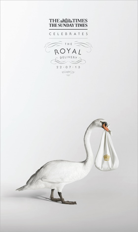
Advertising agency: Grey London
Executive Creative Director: Nils Leonard
Creative Director: Dave Monk
Creative Team: Dominic Butler & Jasper Cho
Year: 2013
Coca-Cola

The cola giant tweeted out a photo of two toasting Coke bottles, one labeled Wills and the other labeled Kate. The tweet read, “Time for a royal celebration.”
Warburtons

Advertising agency: WCRS, London
Copywriter: Steve Hawthorne
Art Director: Katy Hopkins
Creative Director: Billy Faithfull
Year: 2013
Johnson & Johnson


The baby products maker tweeted out a photo of a baby in a bathtub wearing an apparent crown made from baby shampoo bubbles. It also plans to run a print ad in People magazine featuring a baby’s hand holding onto a mother’s finger under the headline: “A parent’s love is the same the world over.”
Oreo

The cookie brand tweeted out a simple photo: An Oreo and milk-filled baby bottle sitting atop a very royal-looking, plush, velvet cushion. The tweet offers this: “Prepare the royal bottle service!”
Play-Doh

Magnum

Starbucks

Delta Airlines

Air New Zealand

Diet Coke

OXO

Sony Pictures

Nintendo

Lego

MINI

Vegas

Nescafé

Advertising by Design (22 Brilliant Ideas)
Posted: July 15, 2013 Filed under: Ambient, Art, Awards, Cannes Lions, Case History, Design, Direct, France, Germany, Graphic Design, Installation | Tags: 22 brilliant ideas, advertising by design, Brazil, Cannes Lions, Case History, Coca-Cola, design, FIAT, Germany, Heineken, Jung von Matt, kit kat, Land Rover, Ogilvy, Red Bull 1 CommentTBWA/Hunt/Lascaris – We Sent Their Briefs Back


Although TBWA\Hunt\Lascaris is well established as an above-the-line agency, our clients were yet to be introduced to the wealth of talent that TBWA\ Design has to offer. So, to get our clients’ attention, we intercepted existing above-the-line briefs and used the physical advertising brief as our canvas. Instead of answering the brief in a traditional manner, we conceptualized various designs that captured the essence of the brands, then brought them to life using only the cardboard job bags and the briefs that were attached to them. We created intricate pieces of paper art, transforming our client’s briefs into multi-dimensional design pieces. We then sent our clients’ briefs back to them, proving that TBWA\ Design can do amazing things with their briefs. Our campaign was a huge success. The design studio received their first new brief from our client just 5 days later. Even more notably, new design work in the system rose by 450% within the first 6 weeks.
Advertising Agency: TBWA\Hunt\Lascaris, Johannesburg
Executive Creative Directors: Matthew Brink, Adam Livesey
Art Director: Jade Manning
Copywriter: Vincent Osmond
Creative Director: Sacha Traest, Mike Groenewald
Design: Sacha Traest, Leigh-anne Salonika, Katleho Mofolo, Graeme Van Jaarsveld, Ilze Venter, jason Fieldgate
Typographer: Hazel Buchan
Photographer: Graeme Borchers, Des Ellis
Year: 2013
——————————————————————————————————————————————————————————————————————————-
Coca-Cola – Sharing Can


Advertising Agency: Ogilvy & Mather, Paris/Ogilvy & Mather, Singapore
Chief Creative Officer: Chris Garbutt, Eugene Cheong,
Creative Director: David Raichman, Frederic Levron, Yvan Hiot
Copywriter: Xiao An Cheng
Designer: Martin Olivier, Olivier Brechon
Technical Partner : Capital Innovation
Year: 2013
——————————————————————————————————————————————————————————————————————————-
Land Rover – The Escape Key

Jaguar Land Rover MENA is promoting the Land Rover LR4 with “The Land Rover Escape Key”, a small icon designed to replace the ESC key on desktop computer. Sent out in three batches of 800 pieces, the keys are designed to remind people at the office that there’s way to escape the every day routine of indoor business. Test driving a Land Rover LR4 is the way to find life beyond the office cubicle. The number of queries almost tripled and test drives are up by 208%.
Advertising Agency: Y&R MENA
Chief Creative Officer: Shahir Zag
Creative Director: Joseph Bihag, William Mathovani
Year: 2013
——————————————————————————————————————————————————————————————————————————-
Kit Kat – The Pillow Book

Advertising Agency: JWT, Sao Paulo, Brazil
CCO: Ricardo John
Art Director: Brunno Cortez
Copywriter: Erick Mendonça
Creative Director: Ricardo John
Year: 2013
——————————————————————————————————————————————————————————————————————————-
Marionnaud – Memory Game

Marionnaud, one of Europe’s largest perfume retailers, celebrated “10 years’ expertise in fragrance”. For the jubilee we created a very special staff incentive: the first Memory game without pictures. The cards had been finished with a fragrance coating. When rubbed, the cards released the scent of ingredients used in perfume manufacture. Rub and sniff: that was the only way to identify the pairs – but no problem for Marionnaud professionals.
Advertising Agency: Wirz/BBDO, Zurich
Executive Creative Director: Philipp Skrabal
Art Director: Barbara Hartmann
Copywriter: Marietta Mügge
——————————————————————————————————————————————————————————————————————————-
FIAT – Hero Hug

Advertising Agency: Leo Burnett, São Paulo
Chief Creative Officer: Marcelo Reis
Executive Creative Director: Guilherme Jahara
Creative Director: Rodrigo Jatene
Copywriter: Caio Lekecinskas
Art Director: Rafa Oliveira
——————————————————————————————————————————————————————————————————————————-
Domino’s Pizza – Domino’s Pizza Disc

Advertising Agency: Artplan, Sao Paulo
Executive Creative Director: Roberto Vilhena
Creative Director: Rodrigo Moraes
Copywriter: Tiago Trindade, Rodrigo Sanches
Art Director: Diogo Barbosa, Guilherme Grotti
Graphic Production: Bruno Werner
——————————————————————————————————————————————————————————————————————————-
Megaman – Light Bulb Calendar

Advertising Agency: Grabarz und Partner, Germany
Executive Creative Director: Ralf Heuel
Creative Director: Andre Price, Jan-Florian Ege
Art Director: Andre Price, Jana Mehrgardt, Jan Riggert
Designer: Sönke Jansen
——————————————————————————————————————————————————————————————————————————-
Heineken – First Interactive Bottle


Heineken embraces the start-up culture of experimentation because it knows that invention never sleeps. The brand understands that the best ‘user experiences’ tap into existing consumer behaviors and push technology into the background.
The intent of the Heineken Ignite project was to develop an idea that would create a memorable Heineken experience unlocking the power and possibilities of mobile innovation and technology.
Heineken believes that mobile innovation could offer a much more rewarding experience than just an app and embraced the challenge to think about how the product could be leveraged as an interface to the brand experience.
A prototype of Heineken Ignite will be revealed on 9 April at Milan Design Week as part of Heineken’s Lounge of the Future concept. Heineken takes its promise to “open your world” even further with the Heineken Ignite project, enhancing the organic way in which the product is used based on social interaction between beer drinkers. This innovative approach lets people be a part of the party in a whole new way and opens up possibilities in social situations.
Advertising Agency: Tribal DDB, Amsterdam
——————————————————————————————————————————————————————————————————————————-
3M Earplugs – Volume Pack

The task was to develop an original promotional packaging solution that immediately conveyed the product value of 3M’s Solar Earplugs – a product targeted at end users frequently requiring effective noise protection (such as musicians and festival-goers). Solution: 3M turned the purpose of the earplugs – to reduce noise – into an original package design. The container’s cap looks like the volume knob of a hi-fi system; when opening it to reach the earplugs, one seems to be turning down the volume.
Advertising Agency: Scholz & Friends, Germany
Chief Creative Officer: Martin Pross
Executive Creative Director: Matthias Spaetgens
Creative Direction: Robert Krause, Wolf Schneider
Copy: Nils Tscharnke
Art Direction: Sebastian Frese, Ralf Schroeder
——————————————————————————————————————————————————————————————————————————-
Deutsche Bank – Anamorphic Mirror


Brief Explanation
The vestibule is a narrow room of 25sqm strongly limiting the possible size of the installation. Therefore, we decided to utilise light for a radiant impact, and to expand the process of reception by making use of the visitors’ movement while approaching the area via a short staircase. Going upstairs becomes part of the experience as visitors gain increasing insights to the entry with the installation. Its concept is based on the principle of anamorphosis: what you see alters as you change your position in space. The image only fully resolves itself when seen from a particular ‘sweet spot’.
Describe the brief from the client
The redesigned corporate headquarters of Deutsche Bank in Frankfurt am Main are now housing a brand and conference area. Parts of this section are public and can be accessed directly from the spacious atrium via a staircase. Deutsche Bank commissioned us to develop an installation that references the well-known company logo, originally designed by Anton Stankowski, for the vestibule of this area. The brief was to provide an atmospheric element that would be visible to customers, visitors and employees standing at reception, as well as on the bridge connecting the building’s 2 towers.
Description of how you arrived at the final design
‘Anamorphic Mirror’ consists of a faceted mirror and blue light projected onto the opposite wall. When viewed from the ‘sweet spot’ the mirror reflects the Bank’s logo. Standing at the bottom of the stairs, visitors see seemingly random blue reflections on the mirror’s facets. As they get closer, the blue reflections begin to take shape, until they resolve into the bank’s logo upon the visitors’ reaching the stairs’ top. In this manner, an animation is created from a static surface. While getting even closer to entering the conference area, visitors are themselves reflected in the mirror and thus take centre stage.
Indication of how successful the outcome was in the market:
Since the opening on April 6 more than 20,000 visitors came to see the public part of the brand area. Board members use the overall facilities to hold receptions, functions such as HR are using it for employee activities, bank managers invite partners and clients, the press department welcomes journalists. With unobtrusive means, the dynamic and yet poetic installation ‘Anamorphic Mirror’ creates an atmospheric element with space-encompassing impact, and attunes visitors to the brand from the very beginning.
Advertising Agency: ART+COM in Cooperation with COORDINATION, Berlin
Executive Creative Director: Joachim Sauter
Designer: Simon Häcker
Project Manager: Gert Monath
Senior Art Director: Eva Offenberg
Year: 2013
——————————————————————————————————————————————————————————————————————————-
The Hälssen & Lyon – The Tea Calendar


The Hälssen & Lyon tea calendar is the first calendar in the world to feature calendar days made from tea leaves. Finely flavoured and pressed until wafer-thin, the 365 calendar days can be individually detached and brewed directly in the cup with hot water. The tea calendar was sent exclusively to selected business partners.
Advertising Agency: Kolle Rebbe, Hamburg
Executive Creative Director: Sascha Hanke
Creative Director: Heiko Schmidt and Kay Eichner
Creative: Patrick Schroeder, Julia Meissner
Year: 2013
Gold Lion
——————————————————————————————————————————————————————————————————————————-
Hot Wheels – Don’t Drink and Drive Key Chains

Advertising Agency: Ogilvy, Mumbai, India
National Creative Directors: Abhijit Avasthi, Rajiv Rao
Senior Creative Director: Amitabh Agnihotri, Sameer Sojwal
Creative Group Head: Yogesh Pradhan
Year: 2012
——————————————————————————————————————————————————————————————————————————-
Greenpeace – Do Not Disturb

Advertising Agency: AlmapBBDO, São Paulo, Brazil
Chief Creative Officer: Marcello Serpa
Executive Creative Director: Marcello Serpa
Creative Director: Luiz Sanches
Art Director: Caio Tezoto
Year: 2012
——————————————————————————————————————————————————————————————————————————-
Coca-Cola FM – Magazine Amplifier


The piece consists in an exclusive insert for subscribers of the latest edition of the Capricho magazine which was created by JWT. Attached to the cover, the art allows readers to turn the magazine into an amplifier. Simply by rolling the magazine and inserting the iPhone tuned into the Coca-Cola FM application in the spot indicated. The final format allows the sound waves to travel in two different directions at the same time, intensifying the stereo effect created by the device. The next step is to enjoy the music.
Advertising Agency: JWT, Brazil
Year: 2012
——————————————————————————————————————————————————————————————————————————-
Red Bull – Portable Charger

We created Redbull-shaped portable charger. This Redbull-shaped charger will show its own recharging screen when they fit into the gadget And the mobile webpage of Redbull will be on the screen when it is unlocked.
Advertising Agency: Hallym University, Cheonan-si, South Korea
Copywriter: Heejo Sun, Dongkyun Yu
Art Director: Minseok Go
Year: 2012
——————————————————————————————————————————————————————————————————————————-
Land Rover – Edible Survival Guide

While Land Rover vehicles can take on any obstacles in the desert, it cannot be said the same of their owners. Scorching temperatures, deadly animals and sinkholes are just a few things they might encounter. And when they venture deep into it, even the most experienced drivers can quickly succumb to the harshness of the desert. We wanted to create something that would cut through the clutter and that these people would like to keep. So we created a survival guide, which explained the basics for staying alive in the Arabian Desert, and packaged it in a way that would spur the attention of our target audience.
We researched every indigenous animal and plant, people could encounter in the Arabian Desert and how they could be used to survive. We studied the topography of the region to guide people to safety. We used a reflective packaging similar to army rations, which could be used to signal for help, and bound the book with a metal spiral, which could be used for cooking. Finally, we even took an extra step so that in case of emergency, people could always EAT the book. It was made out of edible ink and paper, and it had a nutritional value close to that of a cheeseburger.
We sent the book to 5,000 existing customers, gave it away as a supplement to the cars’ manual and made it freely available in sports shops. The initial response was very positive. And the client was so happy with the concept that they asked us to include the book as an insert in the next edition of a car magazine, with a 70,000 circulation.
Advertising Agency: Y&R, Dubai, UAE
Chief Creative Officer: Shahir Zag
Creative Director/Copywriter: Shahir Zag
Creative Director/Art Director/Illustrator: Joseph Bihag
Copywriter: Guillaume Calmelet
Designer/Copywriter: Khaled Said
Year: 2012
——————————————————————————————————————————————————————————————————————————-
IBM – Outdoor as Utility


Advertising Agency: Ogilvy France
——————————————————————————————————————————————————————————————————————————-
Ricola – Ricola Music Edition


Ricola, a brand of cough drops and breath mints in Switzerland, is known for its traditional blend of thirteen natural herbs. The provision of instant relief, even to the most strained throats, is visualised with the help of the wrapping paper. The Music Edition, an illustrated release, turns the drops into the heads of suffering singers. Each and every throat appears to be constricted. However, when you unwrap a bonbon, the throat is relieved and all hoarseness disappears. Print advertising presented the five characters: Rockabilly, Pop star, Opera singer, Rapper and Punk Rocker, with the tag line, “Unwrap your voice”. The project won Gold for Package Design at the London International Awards this week.
Advertising Agency: Jung von Matt, Hamburg
——————————————————————————————————————————————————————————————————————————-
Camp Nectar – Fruit Boxes (Made from Real Fruit)


General Brands in Brazil ran a two-year experimental campaign in which fruit was grown in the shape of Camp Nectar fruit boxes to promote the claim, “Made from Real Fruit”. Customized juice box molds were placed around growing fruit on an orchard in Paranapanema, producing 1,123 oranges, lemons, guavas and passion fruit with the Camp Nectar box shape. The specially designed fruit, complete with brand imprint, straw and carton flaps, were placed in supermarkets and fairs to promote the juice range. The campaign won a Gold Outdoor Lion, a Bronze Direct Lion, a Silver and Bronze Promo & Activation Lion.
Advertising Agency: Age Isobar, Sao Paulo
——————————————————————————————————————————————————————————————————————————-
Sweet Enough – The Candy Room


Sweet Enough, an importer of sugar free candy products in Australia, has set up The Candy Room, a store in Melbourne designed to draw out the inner child in customers, connecting them with childhood, fantasy and fiction and of course, sweets. Black line artwork is applied on white space, supplemented with the bright colours of the sweets throughout the store.
Advertising Agency: Red Design Group
——————————————————————————————————————————————————————————————————————————-
Oreo – Oreo Crumb Case


Miami Ad School students have developed a tea bag enclosure for Oreo cookie crumbs to infuse milk with Oreo flavor. The Oreo Crumb Case, developed as a student project, could go a long way. Just shake together all the crumbs left in the Oreo packet, sprinkle them into the Crumb Case, and infuse the crumbs in your tumbler of milk.
Advertising Agency: Miami Ad School
