The throne awaits you, the adverts don’t… (Royal Baby in advertising)
Posted: July 25, 2013 Filed under: Best Use of Print, Beverages, Cliché, Coca-Cola, Digital, Event, Press/Outdoor, Testimonial, TV/Film, UK, Viral | Tags: Carling, Coca-Cola, Congratulations, Kate, Lego, Magnum, Mini, Nescafé, Oreo, Pampers, Royal Baby, Sony, The Sun, Twitter, Warburtons, Wills Leave a commentWithin hours of the announcement the Duke and Duchess of Cambridge had welcomed their baby boy into the world on Monday, a raft of companies took to Twitter advertising their brand along with cute messages of congratulation…
Carling Beer

Advertising agency: Creature, London
Year: 2013
Pampers

The diaper maker tweeted out a video stuffed with heart-tugging shots of babies under this headline: Every Little Baby is a Prince or Princess.
The Sun

Advertising agency: Grey London
Executive Creative Director: Nils Leonard
Creative Director: Dave Monk
Creative Team: Dominic Butler & Jasper Cho
Year: 2013
The Times
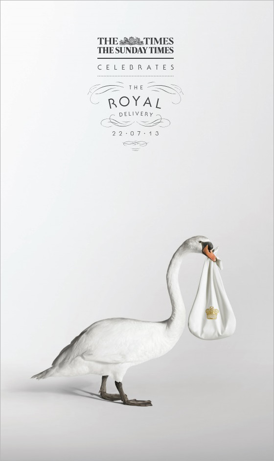
Advertising agency: Grey London
Executive Creative Director: Nils Leonard
Creative Director: Dave Monk
Creative Team: Dominic Butler & Jasper Cho
Year: 2013
Coca-Cola

The cola giant tweeted out a photo of two toasting Coke bottles, one labeled Wills and the other labeled Kate. The tweet read, “Time for a royal celebration.”
Warburtons

Advertising agency: WCRS, London
Copywriter: Steve Hawthorne
Art Director: Katy Hopkins
Creative Director: Billy Faithfull
Year: 2013
Johnson & Johnson


The baby products maker tweeted out a photo of a baby in a bathtub wearing an apparent crown made from baby shampoo bubbles. It also plans to run a print ad in People magazine featuring a baby’s hand holding onto a mother’s finger under the headline: “A parent’s love is the same the world over.”
Oreo

The cookie brand tweeted out a simple photo: An Oreo and milk-filled baby bottle sitting atop a very royal-looking, plush, velvet cushion. The tweet offers this: “Prepare the royal bottle service!”
Play-Doh

Magnum

Starbucks

Delta Airlines

Air New Zealand

Diet Coke

OXO

Sony Pictures

Nintendo

Lego

MINI

Vegas

Nescafé

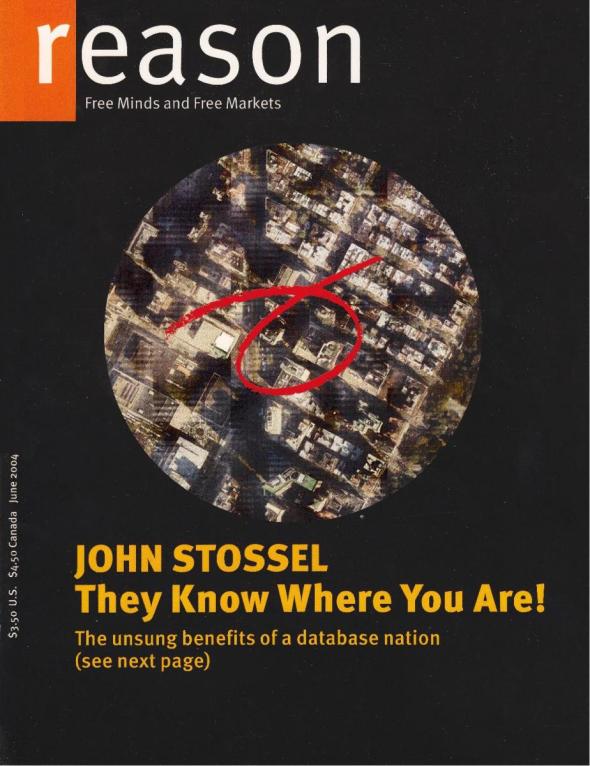
Reason Magazine – 40,000 Readers on a Cover
Posted: February 15, 2013 Filed under: Best Use of Print, Case History, Direct, USA | Tags: cover, Direct, free minds free markets, Nick Gillespie, Promotion, readers on a cover, Reason Magazine, satellite photo, USA Leave a comment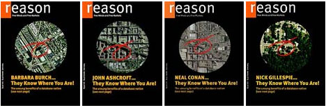
“This represents an unprecedented experiment in hiper-individualizing a commercial print publication”
Nick Gillespie, Editor-in-Chief of Reason, in the June 2004 issue
Monthly libertarian magazine Reason pulled off the ultimate in customized publishing when its 40.000 subscribers received their June 2004 copy with a satellite photo of their own neighbourhood on the cover and their house circled in red. On the back cover readers found adverts customized to them and their neighbourhood. The stunt accompanied the magazine’s cover article about the power and importance of databases to customize information.
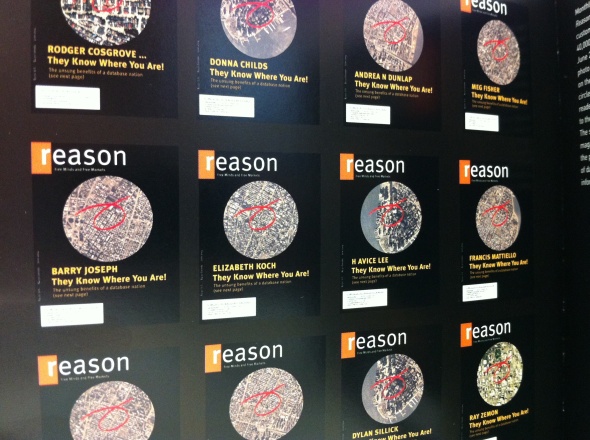
When the 40,000 subscribers to Reason, the monthly libertarian magazine, receive a copy of the June issue, they will see on the cover a satellite photo of a neighborhood – their own neighborhood. And their house will be graphically circled.
On one level, the project, sort of the ultimate in customized publishing, is unsurprising: of course a magazine knows where its subscribers live. But it is still a remarkable demonstration of the growing number of ways databases can be harnessed. Apart from the cover image, several advertisements are customized to reflect the recipient’s particulars.
Nick Gillespie, editor in chief of Reason, said the magazine, with an editorial mission of “Free Minds, Free Markets,” used the stunt to illustrate the cover article about the power and importance of databases.
“Our story is man bites dog,” Mr. Gillespie said. “Everybody, including our magazine, has been harping on the erosion of privacy and the fears of a database nation. It is a totally legit fear. But they make our lives unbelievably easier as well, in terms of commercial transactions, credit, you name it.”
Rodger Cosgrove, president of Entremedia, a direct marketing firm and a member of Reason’s board, assisted in coming up with a program that allows the subscriber list to be integrated with satellite photographs. He also worked with Xeikon, the manufacturer of the printer that made the endless customization possible.
“They were interested in showing what this technology could do,” he said, “and we were interested in demonstrating the power of databases to customize information.”
The cover article, written by Declan McCullagh, suggests that while databases can lead to breaches in privacy, it allows Dell to provide instant credit to computer buyers, grocery stores to stock goods that their customers want, and mortgage lenders to keep their rates down.
“It’s obvious that databases provide enormous benefits to modern life,” said Marc Rotenberg, president of the Electronic Privacy Information Center. “We could no more operate without computer databases than we could without electricity.”
“That doesn’t mean that there aren’t still some serious debates to have about government databases,” he added, “including the monitoring of the general American public under John Poindexter’s Total Information Awareness program and the passenger profiling that has gone on.”
In some respects, Reason’s cover stunt is less Big Brother than one more demonstration that micromarketing is here to stay. “My son gets sports catalogs where his name is imprinted on the jerseys that are on the cover,” Mr. Rotenberg said. “He thinks that’s very cool.”
In his editor’s note describing the magazine’s database package, Mr. Gillispie left open three spots – commuting time, educational attainment and percentage of children living with grandparents – so he could adapt his message to individual readers. Mr. Gillespie said that the parlor trick could have profound implications as database and printing capabilities grow.
“What if you received a magazine that only had stories and ads that you were interested in and pertained to you?” he asked. “That would be a magazine that everyone would want to read.”
Agency: Entremedia, USA
Year: 2004
Mercedes-Benz – The Campaign Created By Nature
Posted: September 24, 2012 Filed under: Best Use of Print, Car, Case History, Event, Press/Outdoor, The Nederlands, Viral | Tags: boars, Car, Case History, Ed van Bennekom, euro 6 engine, installation, Jasper Diks, making of, Mercedes Benz, N=5, pawprints, posters, rabbit, The Campaign Created By Nature, truks Leave a comment
Mercedes-Benz Trucks has chosen an innovative approach to promoting the clean Euro 6 engine. The entire campaign is literally created by nature. That’s because it is vitally important that we switch to cleaner engines for the sake of nature. And who can convince you to switch better than nature itself. How have animals made the posters? Cut-outs of letters are put on canvas posters and then placed in nature so that rabbits, hedgehogs, boars and other animals can create the advertisements with their pawprints. They do this by leaving behind their muddy pawprints on the canvas posters. So this is how the cut-out letters are gradually filled in. The posters can be seen at car shows and in outdoor advertising together with a link to the making of.


Advertising Agency: N=5, Amsterdam, The Netherlands
Art Director: Ed van Bennekom
Copywriter: Jasper Diks
Producer: Guy van der Hoop
Director: Danny van den Bersselaar
Production Company: Big Shot
Year: 2012
Congratulations George! Congratulations Jim! Congratulations Steven!
Posted: July 10, 2012 Filed under: Best Use of Print, Legendary, Press/Outdoor, Testimonial, USA | Tags: congratulation, dear george, E.T., George Lucas, Hollywood, James Cameron, jaws, R2-D2, star wars, Steven Spielberg, Titanic, Variety Leave a commentIn 1998, Titanic topped Star Wars as the #1 box office movie of all time. In congratulations, George Lucas bought this full-page ad inVariety, in which the Star Wars crew jumps out of the sinking ship and into the ocean of second place.

Apparently, it is a Hollywood tradition for directors who have their #1 records smashed to take out full page ads congratulating the new record-holders. When Star Wars broke Jaws‘ record, Steven Spielberg congratulated George Lucas by taking out a full-page ad with a picture of R2-D2 snagging Jaws on a fishing line.

Thereafter, E.T. beat Star Wars and held the record for a while. This was the message to Steven Spielberg from George Lucas in 1983 congratulating Spielberg for E.T passing Star Wars in the movie rental takings…

But Star Wars Special Edition reclaimed #1 in 1997. The result? Another full-page ad in which E.T. puts a crown on R2’s head…

Steven Spielberg, director of E.T., honored his friend Lucas with an advertisement in Daily Variety, the entertainment industry magazine, with a picture of E.T., the alien from the movie, putting a crown on top of R2-D2, the small robot from Star Wars.
“Dear George,” the ad read, “Congratulations for renewing the most enduring motion picture in cinema history. Your pal, Steven.”
Serviceplan for Austria Solaragency – The first annual report powered by the sun
Posted: May 16, 2012 Filed under: Best Use of Print, Case History, Design, Germany, Graphic, Graphic Design | Tags: Alexander Nagel, Alexander Schill, annual report, Austria Solaragency, Christoph Everke, Cosimo Möller, Serviceplan, Verband Austria 3 Comments

Annual reports—traditionally soul-crushing visual creations—are suddenly getting creative. First, we had the eyewear maker that packaged its annual report as an eye-catching infographic. Now, we have a stunning annual report from the Austria Solar trade association—whose text and graphics are invisible until revealed by sunlight.The work is an elegant expression of the constant radiating power of the sun and an eye-catching way for Austria’s pre-eminent solar trade association to associate themselves with innovative thinking.


Creative director Cosimo Möller says he was working on a terrace when inspiration struck. “It was one of the last sunny days in October,” he says. “The sun was shining on my notepad and was reflected so intensely that I wasn’t able to read my words anymore. So, the idea was born: Does it work the other way round?”

This brilliantly crafted annual report for Verband Austria is almost a sure bet to pick up a Cannes Design Lion.
Advertising Agency: Serviceplan
Chief Creative Officer: Alexander Schill
Creative Director: Christoph Everke, Cosimo Möller, Alexander Nagel
Art Director: Matthäus Frost
Graphic Design: Matthäus Frost, Mathias Nöselfilming
Volkswagen Polo – Sell Your Car
Posted: March 8, 2012 Filed under: Best Use of Print, Car, Case History, Direct, Press/Outdoor, South Africa | Tags: Ambient, Cannes Lions, Case History, Chris Gotz, Direct, Ogilvy Cape Town, Polo, Sell Your Car, Volkswagen Leave a comment
The brief
The brief was to create a newspaper ad to advertise the desirable (yet affordable) Volkswagen Polo. Our research showed that when you see a Polo, you want one, so we targeted people in the market for a new car and placed our ad in the Motoring section.
The creative solution
Working off the “love at first sight” strategy, we ran a double-sided ad. The front set up the desire, while the back allowed a unique response. Using the ad helped readers to sell their current car, while at the same time helping us advertise the Polo. In effect, this symbiosis turned a print ad into an ambient one. Our expectation was that if just a small fraction of readers (even 1%) used the ad, it would extend the message of Polo’s desirability to a far wider audience than just that of the paper.
It was a simple, cheeky idea, asking people to get rid of their car upon seeing ours, and getting them to use their own vehicle to help punt the Polo – ideal for a brand that has always relied on simple, cheeky communication.
The results
The interaction between consumers and the ad turned car windows into a new media space. Our target market’s own cars (most of them competitor models like Toyotas and Fords) became mini billboards for the Polo’s sheer desirability. Furthermore, anecdotal evidence suggested that approximately 3% of readers used the ad – meaning that our simple, low-cost idea generated thousands of dollars in earned outdoor media.
Advertising Agency: Ogilvy Cape Town, South Africa
Executive Creative Director: Chris Gotz
Creative Director: Chris Gotz
Art Director: Prabashan G. Pather
Copywriter: Sanjiv Mistry
Year: 2011
Shortlist
Iwatte Nippo – Your Happy News is our Top Story
Posted: January 18, 2012 Filed under: Ambient, Best Use of Print, Cannes Lions, Case History, Direct, Japan | Tags: Case History, good news, Hakuhodo DY Media Partners, iwatte, Japan, not global but personal, Promotion, Your Happy News is our Top Story Leave a comment
Insights, Strategy & the Idea
Iwate Nippo, a newspaper company in a rural Japanese town, faced the problems of dwindling circulation and a growing indifference on the part of youth towards newspapers. The newspaper needed something to help it break free from these trends and create a new bond with readers as a ‘newspaper loved by local residents. ‘ Although today’s world is applauded for its globalization, we focused on the local residents who are the newspaper’s clients and created a system in which individual readers could utilize the media power of the newspaper to communicate any type of good news, be it small, everyday types of happiness or huge, life-altering types of happiness.
Creative Execution
To create a new bond with readers as a “newspaper loved by local residents,” the newspaper decided to celebrate its readers’ good news. This is how IWATTE was born. IWATTE is a special edition newspaper service that anyone can use to publish their news. Users can easily sign up online and then share their printed newspapers with friends and family. We proposed the IWATTE system in which readers communicate their news to the newspaper, which would then print that news, because to a reader, happy news close to home is just as important as world news. The service was embraced by a large number of readers and created a lot of buzz. After the service was launched, the buzz grew even larger and was eventually a hot topic among the media despite the fact that almost no advertisements had been run in the mass media.

Results and Effectiveness
・2 million hits to the Iwate Nippo website since the launch of IWATTE
・151% increase in awareness of Iwate Nippo since the launch of the service according to a survey
・20% increase in young people wanting to join the company compared to the previous year
・100% maintenance of circulation since the launch of IWATTE
Advertising Agency: Hakuhodo DY Media Partners, Tokyo
Year: 2011
Gold Lion
Asahi Newspaper – The Asahi Newspaper Moves
Posted: October 19, 2011 Filed under: Best Use of Print, Cannes Lions, Case History, Direct, Japan | Tags: Asahi Newspaper moves, Dentsu, gold lion, Japan, Media lions, movement, paper, the moving ad 1 Comment

The Asahi Shimbun, the top share newspaper in Japan, renews greatly its layout and figure. To communicate the “movement” we made all the ads on the paper move. Most readers watched the advertising much longer than usual (about 20min per person) because of the surprise that the newspaper ad moved and the accuracy of the movement.
The Moving Ad told both of the renewal of Asahi Shimbun and what clients (of Asahi Shimbun) want to say at the same time.
As a result, the Moving Ad was watched by 1.3 million families of the reader and attracted the attention from over 100 of internet media like blogs, SNS, videos on Youtube and TV news.
Advertising Agency: Dentsu Kansai, Osaka
Executive Creative Director: Takaaki Yamazaki
Creative Director: Jurichi Harima
Art director: Mamoru Ichino
Year: 2008
Gold Lion
Harry Potter in advertising
Posted: September 27, 2011 Filed under: Ambient, Best Use of Print, Direct, Press/Outdoor, Promotion, Testimonial, TV/Film | Tags: advertising, Ambient, Cinema, eletronic arts, Harry Potter, Harry Potter and the Deathly Hallows, harry potter dies, magic cup, Playstation, suzuki, Titanic 3 CommentsPlaystation 3/Blue Ray

Marani Eyewear

Crisol Bookstore

Harry Potter at PVR Cinema

ODEL Department Store – Harry Potter Promotion

Promotion done at the Department Store ODEL, for the release of the new Harry Potter book. The spoon was magically moving in the cup on its own.
This simple yet innovative deployment immediately captured the public’s attention. A captured video was posted on youtube and became one of the top 40 most linked videos of that week, resulting in 53,880 views, as well as newspaper and TV coverage.
With an investment of merely Rs.2,000 (USD20), the campaign generated a total of Rs.100,000 (USD1,000) in Advertising Value Equivalent (AVE). The entire stock of 150 books was completely sold out in hours, generating a total revenue of Rs.412,500 (USD4,125). The Return on Investment for this project mounted up to 256 times.
ODEL, Colombo’s premier department store, had to compete with all the major bookstores who were frantically promoting pre-bookings for the much-anticipated “Harry Potter and the Deathly Hallows”.
We wanted to bring a bit of Harry Potter Magic to ODEL. Shoppers at Odel’s in–store eateries were amazed to witness a self-stirring cup of coffee. Beside it lay a mock copy of the “Deathly Hallows” carrying the message, “Book your copy right now for a deposit of Rs.500.”
McDonald’s
Videomarathon 2003 – Reality sucks

BED Club – Drag Show

Electronic Arts – Harry Potter and the Order of the Phoenix
LT Libreria Tecnica

Fundacìon Par

Suzuki Motorcycles School

Odyssey Multimedia Center – Harry Potter and The Deathly Hallows

Super Glue

Harry Potter BlueRay Collection – Promotion

The objective of the promotion
To advertise the arrival of the Harry Potter saga in high definition at Livraria Cultura.
The Idea
We’ve recreated one of the most famous passages in the saga – the passage through platform 9-3/4, using a technology called fogscreen. We’ve projected over a smokescreen the wall of the platform. So, people could cross the “brick wall” as if they were wizards.
Results
By it’s innovativeness, it was an important attraction in the store, taking customers directly to the movie’s shelf, prompting an interaction with consumers, enjoyment for all ages, hundreds of spontaneous mentions in blogs about advertising, innovation, the series fan clubs among others, in Brazil as well as abroad. It allowed a “magic” experience for consumers, bringing them close to the series reality.
Titanic Magazine – Harry Potter Dies Promotion

The objective was to create a low budget promotion reinforcing the Titanic’s image as Germany’s number one satire magazine while generating new subscribers. On 27.10.2007, the very day when the last Harry Potter book was finally released with much ceremony, the Titanic, in true kill-joy spirit, revealed on various advertising mediums around the book’s point of purchase (pedestrian zones and book stores) that Harry would supposedly die on page 652, thereby eliciting the very strong reactions that a magazine of its nature is meant to.
What better way to promote Germany`s No. 1 satire magazine, famous for eliciting both malicious joy and laughter in equal measures, by creating a promotion that would do just that. The response was overwhelming: after the promotion the number of subscribers increased by 2,3 %. And the following edition of the Titanic magazine was sold out so the print run had to be increased by 5 %.
For the consumers this promotion was confirmation that Titanic is the best, therefore meanest satire magazine in Germany.
IMax

Red Peppers Audio Boks

Terramycin Plus Ointment

Beloura Shopping Center

Harry Potter at The Sun Theatre – Ambient

Seventy MM – Online Book


Mike Hutcheson’s book

Coca-Cola Cinema Ticket


Coca-Cola wanted to invite some executives from important Spanish companies and their families to the Première of the latest Harry Potter film. We were asked to create an invitation for that event that could fit in a A5 envelope.
Harry Potter is a film based on the power of magic so we came up with the idea of a blank card, with no text. A magic card. So in order to read the text you had to use a trick. The magic trick was rubbing the surface with a wet cloth. But of course the text would disappear again after a while.
No response was expected in any way by this action. However Coca-Cola got a lot of congratulations calls.
Kinokuniya Bookstores – Harry Potter mounth


Winnie the Pooh teaser trailer: How do you spell adventure?
Other Post
Mont Blanc – Handwritten Newspaper
Posted: July 25, 2011 Filed under: Best Use of Print, Cannes Lions, Case History, Copywriting, Press/Outdoor, Spain | Tags: articles, best use of newspapers, Cannes Lions, Case History, fountain pen, gold lion, handwritten newspaper, Jamie Mietz, Jonathan Commerford, Livio Tronchin, Media lions, Mont Blanc, Pen & Art, South Africa, The Jupiter Drawing Room Leave a comment

Mont Blanc is a well-known international pen brand. Lately, the use of fountain pens has declined dramatically. We were briefed to increase the sales of these premium quality pens. We chose to reach our audience through a daily newspaper, with a strong business slant, widely read by the professional people of Cape Town.
We arranged with the newspaper to allow us to hand write one of their pages. They provided us with all of the articles and we wrote them out by hand and set them in the style of newspaper editorial, demonstrating the ease and pleasure of writing with a Mont Blanc fountain pen.
The readers of the newspaper in which we placed our ad are generally wealthier, business-minded professional people – the exact audience we needed to reach. By presenting them with a page of editorial written out by hand, we were able to catch their attention and hold it for a lot longer than a regular ad.
Because we were essentially still running all the newspaper’s editorial, we were able to negotiate a far cheaper rate than a normal full-page ad.This was the first time a newspaper had allowed an advertiser to set their articles, and this fact alone generated a lot of publicity for Mont Blanc.
Advertising Agency: The Jupiter Drawing Room, South Africa
Creative Director: Livio Tronchin
Copywriter: Jonathan Commerford
Art Director: Jamie Mietz
Typographer: Joanne Thomas
