15 Most Insightful Call for Entries Ads
Posted: May 16, 2013 Filed under: Art, Awards, Belgium, Canada, France, Hungary, Illustration, Press/Outdoor, South Africa, The Philippines, TV/Film, UK, USA | Tags: 15 Most Insightful Call for entries Ads, ADC-UA Awards, advertising, AlmapBBDO, BBDO, Brazil, Call for Entries, Clio Awards, Del Campo Nazca Saatchi & Saatchi, France, funny, Keep Fighting the good fight, Leo Burnett, Press, Taxi Canada, The Art Directors Club Leave a comment1 – ADC-UA Awards (Ukraine)/Agency: Leo Burnett Ukraine


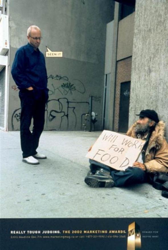
2 – The 2002 Marketing Awards/Agency: Taxi Canada


3 – Art Director’s Club CdF 2006/Photographer Vincent Dixon

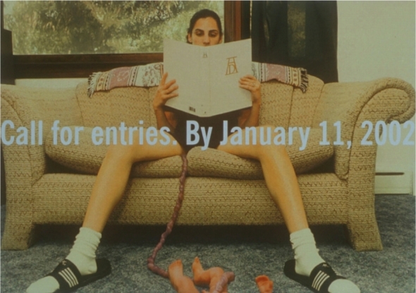
4 – The Art Directors Club CfE 2002/Bozell New York


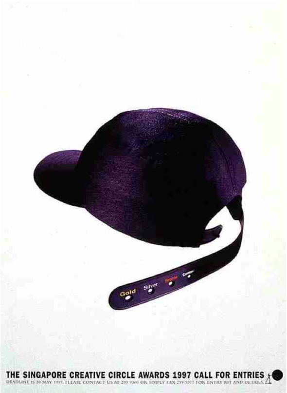
5 – The Singapore Creative Circle Awards 1997/Leo Burnett Singapore
6 – Creative Club of Belgium (Call for entry 2005)/Agency: Duval Guilarme, Brussels

7 – The KBP Radio Awards, C.f.E 2007/Agency: BBDO Guerrera Ortega, Philippines


8 – The Art Director’s Club CdF 2009/Agency: Publicis New York


9 – Clio Awards 2004/Agency: ALMAP/BBDO


10 – The Art Director’s Club Cdf 2011/Agency: DDB New York


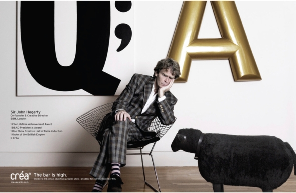
11 – Crèa Awards 2007/Agency: BOS, Canada


12 – The One Club Call for Entries 2007/Agency: Jupiter Drawing Room, South Africa


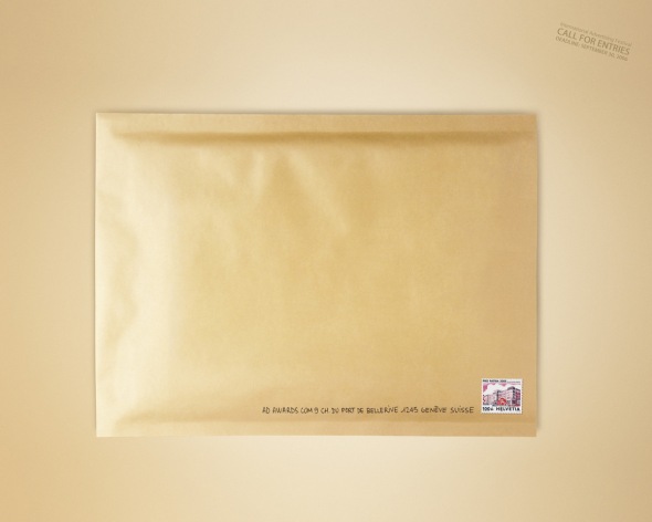
13 – AdAwards Call for Entries 2006/Agency: Saatchi & Saatchi, Paris
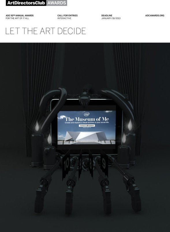
14 – ADC 92° Annual Awards/Agency: The Conquistadors Collective, New York


15 – The Tinta Awards Call for Entries 2012/Agency: Young & Rubicam Philippines


Sponsored Heroes
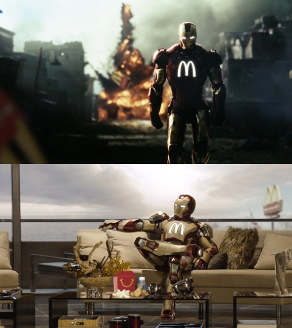
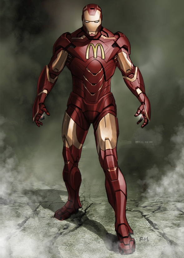
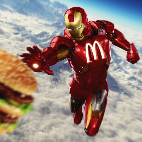
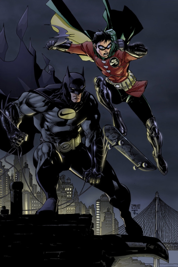
Posted: April 26, 2013 Filed under: Art, Coca-Cola, Design, Graphic, Graphic Design, Illustration, Italy, parody | Tags: adidas, Apple, Avengers, Batman, Burger King, captain america, Coca-Cola, Flash, funny, hulk, Iron Man, McDonald's, monster, Nike, Roberto Vergati Santos, sponsored heroes, superheroes, Superman, Wolverire Leave a comment“Imagine if one day capitalism reaches the point, where the big brands starts to sponsor the superheroes. How would this influence their images?”
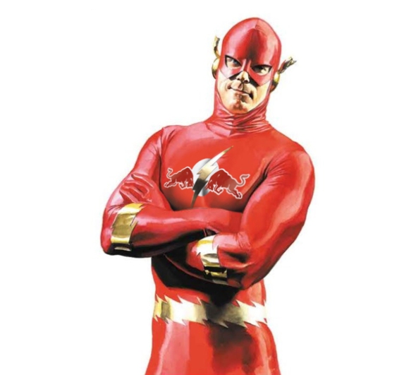
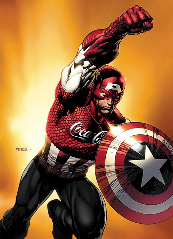
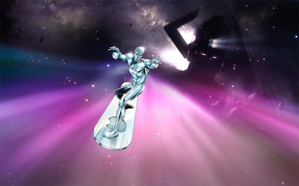
Being a superhero doesn’t seem to be a lucrative gig, but what if it was? Brands sponsor athletes and celebrities all the time, and with the increasing popularity of superheroes, it’s not all that shocking to think that The Incredible Hulk could one day be rocking a massive Monster logo across his chest.
Italian graphic designer Roberto Vergati Santos imagined many of our favorite superheroes sponsored by our favorite brands. The aptly titled ‘Sponsored Heroes’ series sees characters from both the Marvel and DC Comics universe, and includes all the members of The Avengers, Batman, Wolverine, and many more. Batman can be seen sporting a Nike suit of armor, while Iron Man has been stamped with the golden arches of McDonald’s, and Captain America is seen holding a massive UPS shield. Check out some of the superheroes from the collection below.
IRON MAN – Sponsored by McDonald’s
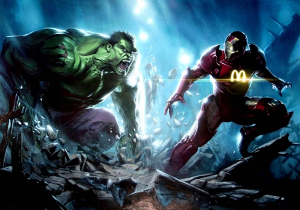
HULK – Sponsored by Monster Energy


WOLVERINE – Sponsored by Adidas


BATMAN – Sponsored by Nike


CAPTAIN AMERICA – Sponsored by UPS

FLASH – Sponsored by Red Bull


AVENGERS – Sponsored by Coca-Cola

SILVER SURFER- Sponsored by Apple


SUPERMAN – Sponsored by Giorgio Armani


IRON MAN (Sponsored by McDonald’s) vs CAPTAIN AMERICA (Sponsored by Burger King)

Happy New Year Ads
Posted: December 31, 2012 Filed under: Axe, Car, Cliché, Germany, Illustration, Italy, Press/Outdoor, Spain, UK | Tags: ads, advertising, audi, axe, Barilla, BMW, duracell, durex, Happy New Year, Honda 2 CommentsHappy New Year from BRUSSELS AIRLINES

Happy New Year from DISCO SUPERMARKETS

Happy New Year from DURACELL

Happy New Year from DUREX


Happy New Year from TMB (Metro de Barcelona)

Happy New Year from ALKA SELTZER

Happy New Year from AUDI


Happy New Year from AXE

Happy New Year from BARILLA

Happy New Year from YES Tablet

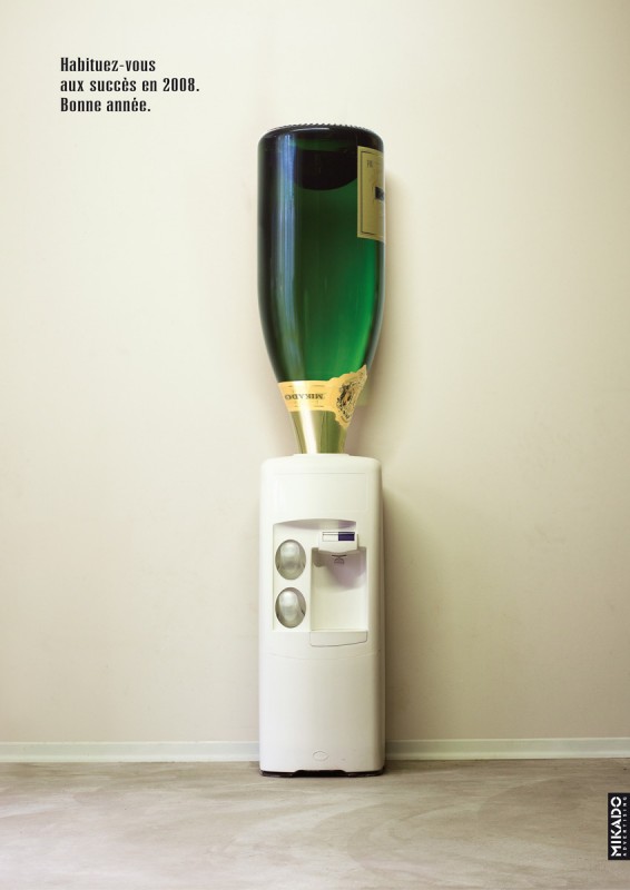
Happy New Year from MIKADO
Happy New Year from HONDA

Happy New Year from BMW

Happy New Year from O.B.

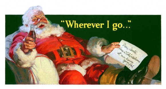
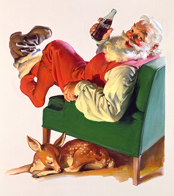
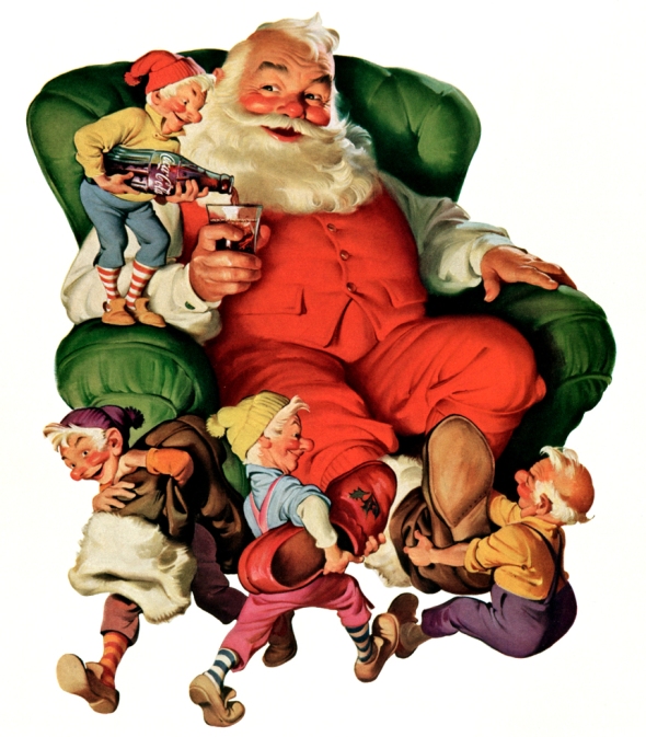
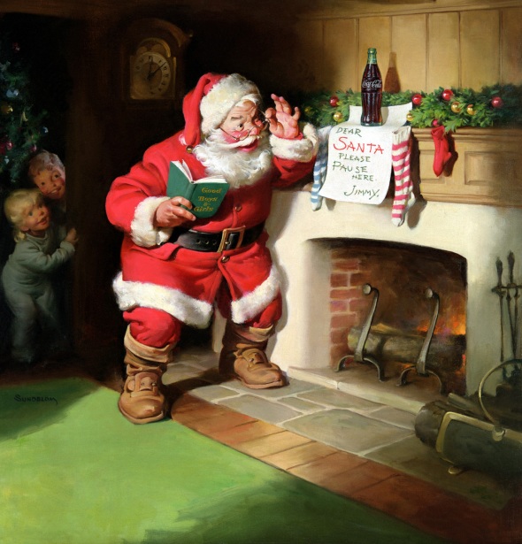
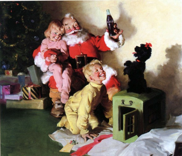
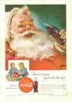
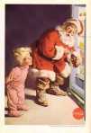
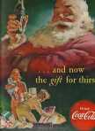
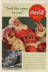
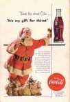
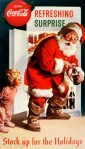
Haddon Sundblom for Coca-Cola – The Man Who Painted Christmas
Posted: December 14, 2012 Filed under: Art, Beverages, Case History, Coca-Cola, Graphic, Graphic Design, Illustration, Legendary, Press/Outdoor, Testimonial, USA, Vintage | Tags: advertising, artwork, Christmas, Christmas Eve, Clement Moore, Coca-Cola, Coca-Cola Santa Claus, coke, Haddon Sundblom, icon, Santa, St. Nicholas, the pause that refreshes, USA Leave a comment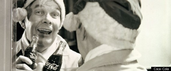
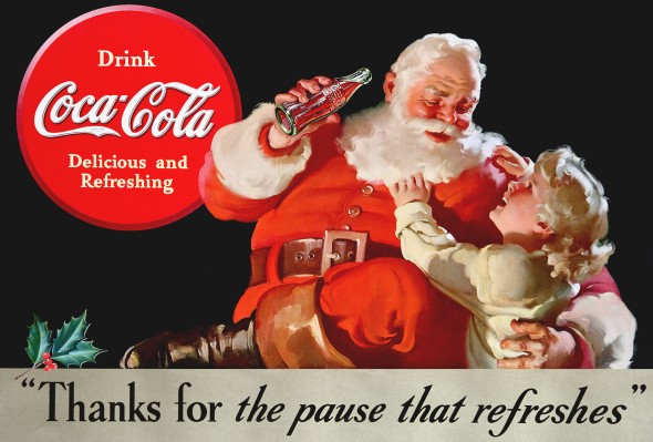
Though he was not the first artist to create an image of Santa Claus for Coca-Cola advertising, Haddon Sundblom’s version became the standard for other Santa renditions and is the most-enduring and widespread depiction of the holiday icon to this day. Coca-Cola’s Santa artworks would change the world’s perception of the North Pole’s most-famous resident forever and would be adopted by people around the world as the popular image of Santa.
In the 1920s, The Coca-Cola Company began to promote soft drink consumption for the winter holidays in U.S. magazines. The first Santa ads for Coke used a strict-looking Claus. In 1930, a Coca-Cola advertised with a painting by Fred Mizen, showing a department store Santa impersonator drinking a bottle of Coke amid a crowd of shoppers and their children.
Not long after, a magical transformation took place. Archie Lee, then the agency advertising executive for The Coca-Cola Company, wanted the next campaign to show a wholesome Santa as both realistic and symbolic. In 1931, the Company commissioned Haddon Sundblom, a Michigan-born illustrator and already a creative giant in the industry, to develop advertising images using Santa Claus. Sundblom envisioned this merry gentleman as an opposite of the meager look of department store Santa imitators from early 20th century America.
Sundblom turned to Clement Moore’s classic poem “A Visit from St. Nicholas” (better known as “’Twas the Night Before Christmas”) for inspiration:
His eyes — how they twinkled! His dimples: how merry,
His cheeks were like roses, his nose like a cherry;
His droll little mouth was drawn up like a bow,
And the beard of his chin was as white as the snow
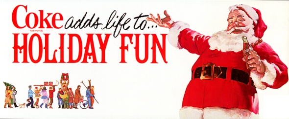
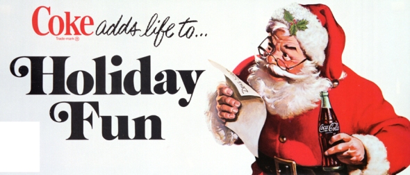
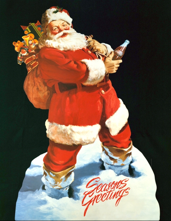
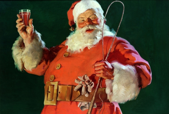
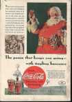
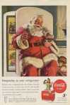
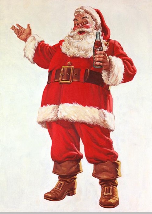
The ode’s description of the jolly old elf inspired Sundblom to create an image of Santa that was friendly, warm and human, a big change from the sometimes-harsh portrayals of Santa up to that time. He painted a perfectly lovable patron saint of the season, with a white beard flowing over a long red coat generously outlined with fur, an enormous brass buckle fastening a broad leather belt, and large, floppy boots.
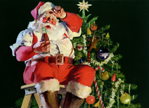
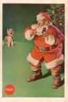
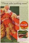
Sundblom’s Santa was very different from the other Santa artworks: he radiated warmth, reminded people of their favorite grandfather, a friendly man who lived life to the fullest, loved children, enjoyed a little honest mischief, and feasted on snacks left out for him each Christmas Eve . Coca-Cola’s Christmas campaign featuring this captivating Santa ran year after year.
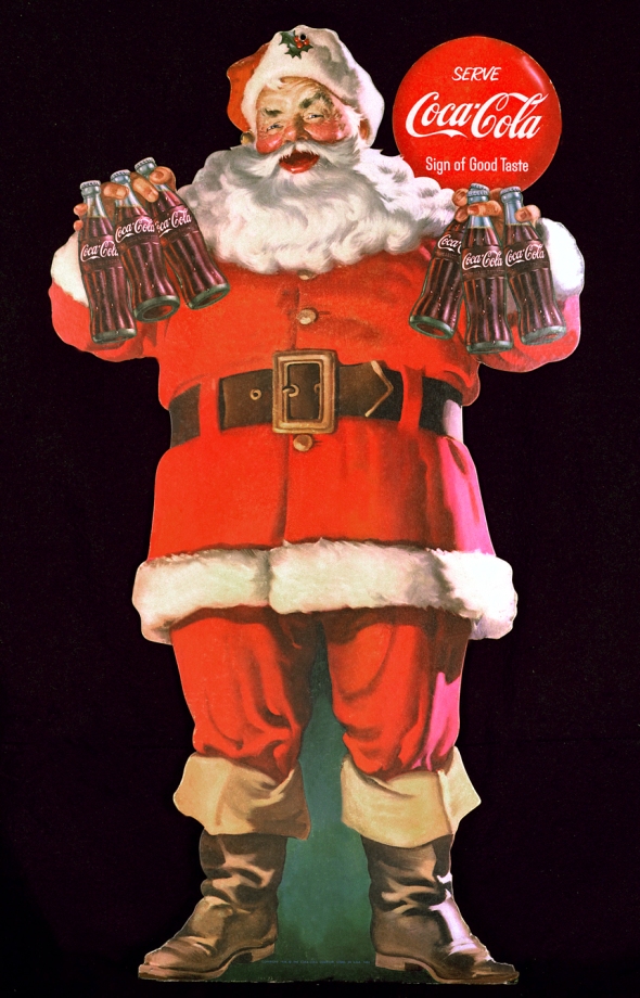
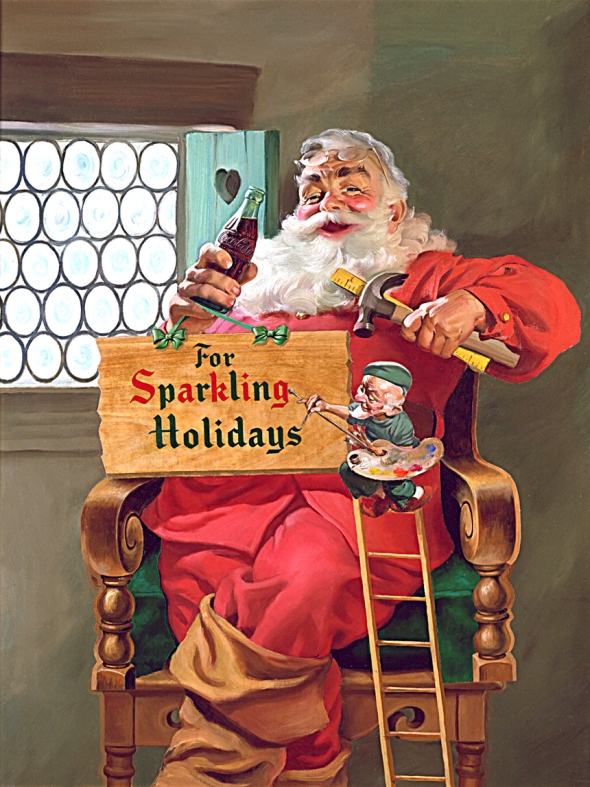
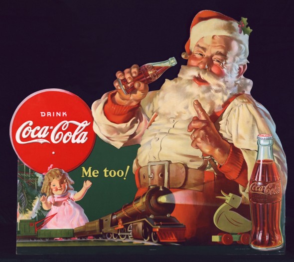
As distribution of Coca-Cola and its ads spread farther around the world, Sundblom’s Santa Claus became more memorable each season, in more and more countries. The character became so likable, The Coca-Cola Company and Haddon Sundblom struck a partnership that would last for decades. Over a span of 33 years, Haddon Sundblom painted imaginative versions of the “Coca-Cola Santa Claus” for for Coke advertising, retail displays and posters.
Sundblom initially modeled Santa’s smiling face after the cheerful looks of a friend, retired salesman Lou Prentiss. “He embodied all the features and spirit of Santa Claus,” Sundblom said. “The wrinkles in his face were happy wrinkles.” After Prentiss passed away, the Swedish-American Sundblom used his own face as the ongoing reference for painting the now-enduring, modern image of Santa Claus.
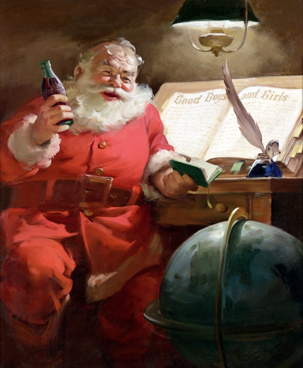
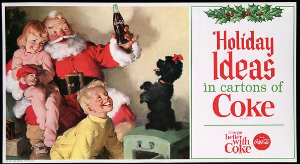
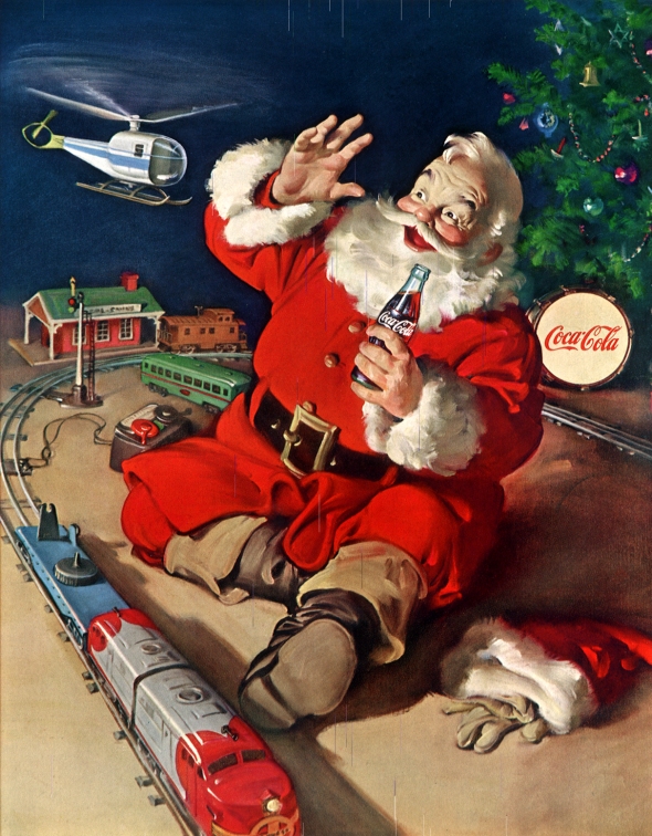
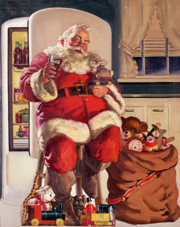
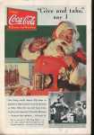
In 1951, Sundblom captured the Coca-Cola Santa “making his list and checking it twice.” However, the ads did not acknowledge that bad children existed and showed pages of good boys and girls only. Mischievous and magical, the Coca-Cola Santa was not above raiding the refrigerator during his annual rounds, stealing a playful moment with excited children and pets, or pausing to enjoy a Coca-Cola during stops on his one-night, worldwide trek. When air adventures became popular, Santa also could be caught playing with a toy helicopter around the tree.
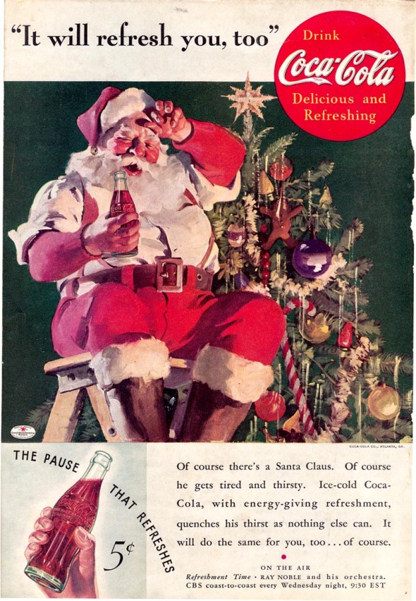
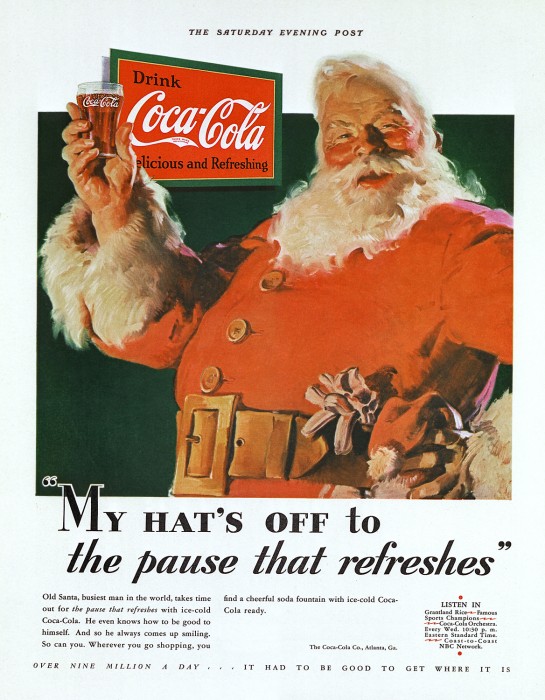
Haddon Sundblom passed away in 1976, but The Coca-Cola Company continues to use a variety of his timeless depictions of Saint Nicholas in holiday advertising, packaging and other promotional activities. The classic Coca-Cola Santa images created by Sundblom are as ubiquitous today as the character they represent and have become universally accepted as the personification of the patron saint of both children and Christmas.
As Joanna Berry, Lecturer in Marketing at Newcastle University Business School, explains: “Whilst Sundblom didn’t invent Santa as the jolly, white haired rotund old man we all now expect, he certainly did more than anyone to imprint that image onto our minds in relation to Coca-Cola in one of the most enduring brand images ever to have been created.”
————————————————————————————————————————————————————————————
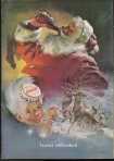
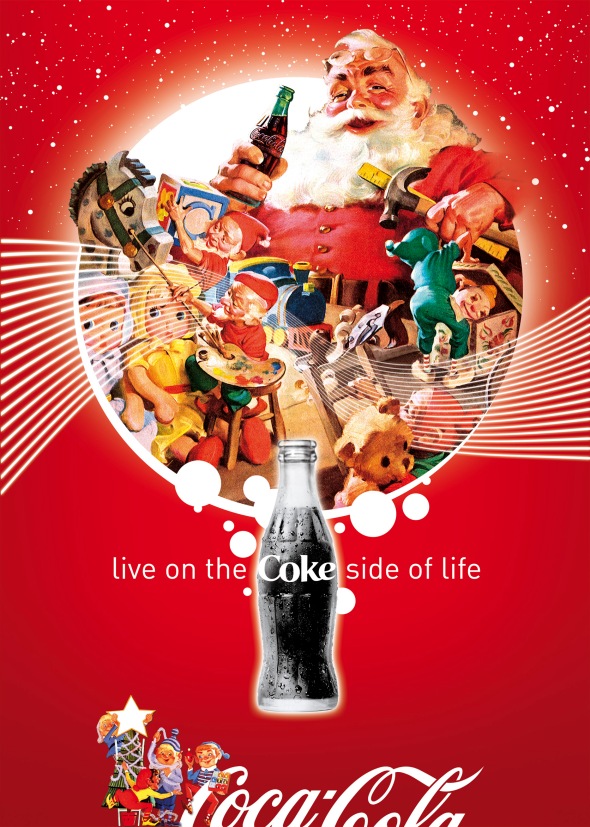
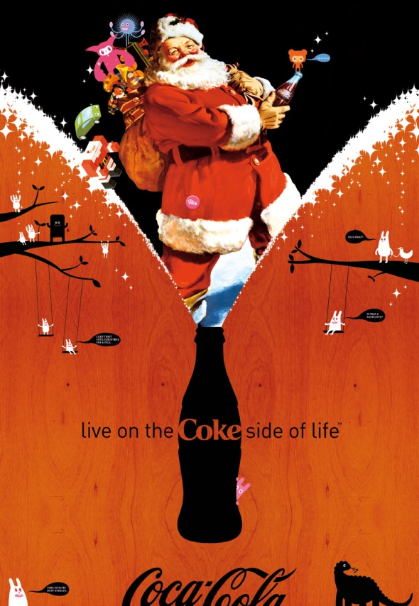
A tribute to Haddon Sundblom from “Coke Side of Life” Campaign
McCann Australia for Metro Trains Melbourne – Is “Dumb Ways To Die” the new “Chipotle”?
Posted: December 10, 2012 Filed under: Animation, Australia, Case History, Copywriting, Design, Digital, Graphic, Graphic Design, Illustration, Press/Outdoor, Social, Viral | Tags: Animation, be safe around trains, Case History, Chipotle, Digital, Dumb Ways to Die, Edward Gorey, funny, Is "Dumb Ways To Die" the new "Chipotle"?, John Mescall, Julian Frost, McCann Australia, Melbourne Metro, metro trains, Ollie McGill, The Gashlycrumb Tinies, Viral Leave a comment

“Dumb Ways to Die”, is an integrated advertising campaign designed to curb the number of train-related deaths in Victoria. The campaign is centred around a three-minute animated music video, highlighting the many dumb ways there are to die, with being hit by a train – a very preventable death – among them. The video and iTunes single are accessible online at DumbWaysToDie.com, with animated gifs being released on Tumblr, on radio, in posters on small and large space outdoor and throughout the Metro Trains network, with the lyrics to the song on the art work.

The Idea: Safety PSAs are gloomy and tedious and largely ignored by young people hardwired to resist them—except when they’re irresistibly fun and impossible not to share with friends. McCann Australia managed just such an evolution of the genre with “Dumb Ways to Die” its animated train-safety spot for the Melbourne Metro. The three-minute music video shows adorable blobs making the stupidest decisions ever—messing with animals, sticking forks in toasters, eating superglue, etc.—leading to all sorts of gruesome, fatal accidents. The dumbest way to die, the ad suggests at the end, is by being careless around trains. “The idea for a song started from a very simple premise: What if we disguised a worthy safety message inside something that didn’t feel at all like a safety message?” said McCann executive creative director John Mescall. “So we thought about what the complete opposite of a serious safety message would be and came to the conclusion it was an insanely happy and cute song.” With more than 30 million YouTube views, it seems happy, cute and grisly was the way to go.
The Song: The song begins, “Set fire to your hair/Poke a stick at a grizzly bear/Eat medicine that’s out of date/Use your private parts as piranha bait,” before the chorus repeats the two lines, “Dumb ways to die/So many dumb ways to die.” Mescall wrote most of the lyrics in one night at the agency. “It then took a few weeks of finessing,” he said, “getting rid of a few lines that weren’t funny enough and replacing them with new ones.” The line “Sell both your kidneys on the Internet” was a late inclusion. “I’m glad it’s there. It’s my favorite,” he said.

Australian musician Ollie McGill from the band The Cat Empire wrote the music. “We basically gave him the lyrics and told him to set it to the catchiest nonadvertising type music he could,” said Mescall. McGill delivered something almost unbearably catchy. “The melody is easy to remember and sing along to, the lyrics are fun, bite-sized chunks of naughtiness, and the vocals have just the right amount of knowing innocence,” Mescall said. “It’s a song that you want to hate for living in your head, but you can’t bring yourself to hate it because it’s also so bloody likable.” The singer is Emily Lubitz of another Australian band, Tinpan Orange. (The song is credited to Tangerine Kitty, which is a mashup of the two band names.) “Emily brought a great combination of innocence, playfulness and vocal integrity,” Mescall said. “She brings a level of vocal quality you don’t normally get on a video about cartoon death.”
The Art Direction: Australian designer Julian Frost did the animation. “We gave him the most open brief we could: Just make it really funny and really awesome and do it to please yourself,” said Mescall. The visual reference points ranged from Edward Gorey’s The Gashlycrumb Tinies to Monty Python’s “Always Look on the Bright Side of Life” (which showed men singing while being crucified) to “any number of hokey indie music-video flash mobs you see on YouTube,” said Mescall.


“Julian was keen to contrast the extreme situations described in the lyrics with the simplest animation possible. Otherwise it would become just too much.” After the spot blew up online, Frost wrote on his website: “Well, the Internet likes dead things waaay more than I expected. Hooray, my childish sense of humor pays off at last.”


The spot lives online, in short bursts on music TV, and may reach cinemas. The campaign is also running in radio, print and outdoor. The song is on iTunes, where it reached the top 10. The agency is also producing a book as well as a smartphone game that should be ready by Christmas.
Advertising Agency: McCann, Melbourne
Executive Creative Director: John Mescall
Creative Team: John Mescall, Pat Baron
Animation: Julian Frost
Digital Team: Huey Groves, Christian Stocker
Year: 2012
H-57 Milan/Life in Five Seconds: Over 200 Stories for Those With No Time to Waste
Posted: October 31, 2012 Filed under: Animation, Art, Design, Digital, Graphic, Graphic Design, Illustration, Italy, Promotion, Viral | Tags: Gianmarco Milesi, H 57, H-57 Creative Station, Life in 5 seconds, Matteo Civaschi, over 200 stories for those with no time to waste, Quercus 2 Comments
 “In our jet-fuelled, caffeine-induced, celebrity-a-minute world, who actually has the time to learn a thing or two? C’mon, let’s face it, life’s too bloody short. What you need is instant knowledge. Life in Five Seconds takes 200 world events, inventions, great lives, places, animals and cultural icons that you really need to know about, and then, hey presto!, cuts away all the useless details. The Last Supper, Lady Gaga, the moon landings, the Mona Lisa, the invention of electricity, Ikea, the Berlin Wall, celebrity chefs and everything in-between. This is the perfect gift for anyone with a sense of humour…”
It is true that the “information overload syndrome” (infobesity) often pushes us to the limit of complex thinking …
To cope with this phenomenon, a concept has recently taken up the challenge of simplicity, with a book entitled “Life in 5 seconds” and directed by agency H-57 Milan (Matteo Civaschi & Gianmarco Milesi). A super simplified storytelling to narrate the life of fictional characters, historical figures, or even social phenomena in less than 5 seconds. The result is pretty funny.
“We want to create many of them to give our point of view on the most famous world stories. Unfortunately, the ones with tragic ending are the funniest and most interesting.” H-57


Here’s one of our awesome stories from “Life in Five Seconds” brought to life by our Quercus Eye app. Select Quercus books have pages that spring to life. All you need is a web enabled mobile phone or tablet and to download the free app now available on Android or Apple platforms.


You will have to wait until November 8 for for the book’s publication, but a preview is already available on the official website: http://www.lifeinfiveseconds.com
Freddy Krueger (and Nightmare on Elm Street) in advertising
Posted: October 30, 2012 Filed under: Cliché, Illustration, Italy, parody, Press/Outdoor, Testimonial, TV/Film | Tags: advertising, Burger King, Direct tv, Fonzies, Freddy Krueger, funny, Halloween, interruptions, kill the nightmare, Mtv, Nightmare on Elm Street, nulaid eggs, Post-it, Press, screamfest, TV/Film, yamaha Leave a commentYamaha

Burger King/Open Late

Picasso (Bed & Mattresses)

GSC/Developers against Piracy

Horror Night at Playcenter

Nulaid Eggs

Screamfest (Independent Horor Film Festival)

Post-it notes

Fonzies Chips
MTV/Nightmare on Elm Street Campaign
During some ads for America’s Best Dance Crew, Freddy Krueger comes out of nowhere and interrupts them as a way to advertise A Nightmare on Elm Street.
Direct TV
Adidas: Adicolor Project – United Colors of adidas
Posted: October 24, 2012 Filed under: Animation, Art, Case History, Design, Digital, Graphic, Graphic Design, Illustration, Promotion, Sportwear, Testimonial, USA, Viral | Tags: adicolor, adidas, Animation, black, Case History, colour, costomization, Digital, green, Happy, idealogue, Neill Blomkamp, personal expression, pink, Psyop, red, Roman Coppola and Andy Bruntel, Saimon Chow and Charlie White, Tronic, USA, Viral, white, yellow Leave a comment
The adicolor podcast is a series of seven short films created for adidas to celebrate “colour, costomization and personal expression”. The films were created to be specifically viewed on iPods, PSPs and online, which was still a fairly revolutionary proposition back in 2006 when the films were made. A team of excellent directors was put together, with Neill Blomkamp, Psyop, Happy, Tronic, Roman Coppola and Andy Bruntel, Saimon Chow and Charlie White each given an entirely open brief to create a film based on their emotional response to a particular colour. The podcasts related to the adicolor global digital campaign for which adidas had asked 20 artists to design a shoe based on their response to a colour. The films feature such surreal scenes as an orgiastic dinner party involving green paintball splashes and a pink-loving teenager’s transformation into a bejewelled figurine. With an original goal of achieving one million views globally, the campaign actually achieved over 25 million views in just seven weeks.

Adicolor BLACK
Stills from Saiman Chow’s film for the colour BLACK. The film is a surreal tale about a lonely, crazed panda.
Adicolor PINK
Charlie White directed the adicolor PINK film, which sees a teenager turn into a bewelled figurine while her pink teddy looks on helplessly.
Adicolor BLUE
Psyop is behind the adicolor blue film, where New York City is turned black and white, apart from the odd splashes of blue.
Adicolor GREEN
Adicolor green by Happy shows a space-age dinner party where everything gets a little out of hand after some green treats are consumed.
Adicolor WHITE
Adicolor WHITE was directed by Tronic and sees Jenna Jameson enthusiastically playing a funfair game.
Adicolor YELLOW
Neil Blomkamp directed the adicolor YELLOW film, a gripping tale about robots and artificial life.
Adicolor RED
Roman Coppola and Andy Bruntel created this animated history of the colour red for the adicolor RED film.
Advertising Agency: Idealogue, New York
Year: 2006
JWT Buenos Aires for Mercado Magazine – The World is a Hard Place to Understand
Posted: May 28, 2012 Filed under: Ambient, Argentina, Art, Event, Graphic Design, Illustration, Installation, Press/Outdoor | Tags: 3D outdoor, Ambient, Argentina, Estilo 3D, flag, Gonzalo Vecino, hope, installation, JWT, Mercado Magazine, Obama, Pablo Alvarez Travieso, Press, The World is a Hard Place to Understand 2 CommentsMercado Magazine is a magazine that analyses political and economic information and helps people understand the reasons and consequences of the events that take place on our planet, and how these affect the business world. Under the concept of: “The world is a hard place to understand”, the campaign emerges from a universal truth and as from its executions, bases itself on current market issues.

“The largest trade partner of the European Union is now another country.”

“The world’s sixt large economy is another country.”

“The top weapon importer is now another country.”
Hope
This 3D outdoor medium is a monument that changes dramatically according to the angle it is viewed from. Demonstrating the more angles you have, the deeper the analysis of that reality will be. And the passerby lived that experience with a sculpture that made them wonder how hard it is to understand a world in permanent change.
Advertising Agency: JWT, Buenos Aires
Chief Creative Officer: Gonzalo Vecino, Pablo Alvarez Travieso
Executive Creative Director: Gonzalo Vecino, Pablo Alvarez Travieso
Creative Director: Ariel Abadi
Art Director: Fernando Zagales
Copywriter: Juan Mesz
Account Supervisor: Carlos Nesci
Account Manager: Eliana Garcia
Producer: Fabián Catanese
Production: Buenamano Realizaciones
Ilustrator: Estilo 3D
Year: 2012
Almap/BBDO for Volkswagen Original Parts (1999/2012) – The Original Case History
Posted: May 25, 2012 Filed under: Agency, Awards, Brazil, Cannes Lions, Car, Case History, Digital, Illustration, Press/Outdoor, TV/Film, Viral | Tags: AlmapBBDO, Brazil, Cannes Lions, Cassio Zanatta, clone, Giba Lages, Luiz Sanches, Marcello Serpa, never accept alternatives, Original parts, Press, the original click, TV/Film, Viral, Volkswagen Leave a commentGrasshopper/Caterpillar/Worm (1999)


Creative Director: Marcello Serpa
Copywriter: Cassio Zanatta
Art Director: Valdir Bianchi
Photographer: Alexandre Catan
Shirt Bottom (2000)

Creative Director: Marcello Serpa
Copywriter: Rondon Fernandes
Art Director: Luciano Lincoln
Photographer: Claus Stellfeld
Ducklings/Grenade (2001)


Creative Director: Marcello Serpa/Eugenio Mohallem
Copywriter: Beto Ovelha
Art Director: Marcelo Siqueira
Photographer: Fernanda Tricoli
Clone (2005)
A surprising ending dramatizes why you should buy real Volkswagen parts.
Chief Creative Officer: Marcello Serpa
Creative Director: Marcello Serpa, Cassio Zanatta, Giba Lages
Art Director: Roberto Fernandez
Copywriter: Sophie Schoemburg
Production Company: Jodaf Mixer
Director: Joao Caetano Seyer
Bronze Lion
Letters (2006)
")
Creative Director: Marcello Serpa/Cassio Zanatta
Copywriter: Cassio Zanatta
Art Director: Giba Lages
Hook/Lifeguard/Parachute (2009)


Executive Creative Director: Marcello Serpa
Creative Director: Luis Sanchez, Dulcidio Caldeira
Copywriter: Andrè Godoi
Art Director: Andrè Gola
Helmet/Baby Seat (2010)


Executive Creative Director: Marcello Serpa
Creative Director: Luis Sanchez, Dulcidio Caldeira
Copywriter: Andrè Godoi
Art Director: Andrè Gola
Chinese/Meditation (2010)


Executive Creative Director: Marcello Serpa
Creative Director: Luis Sanchez
Copywriter: Renato Simoes
Art Director: Bruno Prosperi
I love You/Son You’re Adorable/Boss/It’s Not You (2011)
Chief Creative Officer: Marcello Serpa
Executive Creative Director: Marcello Serpa
Creative Director: Luiz Sanches
Art Director: Bruno Prosperi
Copywriter: Renato Simoes
Production Company: Vetor Zero
Director: Fabio Acorsi
Editor: Thiago Bueno
Sound Design: Raw Produtora De Audio
Silver Lion for the Campaign
I love You/Boss/Melissa/Adopted (2011)


Chief Creative Officer: Marcello Serpa
Executive Creative Director: Marcello Serpa
Creative Director: Luiz Sanches
Art Director: Bruno Prosperi
Copywriter: Renato Simoes
Chemical Formula (2011)

Chief Creative Officer: Marcello Serpa
Executive Creative Director: Marcello Serpa
Creative Director: Luiz Sanches
Art Director: Pedro Rosa
Copywriter: Marcelo Nogueira
The Original Click (2012)
For each successful video on YouTube there is poorly made imitations. There are hundreds of bad imitations and video clip remakes. Some of these copies had millions of views. And we saw an opportunity behind all this: promoting Volkswagen original auto parts.
We looked for some copies of these videos with a considerable amount of views on YouTube and we placed banners promoting our product in them. When users clicked on the banner, they had a surprise: they were redirected from the copy to the original video and thus we managed to promote our product without taking anyone to visit a corporate site.
For each US$100 spent, we had almost 125,000 views and approximately 500 clicks.
General Creative Director: Marcello Serpa
Creative Director: Luiz Sanches
Co-Creative Director Online: Luciana Haguiara, Sandro Rosa
Art Director: Sandro Rosa, Raul Arantes, Victor Britto
Copywriter: Andre Almeida; Luciana Haguiara
