From TV IS GOOD to WE LOVE TV – The controversial story of ABC campaign
Posted: August 28, 2012 Filed under: Case History, Copywriting, Legendary, Press/Outdoor, USA | Tags: ABC, ABC yellow ads, advertising, Alan Cohen, America’s Broadcasting Company, Before TV, Case History, Lee Clow, Life Is Short. Watch TV, Outdoor, TBWA/Chiat/Day, tv is good, two world wars. After TV, USA, we love tv, zero Leave a commentTraditionally, every summer the broadcast television networks launched marketing campaigns to spotlight their program offerings for the coming season. The campaigns were often uneventful and run-of-the-mill, with viewers and the media paying little notice. In 1997, however, ABC, unveiled a different kind of campaign created by TBWA\Chiat\Day in Los Angeles. The campaign, called ‘‘TV Is Good,’’ was designed to help ABC break out of the traditional confines of network slogans and logos, and it created a stir.
Targeting viewers aged 18 to 49 and leveraging a budget of $12 million in its first season, ‘‘TV Is Good’’ directly addressed the guilt associated with watching television. Commercials featured messages that verged on the cynical, such as ‘‘Don’t worry, you’ve got billions of brain cells,’’ and ‘‘Life Is Short. Watch TV.’’ While many in the media criticized the campaign’s apparently insincere celebration of decadent TV-watching, the resulting debate about the merits of ‘‘TV Is Good’’ built considerable buzz around the ABC brand. A 1998–99 modification of the campaign, budgeted at $15 million and tagged ‘‘We Love TV,’’ further contributed to ABC’s emerging personality.
This tactic did not please everyone. For example, Joseph Turow, professor of media at the University of Pennsylvania’s Annenberg School for Communication, said of the ‘‘TV Is Good’’ campaign, ‘‘I don’t think they care if it turns off people who are over the hill. Advertisers and networks are really getting manic about attracting people under 30.’’ Alan Cohen, ABC’s executive vice president for marketing, said that the network was not intentionally spurning people over 49. Cohen told the Pittsburgh Post-Gazette that, when ABC tested its campaign promos on viewers aged 18–54, ‘‘The campaign played universally the same . . . The audience is right with us on this.’’
The Strategy
ABC’s third-place position in the ratings convinced its executives that the time was right to try something completely different. As Cohen told Broadcasting & Cable, ‘‘When you’re not number one, you have to take more chances.’’ ABC’s research had revealed that most television viewers could not distinguish between the existing network advertising slogans and that most people tended to ignore logos or stars repeating catchphrases. Cohen said, ‘‘They were all drowning out each other, and it left networks without a brand identity.’’
The goal of the ABC campaign was clear. Cohen explained to the Salt Lake Tribune, ‘‘We want to establish an attitude and personality for ABC that’s funny, friendly, and irreverent.’’ Through test and focus groups the network had further discovered that people enjoyed television more than they were willing to admit, and as Lee Clow, TBWA\Chiat\Day’s chairman, explained, the agency based its creative approach on this knowledge. ‘‘As you talk to people about their lives these days and how stressed they are, TV is this period of time where they actually get to recuperate a little bit,’’ Clow said. ‘‘Kind of just plop yourself down and let something happen to you so you don’t have to use your brain and work too hard for a few minutes. So we thought, why not kind of honestly celebrate the notion that TV is a good part of our lives, and sitting down in front of it for a while isn’t a bad thing.’’
Launching a marketing campaign that celebrated television was not without risks in 1997. At the time there was outspoken criticism of television, with many people objecting to the sexual situations, strong language, and violence found in the programming. By choosing to praise television at a time when it was popular to criticize the medium, ABC knew that it was taking a chance. The first phase of the campaign, which did not mention specific network programs, appeared on television.
The Campaign
These spots established the visual elements that would define the campaign throughout its run: a yellow background on which appeared the black text of witty slogans offering a variety of takes on the ‘‘TV Is Good’’ theme. The initial wave of spots featured messages such as ‘‘Don’t worry, you’ve got billions of brain cells,’’ ‘‘You can talk to your wife anytime,’’ ‘‘The couch is your friend,’’ and ‘‘Life is short. Watch TV.’’ Print and billboard ads appeared next, and, finally, the network began running spots for individual shows that incorporated the campaign style. The budget for ‘‘TV Is Good’’ was approximately $12 million in 1997–98.
The TV spots got the attention of the press even before they were first broadcast. The message was quickly picked up by newspaper writers, and ABC was thrust into the media spotlight. Under the headline ‘‘Ads that Rot Your Brain,’’ Jonathan Foreman of the Wall Street Journal wrote, ‘‘The new TV season gets under way this week, amidst one of the worst ad campaigns of all time. In an apparent effort to win over the young viewers of ‘Generation X,’ ABC settled on irony as an advertising gimmick.’’ Monica Collins of the Boston Herald said, ‘‘At ABC, they’re underestimating us like mad while the network runs the snootiest ad campaign ever.’’ Some ABC affiliates had misgivings about the advertisements, too. Complaints from several affiliates convinced the network to drop one spot that said, ‘‘Books are overrated.’’ In addition, organizations critical of television, including the nonprofit TV-Free America, blasted the commercials. As the spots began to air and the media debate about the campaign’s merits gathered steam, Cohen told Bill Carter of the New York Times, ‘‘The reality is the spots have already worked. People are talking about ABC.’’ Jamie Tarses, then the entertainment president for ABC, told Broadcasting & Cable, ‘‘Anybody would give their left arm for this kind of attention. This is what you want if you’re selling television shows or cars or whatever . . . It’s about making noise.’’
From TV IS GOOD to WE LOVE TV
For the 1998–99 TV season, TBWA\Chiat\Day offered what it called an ‘‘evolved’’ version of the campaign, which, according to the New York Times, ‘‘is adspeak for ‘You don’t like it? All right, already! We’ll change it.’’’ The ironic humor was toned down, and ‘‘TV Is Good’’ was changed to the slightly more sincere ‘‘We Love TV.’’
The messages continued to be delivered in the same visual style (black text on a bright yellow background), and many seemed in keeping with the brashness of the previous seasons. For instance, one spot advised viewers, ‘‘Don’t just sit there. Okay, just sit there’’ another offered the dubious historical interpretation ‘‘Before TV, two world wars. After TV, zero.’’ But the campaign also began to offer less polarizing messages, such as ‘‘TV, so good they named a frozen meal after it,’’ and ‘‘Without a TV, how would you know where to put the sofa?’’ .
The 1998–99 season likewise marked an increase in series-specific commercials using the overall campaign’s visual elements, humorous tone, and tagline. The campaign budget for that season was estimated at $15 million.
ABC saw its ‘‘TV Is Good’’ campaign as successful for a number of reasons. First, the campaign received an impressive amount of press coverage. Second, another of the big three networks added to the publicity windfall by mocking the campaign with a television spot of its own. Third, public response to the campaign was mostly favorable. Cohen said to Tom Feran of the Cleveland Plain Dealer, ‘‘We did talk to a lot of viewers around the country and show them this material, and I think people sort of got it. They said, ‘Wow, this is funny. ABC is funny. They must have good comedies.’ And that’s exactly the connection we wanted them to make.’’
In the 1999–2000 season ABC and TBWA\Chiat\Day further redefined the brand-building project. Although the network’s promotional spots continued to employ the visual elements and a measure of the ironic humor from the previous two seasons’ campaigns, the new tagline, ‘‘America’s Broadcasting Company,’’ seemed to mark a departure in tone and strategy. The network and its agency maintained that the campaign was not a reversal of the previous years’ tactics but rather a further evolution. This view was supported by a recurring message in the ‘‘America’s Broadcasting Company’’ spots: ‘‘United we watch.’’
Absolut Vodka/Swedish House Mafia – Greyhound
Posted: March 23, 2012 Filed under: Alcoholic Drinks, Case History, TV/Film, USA | Tags: Absolut Greyhounds, Absolut Vodka, Carl Erik Rinsch, Case History, desert, Greyhound, robot, RSA, Sue Anderson, Swedish House Mafia, TBWA/Chiat/Day 7 CommentsIn the real world, music and cocktails go hand in hand. In an Absolut world, music and cocktails come with racing robotic greyhounds remotely controlled by a trio of DJs, spurred on by a cast of characters that make Lady Gaga look casual.
An evolution of its longstanding tradition of collaborating with artists, Absolut Vodka’s Drinks 2.0 campaign ventures beyond artist-rendered print ads to a collaboration with dance maestros Swedish House Mafia on an original track and music video to promote its Absolut Greyhound cocktail.
“Greyhound”–which is the title of the drink, the video, and the actual music track–is a three-minute visual feast created by TBWA\Chiat\Day that sees three groups of couture-sporting racing enthusiasts converge on the Bonneville Salt Flats to watch some robotic greyhounds speed across the parched plains, all while sipping light pink Absolut Greyhounds. While the fabulous people in the desert give each other the “my team’s going to win” stink-eye, the three members of Swedish House Mafia are off in a desolate bunker remotely controlling the robodogs to a photo-finish while ensconced in holographic orbs. With impeccable direction from RSA’s Carl Erik Rinsch, eye-popping visual effects from Home, gonzo wardrobe styling from Franck Chevalier, and a banging club track from Swedish House Mafia, this is not an exercise in understated elegance.
Maxime Kouchnir, Vice President, Vodkas, Pernod Ricard USA, says that where much of the brand’s previous marketing efforts have focused on print, and its Drinks 1.0 campaign brought together actors and visionary photographers to create worlds around specific cocktails, “Greyhound” was meant to elevate the idea of collaboration to “a multidimensional, multi-sensory experience with drinks and music.” The goal was also to create something that skewed a bit younger than Absolut’s 25-35 urban influencers (neo-yuppies in marketing speak), which made SHM a good musical match.
“With everything we do on Absolut we have the pleasure of looking at things through an Absolut lens, like pushing the limits of what a greyhound dog race could be in an Absolut place,” says TBWA\Chiat\Day creative director Hoj Jomehri. “We said, where do people go to really go fast? The Bonneville Salt Flats. And what if these aren’t just regular greyhound dogs, but are gigantic robotic dogs? And what if the band is actually controlling them in this other setting? We just play creatively and push it as far as we can.”
Not surprisingly, given the name of the cocktail, the greyhound was the creative crux of the idea. “The name Absolut Greyhound was so inspiring because greyhound just sounds so sexy and sleek and fast, and all of the associations you have with the dog seemed to inspire that whole world,” says TBWA\Chiat\Day global creative director Sue Anderson. “Then once we knew who the band was, that inspired a fair amount of the video as well. SHM aren’t traditional musicians who are playing guitars and drums. They are DJs and music producers. That’s where the idea came from that they would be controlling the dogs because that’s so much of what they do: They go and stand in front of crowds and control music and the energy and the vibe. Then, once we had SHM we knew that we would have three dogs.”
This direction left things wide open for director Carl Erik Rinsch to create something fantastical. No stranger to sleek and fast robots (he directed “The Gift” from Philips that featured a renegade roboguard in a dystopian future Russia, which was awarded the first ever Grand Prix for Film Craft at the 2010 Cannes Lions), Rinsch immediately had a vision for the dogs.
“We’d said they had to be bigger than typical dog size, we wanted them to feel robotic and metallic, but also very elegant and sleek,” says Anderson. “Right on that very first call with Carl he was like, ‘I know exactly what these dogs should look like.’ He actually already had a drawing, he sent over an initial sketch and we went, ‘That’s exactly what they should look like.’”
“Carl understood inherently that you should have an emotional attachment to these dogs, so when they got to animating the race you really got a sense that these were three distinct characters and you were rooting for one or the other in the race,” adds Jomehri. “That’s a really difficult thing to do when you’re speaking about robotic dogs.”
Given that “Greyhound” is part music video, part ad, it will be distributed across a number of channels. “When it come to our target, music is their number one passion point and they live in the digital space so the campaign is really going to primarily TV and digital,” says Absolut’s Kouchnir. The track will premiere on Pete Tong’s BBC Radio One, and the full-length music video will be distributed to MTV and VEVO. Shorter versions will air on TV with a Shazam for TV integration, taking viewers to the full video. All of this will also drive to http://www.absolut.com/remix and Facebook where fans can remix the track “with the band” and share it with friends.
Kouchnir also says this is the first step in the vodka maker’s new direction of “creating cocktail worlds through the lens of music.” Upcoming artists include U.K. pop artis Dan Black and Swedish rock band Little Dragon, both of which will create original music tracks based on specific Absolut vodkas.
Watch behind-the-scenes footage below.
Advertising Agency: TBWA/Chiat/Day
Chief Creative Officer: Mark Figliulo
Global Creative Director: Sue Anderson
Creative Director : Hoj Jomehri
Art Director: Hoj Jomehri, Jin Park
Copywriter: Sue Anderson
Production Company: RSA
Director: Carl Erik Rinsch
Year: 2012
Apple – Think Different
Posted: September 5, 2011 Filed under: Cannes Lions, Case History, Copywriting, Legendary, Press/Outdoor, TV/Film, USA | Tags: Albert Einstein, Alfred Hitchcock, Apple, Bob Dylan, Case History, Craig Tanimoto, Jennifer Golub, Jerry Seinfeld, John Lennon, Lee Clow, Mahatma Gandhi, Martin Luther King Jr, Mohammed Ali, Picasso, Steve Jobs, TBWA/Chiat/Day, Think Different, TV/Film, USA, yoko ono 2 CommentsThis is the story of one of the most successful campaigns in the history of advertising.
In August 1997 Jobs, who had cofounded Apple Computer in his garage 20 years earlier, returned to the company to become its interim chief executive officer. At that time Apple was in the midst of a crisis. Its share of the computer market had plummeted from a peak of 14 percent in 1993 to below 3 percent four years later. ‘‘The company was in a death spiral…’’ its chief financial officer, Fred Anderson, told Newsweek in 1998. Jobs set out to address the problems. He believed that Apple’s difficulties stemmed from the company’s incoherent agenda, which consisted of efforts to move various products without a clearly defined purpose or method. Jobs attempted to redefine the company’s strategy by concentrating on Apple’s key markets: design and publishing, education, and consumers who purchased personal computers for use in the home. He also cut Apple’s product line from 14 to 4. Jobs took charge of Apple’s image-making process as well. When he arrived back at the company, Apple was running more than 25 different advertising campaigns. The company’s domestic and international sales offices advertised independently from, and were often not coordinated with, the campaigns conducted from Apple’s headquarters in California.
Apple’s advertising agency during this period, BBDO, had opted to focus its advertisements on specific Apple products and the technological features of Apple computers. These efforts did nothing to allay consumers’ fears that Apple’s demise was imminent. ‘‘The talk of Apple going under was the worst thing for the company…’’ said Jessica Schulman, the TBWA\Chiat\Day art director for the ‘‘Think Different’’ campaign. ‘‘People won’t buy computer equipment that they think won’t be around in the next year.’’
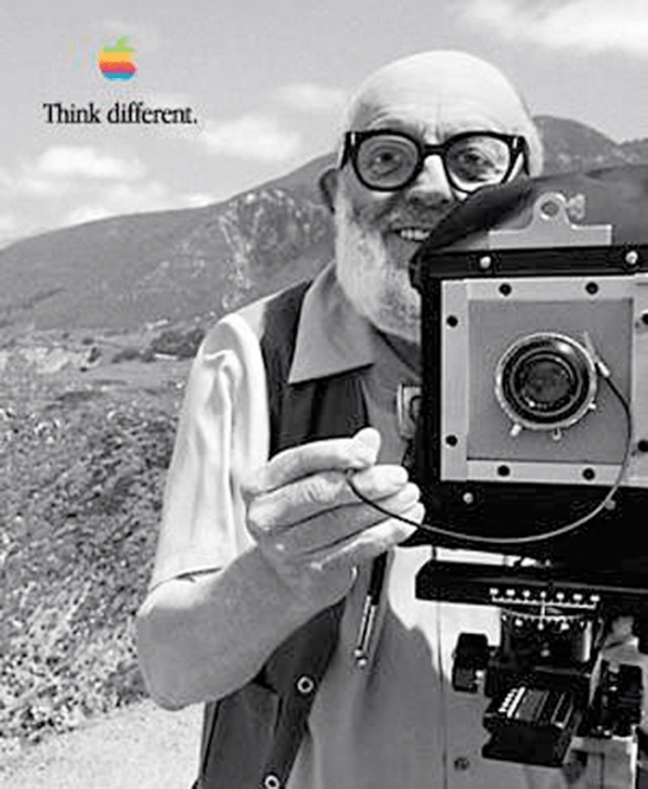
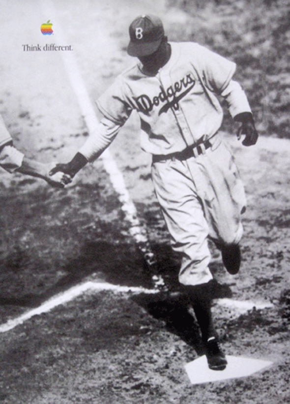
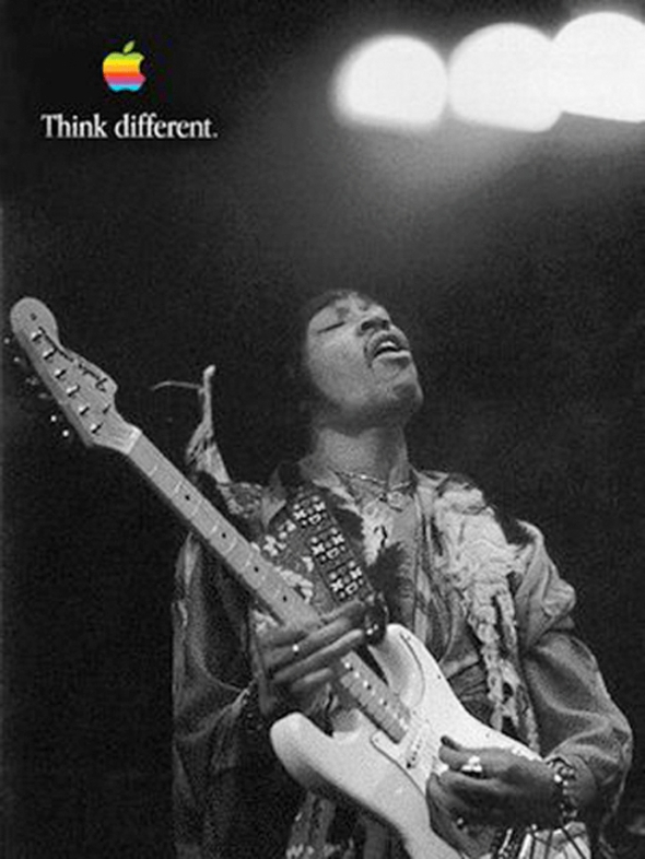
Jobs invited three ad agency reps to present new ideas. Lee Clow, now the creative director for Chiat/Day, was one of them. On August 3, 1997, he presented a new slogan and aesthetic for Apple’s ads: Think Different (perhaps a reference to IBM’s famous “THINK” slogan) and montages of artists and creative professionals using the Mac. In an interview with Electric Escape, Clow said that he wanted to feature filmmakers at Dreamworks SKG working on their Macs. Jobs was enamored with the concept, though now using anonymous figures. And instead of Dreamworks filmmakers, he wanted to use celebrities and thinkers. Jobs had long been a fan of black and white portraits and prints. NeXT’s offices were decorated (expensively) with poster-sized prints from Ansel Adams, and Jobs’ manse in Los Gatos was decorated with black and white portraits of his heroes, including Albert Einstein. He began brainstorming on the spot. Chiat/Day was reinstated as the chief advertising agency, and Lee Clow became a regular presence on the Apple Campus. Although the ad was produced entirely by Chiat/Day staff (on Macs, of course), Jobs (sometimes with marketing staffers) reviewed revisions at every step of the process. He used a satellite uplink between City Center 3 and Chiat/Day’s Venice offices to review the clips in full video instead of relying on the mail or compressed files.
Chiat/Day used a totally computer based creative environment. Jobs gave the group 17 days after approval to complete the entire campaign. That included the television commercial and billboards for major markets such as Los Angeles and New York. An ordinary campaign for a more obscure client (or even Apple under Amelio) would have taken much longer just to get rights to the images. Jobs was particularly useful when Clow and his team needed to get usage rights from celebrities including Joan Baez (Jobs’ ex-girlfriend) and Yoko Ono (once a neighbor near Central Park when Jobs lived in the San Remo and Yoko in the Dakota). If Clow had approached these people’s publicists, he would be another adman. When Jobs called, he was a friend and a cult-figure in computer history.
The television commercial was produced using an Avid 4000 system on a Macintosh with Adobe AfterEffects. Jennifer Gulab, who worked on the television commercial, worked very closely with Jobs via satellite link. The two were in contact daily, working out which images would be used (a choice largely based on the availability of images and permissions), the music, and the narration, which was done by Richard Dreyfus. Dreyfus read a free-verse poem, “Here’s to the Crazy Ones”, written by a Chiat/Day copywriter, Craig Tanimoto. This was used extensively throughout the entire campaign. Rumours say that Steve Jobs wrote the original text, for this spot it’s been changed a little.
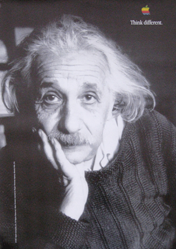
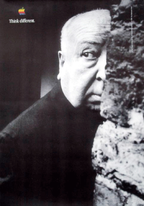
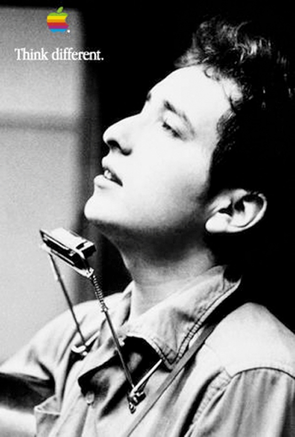
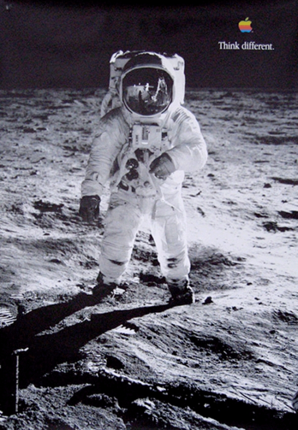
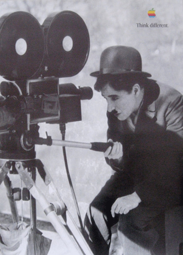
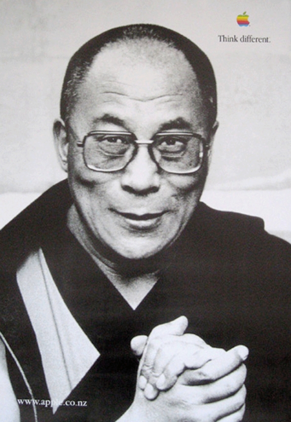
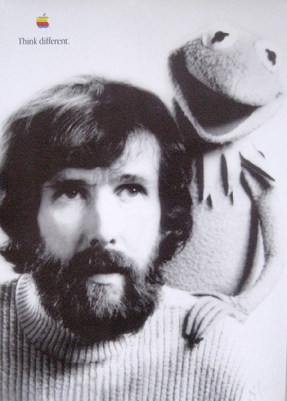
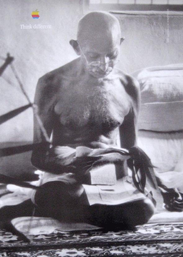
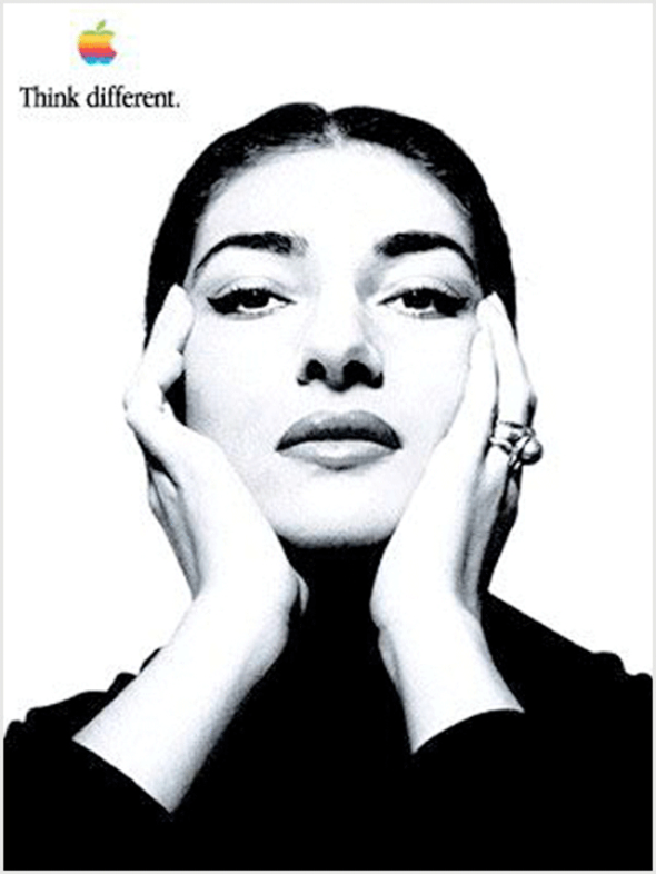
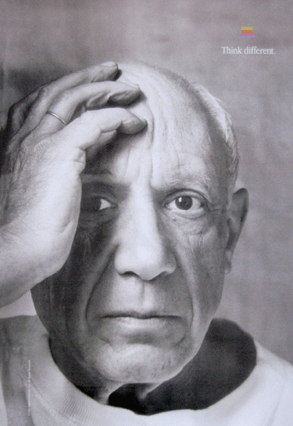
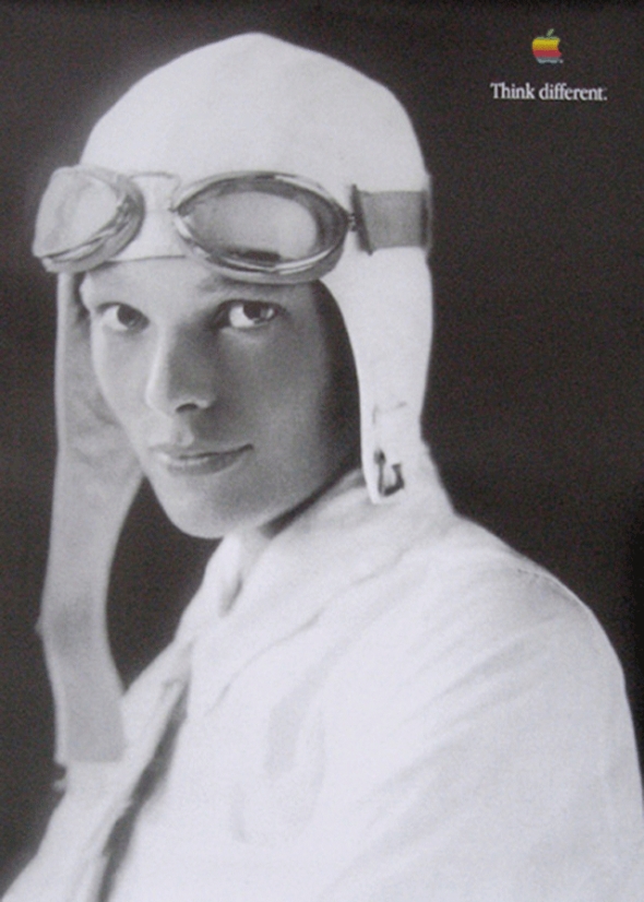
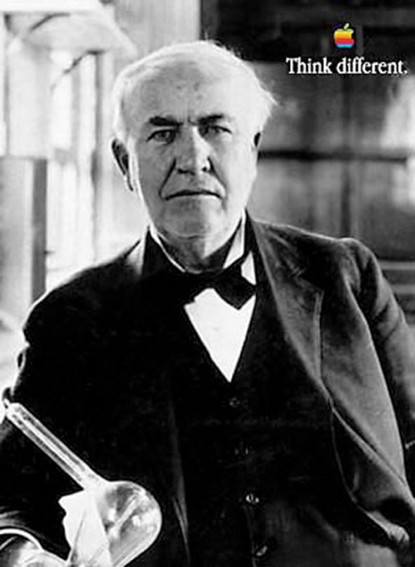
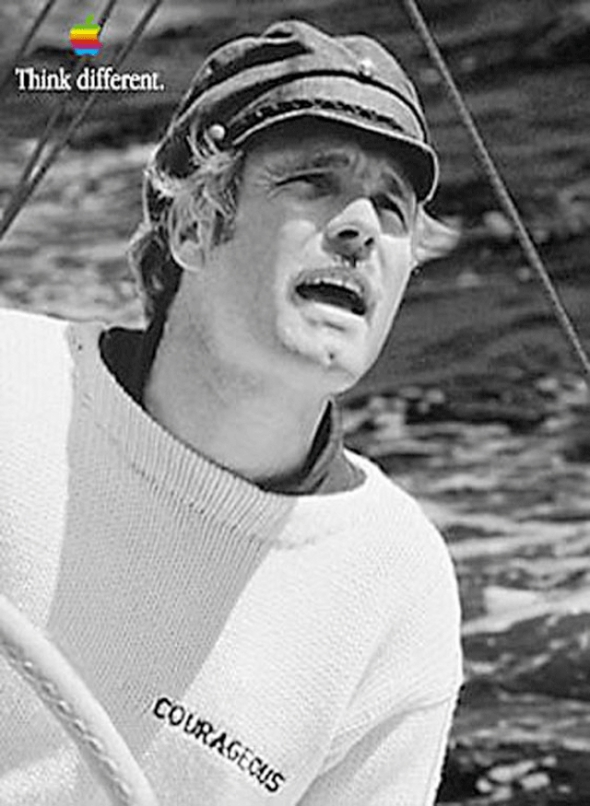
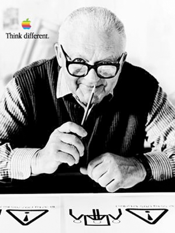
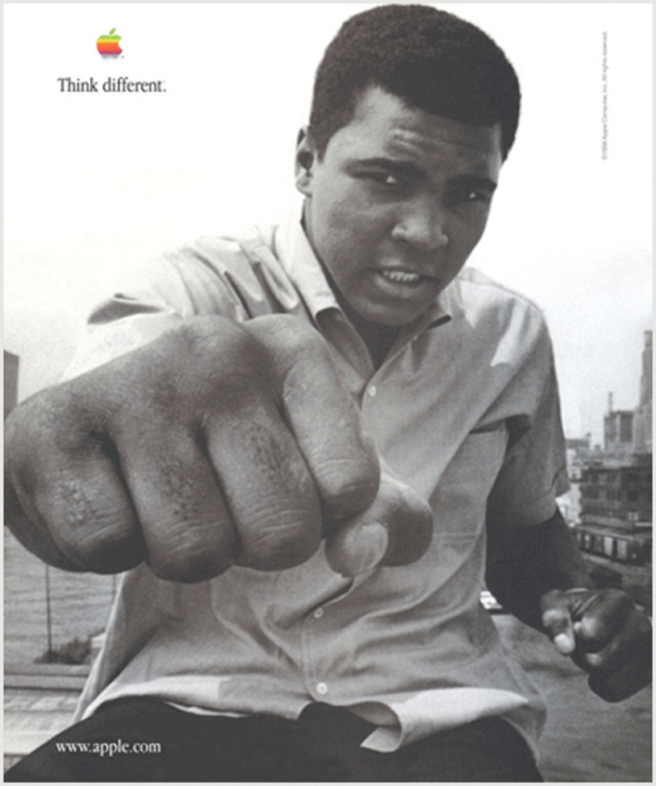
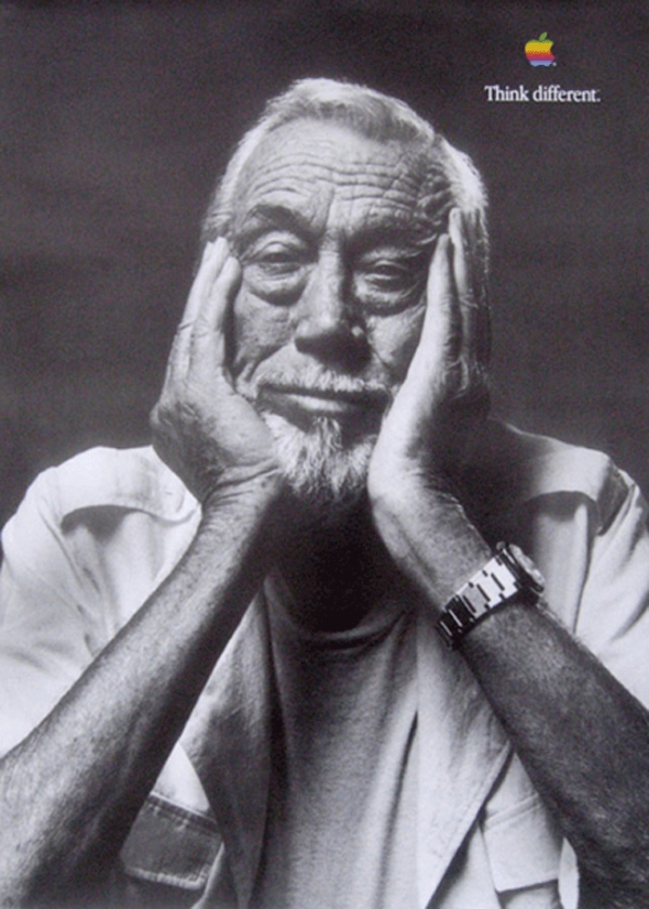
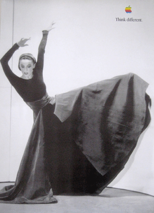
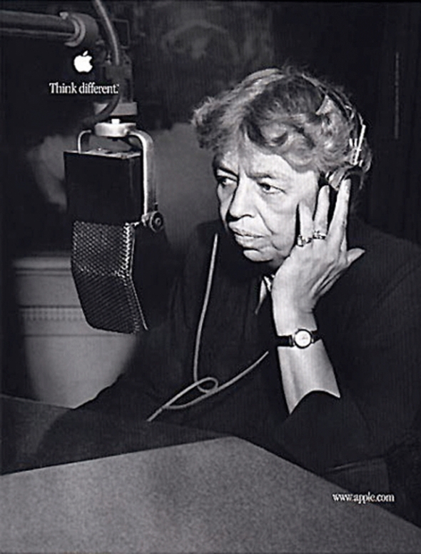
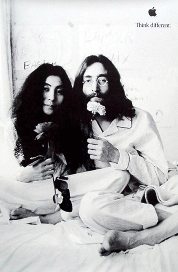
The commercial consisted of the blackand-white images of the 12 visionary thinkers including (in order) Albert Einstein, Bob Dylan, Martin Luther King, Jr.,Richard Branson, John Lennon (with Yoko Ono), R. Buckminster Fuller, Thomas Edison, Muhammad Ali, Ted Turner, Maria Callas, Mahatma Gandhi, Amelia Earhart, Alfred Hitchcock, Martha Graham, Jim Henson (with Kermit the Frog), Frank Lloyd Wright and Pablo Picasso and the reading of a manifesto read by actor Dreyfuss. ‘‘Here’s to the crazy ones,’’ began the voice-over. ‘‘The misfits. The rebels. The troublemakers. The round pegs in square holes. The ones who see things differently. They’re not fond of rules. And they have no respect for the status quo. You can quote them, disagree with them, glorify or vilify them. About the only thing you can’t do is ignore them. Because they change things. They push the human race forward. And while some may see them as the crazy ones, we see genius. Because the people who are crazy enough to think they can change the world are the ones who do.’’ The commercial ends with an image of a young girl, Shaan Sahota, opening her closed eyes, as if to see the possibilities before her.
‘‘Think Different” celebrates the soul of the Apple brand—that creative people with passion can change the world for the better,’’ Jobs told the Wall Street Journal Europe in April 1998. Apple wanted to kick off the campaign in dramatic fashion and decided that the first advertisement should run on television during the September 28, 1997, network television premiere of A Toy Story on ABC. Although difficulties in obtaining the rights to use and publish the photographs of the subjects of the campaign nearly caused Apple to miss its target, the 60-second spot aired as planned.
A shorter version was also produced. It used many of the people above, but closed with Jerry Seinfeld, instead of the young girl. This commercial aired only once, during the series finale of Seinfeld.
The first rule of the campaign was that there would be no products in the ads. Clow and the rest of the creative team were very concerned with appearing to exploit the artists who’s images they used. Instead of being paid, all of the participants (or their estates) were given money and computer equipment to be donated to the charities or non-profits of their choice.
To reinforce the message of the television commercials, Apple conducted a brief second phase of the campaign and ran print ads in major newspapers, including the New York Times and the Wall Street Journal, that consisted of the text of the manifesto and some of the images from the television campaign.

The choice of the tagline ‘‘Think Different’’ rather than ‘‘Think Differently’’ was deliberate. Even though ‘‘Think Different’’ drew public flak for not being grammatically correct, Apple settled on the line because it ‘‘conveyed a total change in the whole body of what you think about,’’ said Jessica Schulman, art director at TBWA\Chiat\Day. ‘‘Instead of thinking in your everyday way, ‘Think Different.’’’
The print and billboard ads were also unique.
Instead of sticking to Mac and general computing magazines, Apple bought space in popular magazines and fashion magazines. Outside advertisements were practically unheard of in the computer industry, but Chiat/Day rented hundreds of major spaces in New York and Los Angeles – and still does.
Since they had little time, instead of making full scale replicas of posters for bus stations or billboards in major cities, Jessica Schulman just imposed her mockups onto street scenes to give her colleagues an idea how her designs would look. She also collaborated with Jobs, exchanging images on the Internet and making constant revisions.
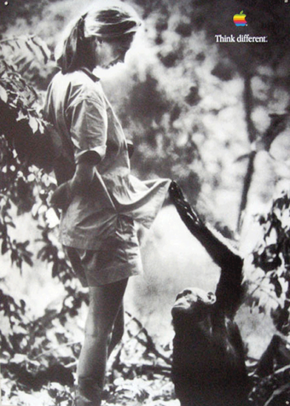
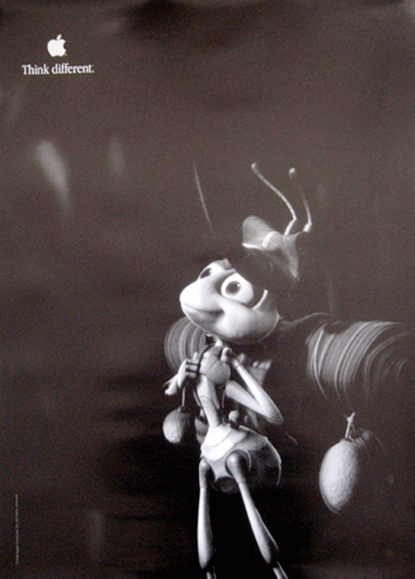
The print campaign was much more elaborate than the television commercial. Over the years there have been dozens of different personalities on the posters. In the end it has become difficult to say which images are original, and which are fake. After the first campaign, Apple started sending complimentary posters to public schools across the nation featuring different celebrities (including Pablo Picasso, Jane Goodall, and Ron Howard) to hang in classrooms. The complete packets now sell for hundreds of dollars on some websites.
The ‘‘Think Different’’ ads reached out to what Apple termed its ‘‘installed base,’’ those consumers who had purchased Apple computer equipment in the past.
Apple consistently performed well in three core markets: designers and desktop publishers, educators and students, and home users. It was these groups that were most likely to have bought Apple products and who were keeping the company afloat during its downturn. But with the publicized record of Apple’s financial troubles, many of them were not purchasing new Apple systems for fear that the company would soon fold, leaving them with obsolete machines. ‘‘Our number one priority was to make people realize that we were still here and still fighting for this brand,’’ said Rhona Hamilton, a marketing representative for Apple. In order to appeal to these users, the campaign stressed the creative roots of the Apple brand. The people who were selected to appear in the ‘‘Think Different’’ campaign were bold thinkers, men and women who were not merely great in a certain field but who were also innovative and independent and who had changed the worlds in which they moved. By aligning itself with the likes of Muhammad Ali, Bob Dylan, and Albert Einstein, Apple clearly strove to deliver a message about itself and its products. ‘‘After talking to a lot of consumers and Macintosh enthusiasts, our strategic direction was to stop acting like a computer company and start acting like a company dedicated to creative thinking,’’ said Schulman. The ‘‘Think Different’’ ads stressed that Apple was an innovative company that, with its creative users, could change the world. With these images and themes, Apple hoped to appeal to its core markets, people who as artists, illustrators, designers, and students valued their own creativity and who viewed themselves as being somewhat outside the mainstream. As Brandweek noted, ‘‘‘Think Different’ [was] clear that it [was] not targeting its message to everyone.’’

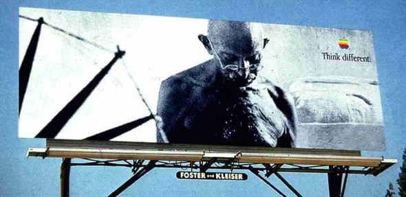
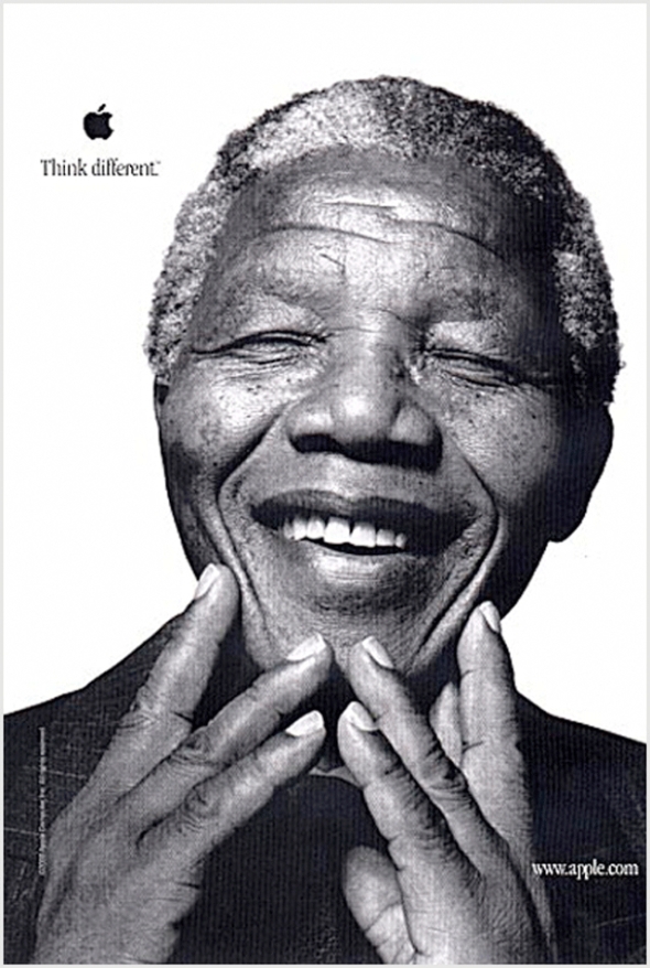
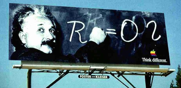
The ‘‘Think Different’’ campaign elicited an outpouring of opinions. Apple’s headquarters was inundated with letters, faxes, phone calls, and E-mails commenting on the campaign. Some questioned the cast of innovative thinkers included in the ads, others were perplexed by the message, and still others were delighted with Apple’s attempt to pay tribute to its heroes. People formed websites spontaneously, discussing who the individuals were, whether the phrase ‘‘Think Different’’ was grammatically correct, and why Apple’s ad campaign would focus on a group of people who for the most part had never touched a computer. Apple and TBWA\Chiat\Day considered the attention paid to the campaign to be a sign of its impact.
At first the advertising industry praised the ‘‘Think Different’’ campaign. The December 15, 1997, edition of USA Today listed Apple’s ‘‘bolder’’ ads as one of the year’s best campaigns. As reported in the same article, ad agency creative directors ranked the campaign as the second best of the year. On May 18, 1998, Advertising Age also voiced its approval: ‘‘The decision to celebrate the kind of independent thinking that has always typified Mac users seems now to make total sense.’’ In fact, the article stated, ‘‘the shots of heroes, geniuses, wildmen, and iconoclasts assembled here makes a strong emotional statement for Apple’s underdog role.’’
Not everyone loved ‘‘Think Different,’’ however. At first Apple had to contend with criticism for launching a ‘‘campaign of dead people.’’ Apple marketing representative Rhona Hamilton spoke of having to educate consumers about what the campaign was attempting to convey. CMP Techwire reported that the company was drawing bad press for undertaking an expensive marketing effort during a period of financial losses. A USA Today Ad Track survey revealed that consumers preferred Intel’s ‘‘Bunny People’’ spots, which were ranked as the most popular technology-industry commercial of 1997.
The campaign had a positive effect on Apple’s bottom line. In April 1998 Apple reported its second straight profitable quarter after nearly two years and $2 billion in losses. Apple attributed the increasing sales to the ‘‘Think Different’’ campaign. ‘‘It let people know that we’re still around and not going anywhere, so that they can feel good about buying the product,’’ said Hamilton. Apple’s market share rose to 4.1 percent. Unfortunately for Apple, the computer maker’s American market share hovered at about 5 percent for the campaign’s final four years. Advertising critics began discrediting ‘‘Think Different’’ for limiting the Apple brand to the small minority of ‘‘revolutionaries’’ that used computers. ‘‘For years, the Apple brand has been associated with artists, writers and designers,’’ Sandra Garcia wrote in the August 2, 2002, issue of Shoot, an ad-industry magazine. ‘‘The so-called ‘creative types’ who seemingly belonged to this secret society of Mac users while the rest of the working public toiled in a clunky PC world.’’
The ads won a slew of awards and developed a cult-following. In 1998 the television spot won the second annual primetime Emmy Award for best commercial from the Academy of Television Arts & Sciences (ATAS). The ad also won a Belding, a Silver Lion and a Gold Lion at Cannes. The long-term campaign won an Effie award for marketing effectiveness. After the first campaign, Apple started sending complimentary posters to public schools across the nation featuring different celebrities (including Pablo Picasso, Jane Goodall, and Ron Howard) to hang in classrooms. The complete packets now sell for hundreds of dollars on some websites.
The campaign ended in 2002.
Advertising Agency: TBWA/CHIAT/DAY, Los Angeles
Chief Creative Officer: Lee Clow
Creative Directors: Ken Segall/Rob Siltanen/Eric Grunbaum/Amy Moorman
Art director: Jennifer Golub/Jessica Schulman/Margaret Midgett,/Ken Younglieb/Bob Kuperman/Yvonne Smith/Susan Alinsangan
Copywriter: Craig Tanimoto
Combos – What your mom would feed you, if your mom were a man
Posted: July 19, 2011 Filed under: Cannes Lions, Case History, Copywriting, TV/Film, USA | Tags: Cannes Lions, Combos, eating combos, Gerry Graf, Ian Reichenthal, Isaac Silvergate, Jeff Andersen, Man-mom, Martin Granger, mom were a man, Moxie Pictures, Scott Vitrone, snack, TBWA, TBWA/Chiat/Day, TV/Film, USA, What your mom would feed you ... if your mom were a man. Leave a commentThis Combos campaign from TBWA\Chiat\Day in New York features some excellent stupid guy humor. The concept: how life would be different if your mom were a man. The upshot: you’d suddenly be eating a whole lot more Combos, among many other not-so-subtle changes. The tagline: “What your mom would feed you … if your mom were a man.” So simple. So stupid. It’s great.
GRACE
Man-mom insists her son says grace before eating combos.
DINNER
Man mom is pleased to see that her son’s already eating combos for dinner.
HEARTH TO HEARTH
Man-mom’s son confides in her about his personal problems, but her thoughts are more focused on Combos.
FEVER
Man-mom’s son wakes her up in the middle of the night with a fever, so she gives him Combos.
VIDEOGAME
Man mom is pleased to see that her son’s already eating combos for dinner.
Describe the campaign
Combos are hollow pretzel nuggets filled with a cheesy center. Since they taste remarkably like nachos or pizza, they’re the ultimate guy food. This led us to: “Combos. What your mom would feed you if your mom were a man” and, subsequently, to the character Man Mom: a manly mother who embodies the campaign idea. Man Mom puts in the least amount of parental effort possible, including always feeding her sons Combos.
Describe how the campaign was launched and executed across each channel in the order of implementation.
The campaign launched with 5 TV spots, all featuring Man Mom and her two grown-up sons who still live at home.
TV was supplemented by radio in which Man Mom gives soliloquies of not-so motherly advice, including eating Combos.
We rounded out the campaign with http://www.man-mom.com: a site where people were encouraged to submit photos of real-life Man Moms (people who blur the line between “mom” and “man”). Viewers could vote on whether a submitted Man Mom was more “man” or “mom”, view the top-10 Man Moms, watch the TV commercials or listen to the Man Mom mood music.
Give some idea of how successful this campaign was with both client and consumer.
The Combos Man Mom campaign succeeded in creating an iconic character that embodies the brand. It also achieved above average recognition, significantly higher levels of claimed ad awareness and grew overall brand awareness. As example of the campaign’s success is seen in the Man-Mom.com website, where traffic exceeded original projections by 38%.
Advertising agency: TBWA/CHIAT/DAY, New York
Creative Director: Gerry Graf/Scott Vitrone/Ian Reichenthal
Copywriter: Isaac Silvergate
Art Director: Jeff Andersen
Production Company: Moxie Pictures, New York
Director: Martin Granger


