Samsung Maestros Academy – The Future of Made in Italy with Samsung and Leo Burnett
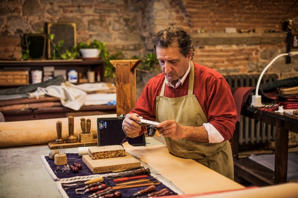
Posted: May 26, 2014 Filed under: Ambient, Case History, Design, Digital, Event, Installation, Italy | Tags: Leo Burnett, Made in Italy, Milan, samsung, Samsung Maestros Academy, Smart Bike Leave a commentItalian craftsmanship has long been considered a renowned art form. Now, in a time when younger generations are gravitating to smartphones rather than toolboxes, expertise is only reminiscent of a bygone era. With the help of Leo Burnett Milan, Samsung created the first-ever digital conservatory called Maestros Academy to foster the next generation of Italian artisans in order to preserve “Made In Italy” excellences.
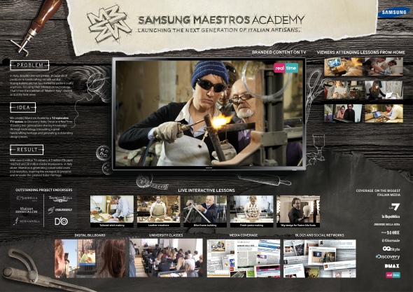
To bring to life the Samsung strategic role of “enabler” in people’s life, we looked at the current social situation in Italy: the disappearance of great handcrafting excellences which once brought Italy to greatness. At the same time, unemployment rate among young people is dramatically growing and younger generations are yearning for new opportunities to discover and express their potential and talent. Our idea aims to deal with this Italian paradox, reconnecting two generations, preserving the future of “Made in Italy” and fostering a new generation of Italian artisans. We want to demonstrate the great results that people and technology can achieve together.
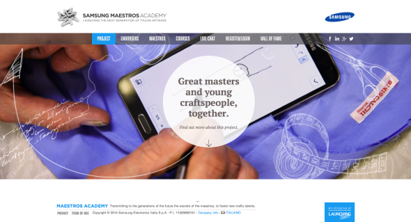
For this reason we created Samsung Maestros Academy: the first digital and integrated platform where young talents can learn the secrets of “Made in Italy” masters, through every kind of smart-device, inspiring the youngest to preserve and innovate the greatest Italian heritage.
The idea of Samsung Maestros Academy was spread on digital channels (FB, Italian newspapers’ and lifestyle magazines websites, Confartigianato’s channels, LinkedIn, Twitter) to join the primary target of the initiative, digital natives, and drive them to the main platform, accessible from every consumer’s electronic device, such as smartphone, tablets, laptops and Smart-TV. The engagement platform consist in more than 40 video-lessons, full of invaluable ancient secrets, in-depth materials and live-interactive lessons, featured even on outdoor and digital-billboards in the major Italian squares, such as Duomo Square in Milan. A technology-enabled connection between two generations, that inspired Discovery Italia channels to produce a 12 episodes TV-series, telling our students’ best success, spread even thanks to Online and mobile TV channels platforms (Realtime.it, DMax.it, Discovery Italia digital platform). The project gained spontaneous echo on national newspapers, magazine and Tv-programs (Piazza Pulita) generating conversation even in the major Italian University.
Samsung Maestros Academy generated a great conversation on newspapers, social media and TV-programs, with more than 6 million TV-viewers, 1 million Youtube-views in few days, 4.5 million FB-users reached and 30 million media impressions -in Italy alone- becoming a big topic even in universities including “Università commerciale Luigi Bocconi”, “Università Cattolica del Sacro Cuore” in Milan, IED, “Università degli studi di Roma Tor Vergata” and even by Fashion Institute of Technology in New York.Thanks to an extensive network of touchpoints people learnt ancient crafts through every smart-device,empowering consumer-awareness on product-features and brand reputation.
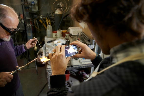
During interactive-lessons, users asked very specific questions, proving a remarkable high user-engagement. Almost the 50% of live-lessons participants asked the Maestros to become an apprentice, exceeding the available positions by 300% on average. Maestros’ students produced with great success innovative design-items, inspiring even more young talents to preserve and innovate the greatest Italian heritage. After Maestro Pelizzoli’s course, Alice created a truly innovative bike, showcased with great success during the Milan Design Week event. Marina together with Maestro Siniscalchi tailored a shirt, featured on an important Italian newspaper, triggering even the curiosity of GQ. Anna and Valerio crafted a bag, immediately displayed by the prestigious “Flow” shop in Florence.The results achieved by many other students generated over 30 million media-impressions and reaching 4.5 million FB-users, on Italian market alone.

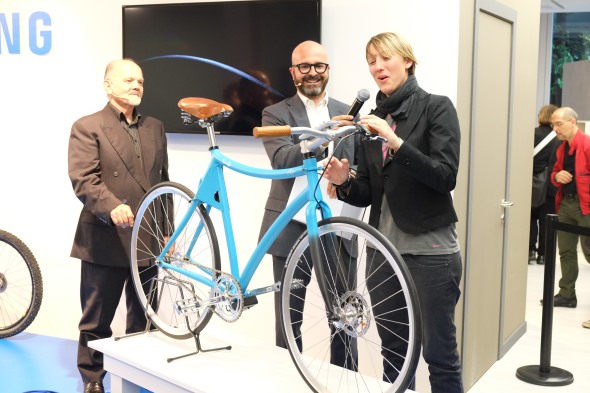
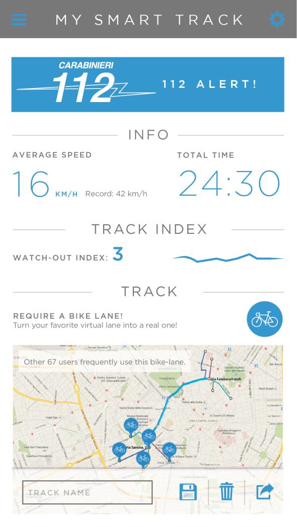
After few months, a student with her Maestro created Samsung Smart-Bike, the first safe-bicycle that protects the rider with its built-in smart-components, automatically activated through a Samsung smartphone. A responsive “safety-environment” that detects ambient-conditions and protects the driver in real-time. A concrete solution for the problem of bikes being the most “unsafe” way of moving in Italy and a real help to break the young people’s barrier with using appropriate safety-equipment.
The idea was to control a fixed-bike and its built-in smart components with a Samsung smartphone and a dedicated app, allowing the automatic control of four laser-beams, a safety-camera a GPS-tracking system, offering innovative safety-features. The first engineered bike and its paired app were presented to one of the greatest design fairs in the world: the Milan Design Week, with the endorsement of EXPO2015 representative of Urban Mobility capturing the interest of important journalists. Alice’s idea has been taken under consideration for applications according to EXPO scenarios, after being recognized as a big step-forward for urban-safety and sustainability.

Advertising Agency: Leo Burnett Italy
Executive Creative Directors: Francesco Bozza, Alessandro Antonini
Creative Director: Christopher Jones, Anna Meneguzzo, Cristiano Tonnarelli
Digital Creative Director: Paolo Boccardi
Copywriter: Alice Jasmine Crippa
Art Director: Alessia Casini, Gianluca Ignazzi
Creative Team: Cristina Bissanti, Felipe Iglesias, Alberto Lot, Lia Paganini
Project Manager: Andrea Castiglioni, Francesco Loprete
Producer: Riccardo Biancorosso, Gaia Fusaro
Art Buyer: Giada Cioffi
PR Coordinator: Maria Teresa Genovese
Managing Director: Niccolo Arletti
Brand Leader: Elena Korzhenevich
Account Supervisor: Luca Ruspini
Account Manager: Federica Giacomotti
Technical Director: Gianluca Mori
Production House: Magnolia
Jung von Matt for Pro Infirmis – Who is perfect, anyway?
Posted: December 6, 2013 Filed under: Ambient, Event, Installation, Switzerland, Testimonial | Tags: Alain Gsponer, Alex Oberholzer, Ambient, Because who is perfect?, disabled people, installation, Jung von Matt, mannequin, Pro Infirmis 1 Comment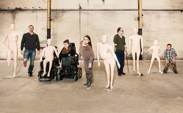
A Swiss charity has created mannequins based on the bodies of disabled people in a bid to raise awareness that no one has a perfect body. Pro Infirmis, an organisation for people with disabilities, worked with people suffering from scoliosis (a curved spine), shortened limbs and a woman in a wheelchair. Each had a mannequin made to perfectly reflect their body shape – which, to their delight, was then displayed in a high street store in Zurich’s main shopping street.


The project was devised to mark the International Day of Persons with Disabilities this week. Called ‘Because who is perfect? Get closer’, the story is captured in a moving four-minute film directed by Alain Gsponer. The film follows four volunteers who enter a warehouse with trepidation. The models are radio host and film critic Alex Oberholzer, Miss Handicap 2010 Jasmine Rechsteiner, athlete Urs Kolly, actor Erwin Aljukić and blogger Nadja Schmid. The film captures the emotional moment each person sees their unique sculpture – and reveals the internal struggle some of those involved have accepting their appearance. Viewers then see the mannequins carefully dressed and placed in the front window in a shop on Bahnhofstrasse, Zurich’s main downtown street. Dave Thomas Junior contributed the music for the new work. The piece Lost at Sea was newly arranged specially for the Pro Infirmis film.
One model said: “Seeing it there for real is quite a shock. This, says the charity Pro Infirmis, is the point of the campaign. It hopes to raise awareness of people with disabilities, specifically in the image-obsessed worlds of fashion and retail. Upon seeing her mannequin, one woman declares: ‘It’s special to see yourself like this, when you usually can’t look at yourself in the mirror”.


Advertising Agency: Jung von Matt/Limmat, Zurich, Switzerland
Executive Creative Director: Alexander Jaggy
Art Director: Daniel Serrano
Copywriter: Samuel Wicki, Mateo Sacchetti
Graphic Designer: Lukas Frischknecht
Year: 2013
British Airways – Plane Detecting Billboards
Posted: November 21, 2013 Filed under: Ambient, Digital, Installation, UK | Tags: Ambient, British Airways, France, installation, Outdoor, plane, Plane Detecting Billboards 2 Comments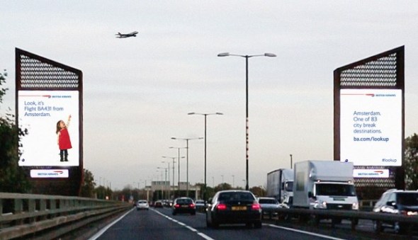
British Airways has unveiled digital billboards which will ‘interact’ with aircrafts flying overhead, as the brand looks to remind customers how magical flying can be, from the perspective of children. Developed by Ogilvy 12th Floor, the ads use custom built surveillance technology which tracks the aircraft and interrupts the digital display just as it passes over the site, revealing the image of a child pointing at the plane overhead accompanied by its flight number and destination it’s arriving from. This will be accompanied by a relevant message to the flight, such as ‘Fly the new A380 to Los Angeles. ba.com/lookup’, or details such as the lowest fare available or the temperature at the destination.
Abigail Comber, British Airways’ head of marketing, said: “This is a first, not just for British Airways but for UK advertising. We all know from conversations with friends and family that we wonder where the planes are going and dream of an amazing holiday or warm destination. The clever technology allows this advert to engage people there and then and answer that question for them. We hope it will create a real ‘wow’ and people will be reminded how amazing flying is and how accessible the world can be.”
The destinations can also be updated immediately depending on changing focus routes for the airline. The ads are part of the airlines’ “Magic of Flying” campaign, which aims to remind people of how magical flying can be, especially from the eyes of a child. The “interactive” billboards are located in London’s Piccadilly Circus and Chiswick.
Advertising by Design (22 Brilliant Ideas)
Posted: July 15, 2013 Filed under: Ambient, Art, Awards, Cannes Lions, Case History, Design, Direct, France, Germany, Graphic Design, Installation | Tags: 22 brilliant ideas, advertising by design, Brazil, Cannes Lions, Case History, Coca-Cola, design, FIAT, Germany, Heineken, Jung von Matt, kit kat, Land Rover, Ogilvy, Red Bull 1 CommentTBWA/Hunt/Lascaris – We Sent Their Briefs Back


Although TBWA\Hunt\Lascaris is well established as an above-the-line agency, our clients were yet to be introduced to the wealth of talent that TBWA\ Design has to offer. So, to get our clients’ attention, we intercepted existing above-the-line briefs and used the physical advertising brief as our canvas. Instead of answering the brief in a traditional manner, we conceptualized various designs that captured the essence of the brands, then brought them to life using only the cardboard job bags and the briefs that were attached to them. We created intricate pieces of paper art, transforming our client’s briefs into multi-dimensional design pieces. We then sent our clients’ briefs back to them, proving that TBWA\ Design can do amazing things with their briefs. Our campaign was a huge success. The design studio received their first new brief from our client just 5 days later. Even more notably, new design work in the system rose by 450% within the first 6 weeks.
Advertising Agency: TBWA\Hunt\Lascaris, Johannesburg
Executive Creative Directors: Matthew Brink, Adam Livesey
Art Director: Jade Manning
Copywriter: Vincent Osmond
Creative Director: Sacha Traest, Mike Groenewald
Design: Sacha Traest, Leigh-anne Salonika, Katleho Mofolo, Graeme Van Jaarsveld, Ilze Venter, jason Fieldgate
Typographer: Hazel Buchan
Photographer: Graeme Borchers, Des Ellis
Year: 2013
——————————————————————————————————————————————————————————————————————————-
Coca-Cola – Sharing Can


Advertising Agency: Ogilvy & Mather, Paris/Ogilvy & Mather, Singapore
Chief Creative Officer: Chris Garbutt, Eugene Cheong,
Creative Director: David Raichman, Frederic Levron, Yvan Hiot
Copywriter: Xiao An Cheng
Designer: Martin Olivier, Olivier Brechon
Technical Partner : Capital Innovation
Year: 2013
——————————————————————————————————————————————————————————————————————————-
Land Rover – The Escape Key

Jaguar Land Rover MENA is promoting the Land Rover LR4 with “The Land Rover Escape Key”, a small icon designed to replace the ESC key on desktop computer. Sent out in three batches of 800 pieces, the keys are designed to remind people at the office that there’s way to escape the every day routine of indoor business. Test driving a Land Rover LR4 is the way to find life beyond the office cubicle. The number of queries almost tripled and test drives are up by 208%.
Advertising Agency: Y&R MENA
Chief Creative Officer: Shahir Zag
Creative Director: Joseph Bihag, William Mathovani
Year: 2013
——————————————————————————————————————————————————————————————————————————-
Kit Kat – The Pillow Book

Advertising Agency: JWT, Sao Paulo, Brazil
CCO: Ricardo John
Art Director: Brunno Cortez
Copywriter: Erick Mendonça
Creative Director: Ricardo John
Year: 2013
——————————————————————————————————————————————————————————————————————————-
Marionnaud – Memory Game

Marionnaud, one of Europe’s largest perfume retailers, celebrated “10 years’ expertise in fragrance”. For the jubilee we created a very special staff incentive: the first Memory game without pictures. The cards had been finished with a fragrance coating. When rubbed, the cards released the scent of ingredients used in perfume manufacture. Rub and sniff: that was the only way to identify the pairs – but no problem for Marionnaud professionals.
Advertising Agency: Wirz/BBDO, Zurich
Executive Creative Director: Philipp Skrabal
Art Director: Barbara Hartmann
Copywriter: Marietta Mügge
——————————————————————————————————————————————————————————————————————————-
FIAT – Hero Hug

Advertising Agency: Leo Burnett, São Paulo
Chief Creative Officer: Marcelo Reis
Executive Creative Director: Guilherme Jahara
Creative Director: Rodrigo Jatene
Copywriter: Caio Lekecinskas
Art Director: Rafa Oliveira
——————————————————————————————————————————————————————————————————————————-
Domino’s Pizza – Domino’s Pizza Disc

Advertising Agency: Artplan, Sao Paulo
Executive Creative Director: Roberto Vilhena
Creative Director: Rodrigo Moraes
Copywriter: Tiago Trindade, Rodrigo Sanches
Art Director: Diogo Barbosa, Guilherme Grotti
Graphic Production: Bruno Werner
——————————————————————————————————————————————————————————————————————————-
Megaman – Light Bulb Calendar

Advertising Agency: Grabarz und Partner, Germany
Executive Creative Director: Ralf Heuel
Creative Director: Andre Price, Jan-Florian Ege
Art Director: Andre Price, Jana Mehrgardt, Jan Riggert
Designer: Sönke Jansen
——————————————————————————————————————————————————————————————————————————-
Heineken – First Interactive Bottle


Heineken embraces the start-up culture of experimentation because it knows that invention never sleeps. The brand understands that the best ‘user experiences’ tap into existing consumer behaviors and push technology into the background.
The intent of the Heineken Ignite project was to develop an idea that would create a memorable Heineken experience unlocking the power and possibilities of mobile innovation and technology.
Heineken believes that mobile innovation could offer a much more rewarding experience than just an app and embraced the challenge to think about how the product could be leveraged as an interface to the brand experience.
A prototype of Heineken Ignite will be revealed on 9 April at Milan Design Week as part of Heineken’s Lounge of the Future concept. Heineken takes its promise to “open your world” even further with the Heineken Ignite project, enhancing the organic way in which the product is used based on social interaction between beer drinkers. This innovative approach lets people be a part of the party in a whole new way and opens up possibilities in social situations.
Advertising Agency: Tribal DDB, Amsterdam
——————————————————————————————————————————————————————————————————————————-
3M Earplugs – Volume Pack

The task was to develop an original promotional packaging solution that immediately conveyed the product value of 3M’s Solar Earplugs – a product targeted at end users frequently requiring effective noise protection (such as musicians and festival-goers). Solution: 3M turned the purpose of the earplugs – to reduce noise – into an original package design. The container’s cap looks like the volume knob of a hi-fi system; when opening it to reach the earplugs, one seems to be turning down the volume.
Advertising Agency: Scholz & Friends, Germany
Chief Creative Officer: Martin Pross
Executive Creative Director: Matthias Spaetgens
Creative Direction: Robert Krause, Wolf Schneider
Copy: Nils Tscharnke
Art Direction: Sebastian Frese, Ralf Schroeder
——————————————————————————————————————————————————————————————————————————-
Deutsche Bank – Anamorphic Mirror


Brief Explanation
The vestibule is a narrow room of 25sqm strongly limiting the possible size of the installation. Therefore, we decided to utilise light for a radiant impact, and to expand the process of reception by making use of the visitors’ movement while approaching the area via a short staircase. Going upstairs becomes part of the experience as visitors gain increasing insights to the entry with the installation. Its concept is based on the principle of anamorphosis: what you see alters as you change your position in space. The image only fully resolves itself when seen from a particular ‘sweet spot’.
Describe the brief from the client
The redesigned corporate headquarters of Deutsche Bank in Frankfurt am Main are now housing a brand and conference area. Parts of this section are public and can be accessed directly from the spacious atrium via a staircase. Deutsche Bank commissioned us to develop an installation that references the well-known company logo, originally designed by Anton Stankowski, for the vestibule of this area. The brief was to provide an atmospheric element that would be visible to customers, visitors and employees standing at reception, as well as on the bridge connecting the building’s 2 towers.
Description of how you arrived at the final design
‘Anamorphic Mirror’ consists of a faceted mirror and blue light projected onto the opposite wall. When viewed from the ‘sweet spot’ the mirror reflects the Bank’s logo. Standing at the bottom of the stairs, visitors see seemingly random blue reflections on the mirror’s facets. As they get closer, the blue reflections begin to take shape, until they resolve into the bank’s logo upon the visitors’ reaching the stairs’ top. In this manner, an animation is created from a static surface. While getting even closer to entering the conference area, visitors are themselves reflected in the mirror and thus take centre stage.
Indication of how successful the outcome was in the market:
Since the opening on April 6 more than 20,000 visitors came to see the public part of the brand area. Board members use the overall facilities to hold receptions, functions such as HR are using it for employee activities, bank managers invite partners and clients, the press department welcomes journalists. With unobtrusive means, the dynamic and yet poetic installation ‘Anamorphic Mirror’ creates an atmospheric element with space-encompassing impact, and attunes visitors to the brand from the very beginning.
Advertising Agency: ART+COM in Cooperation with COORDINATION, Berlin
Executive Creative Director: Joachim Sauter
Designer: Simon Häcker
Project Manager: Gert Monath
Senior Art Director: Eva Offenberg
Year: 2013
——————————————————————————————————————————————————————————————————————————-
The Hälssen & Lyon – The Tea Calendar


The Hälssen & Lyon tea calendar is the first calendar in the world to feature calendar days made from tea leaves. Finely flavoured and pressed until wafer-thin, the 365 calendar days can be individually detached and brewed directly in the cup with hot water. The tea calendar was sent exclusively to selected business partners.
Advertising Agency: Kolle Rebbe, Hamburg
Executive Creative Director: Sascha Hanke
Creative Director: Heiko Schmidt and Kay Eichner
Creative: Patrick Schroeder, Julia Meissner
Year: 2013
Gold Lion
——————————————————————————————————————————————————————————————————————————-
Hot Wheels – Don’t Drink and Drive Key Chains

Advertising Agency: Ogilvy, Mumbai, India
National Creative Directors: Abhijit Avasthi, Rajiv Rao
Senior Creative Director: Amitabh Agnihotri, Sameer Sojwal
Creative Group Head: Yogesh Pradhan
Year: 2012
——————————————————————————————————————————————————————————————————————————-
Greenpeace – Do Not Disturb

Advertising Agency: AlmapBBDO, São Paulo, Brazil
Chief Creative Officer: Marcello Serpa
Executive Creative Director: Marcello Serpa
Creative Director: Luiz Sanches
Art Director: Caio Tezoto
Year: 2012
——————————————————————————————————————————————————————————————————————————-
Coca-Cola FM – Magazine Amplifier


The piece consists in an exclusive insert for subscribers of the latest edition of the Capricho magazine which was created by JWT. Attached to the cover, the art allows readers to turn the magazine into an amplifier. Simply by rolling the magazine and inserting the iPhone tuned into the Coca-Cola FM application in the spot indicated. The final format allows the sound waves to travel in two different directions at the same time, intensifying the stereo effect created by the device. The next step is to enjoy the music.
Advertising Agency: JWT, Brazil
Year: 2012
——————————————————————————————————————————————————————————————————————————-
Red Bull – Portable Charger

We created Redbull-shaped portable charger. This Redbull-shaped charger will show its own recharging screen when they fit into the gadget And the mobile webpage of Redbull will be on the screen when it is unlocked.
Advertising Agency: Hallym University, Cheonan-si, South Korea
Copywriter: Heejo Sun, Dongkyun Yu
Art Director: Minseok Go
Year: 2012
——————————————————————————————————————————————————————————————————————————-
Land Rover – Edible Survival Guide

While Land Rover vehicles can take on any obstacles in the desert, it cannot be said the same of their owners. Scorching temperatures, deadly animals and sinkholes are just a few things they might encounter. And when they venture deep into it, even the most experienced drivers can quickly succumb to the harshness of the desert. We wanted to create something that would cut through the clutter and that these people would like to keep. So we created a survival guide, which explained the basics for staying alive in the Arabian Desert, and packaged it in a way that would spur the attention of our target audience.
We researched every indigenous animal and plant, people could encounter in the Arabian Desert and how they could be used to survive. We studied the topography of the region to guide people to safety. We used a reflective packaging similar to army rations, which could be used to signal for help, and bound the book with a metal spiral, which could be used for cooking. Finally, we even took an extra step so that in case of emergency, people could always EAT the book. It was made out of edible ink and paper, and it had a nutritional value close to that of a cheeseburger.
We sent the book to 5,000 existing customers, gave it away as a supplement to the cars’ manual and made it freely available in sports shops. The initial response was very positive. And the client was so happy with the concept that they asked us to include the book as an insert in the next edition of a car magazine, with a 70,000 circulation.
Advertising Agency: Y&R, Dubai, UAE
Chief Creative Officer: Shahir Zag
Creative Director/Copywriter: Shahir Zag
Creative Director/Art Director/Illustrator: Joseph Bihag
Copywriter: Guillaume Calmelet
Designer/Copywriter: Khaled Said
Year: 2012
——————————————————————————————————————————————————————————————————————————-
IBM – Outdoor as Utility


Advertising Agency: Ogilvy France
——————————————————————————————————————————————————————————————————————————-
Ricola – Ricola Music Edition


Ricola, a brand of cough drops and breath mints in Switzerland, is known for its traditional blend of thirteen natural herbs. The provision of instant relief, even to the most strained throats, is visualised with the help of the wrapping paper. The Music Edition, an illustrated release, turns the drops into the heads of suffering singers. Each and every throat appears to be constricted. However, when you unwrap a bonbon, the throat is relieved and all hoarseness disappears. Print advertising presented the five characters: Rockabilly, Pop star, Opera singer, Rapper and Punk Rocker, with the tag line, “Unwrap your voice”. The project won Gold for Package Design at the London International Awards this week.
Advertising Agency: Jung von Matt, Hamburg
——————————————————————————————————————————————————————————————————————————-
Camp Nectar – Fruit Boxes (Made from Real Fruit)


General Brands in Brazil ran a two-year experimental campaign in which fruit was grown in the shape of Camp Nectar fruit boxes to promote the claim, “Made from Real Fruit”. Customized juice box molds were placed around growing fruit on an orchard in Paranapanema, producing 1,123 oranges, lemons, guavas and passion fruit with the Camp Nectar box shape. The specially designed fruit, complete with brand imprint, straw and carton flaps, were placed in supermarkets and fairs to promote the juice range. The campaign won a Gold Outdoor Lion, a Bronze Direct Lion, a Silver and Bronze Promo & Activation Lion.
Advertising Agency: Age Isobar, Sao Paulo
——————————————————————————————————————————————————————————————————————————-
Sweet Enough – The Candy Room


Sweet Enough, an importer of sugar free candy products in Australia, has set up The Candy Room, a store in Melbourne designed to draw out the inner child in customers, connecting them with childhood, fantasy and fiction and of course, sweets. Black line artwork is applied on white space, supplemented with the bright colours of the sweets throughout the store.
Advertising Agency: Red Design Group
——————————————————————————————————————————————————————————————————————————-
Oreo – Oreo Crumb Case


Miami Ad School students have developed a tea bag enclosure for Oreo cookie crumbs to infuse milk with Oreo flavor. The Oreo Crumb Case, developed as a student project, could go a long way. Just shake together all the crumbs left in the Oreo packet, sprinkle them into the Crumb Case, and infuse the crumbs in your tumbler of milk.
Advertising Agency: Miami Ad School
Ceres Beer – #ivoteanyway (How a beer did what the government could not do)
Posted: May 6, 2013 Filed under: Alcoholic Drinks, Ambient, Case History, Event, Italy, Low Budget | Tags: Ambient, Bcube, Case History, ceres beer, ivoteanyway Leave a commentI’m an Executive Creative Director. And if you ask people who work with me, they’ll tell you that when it comes to judging our own works, I’m always hypercritical. That’s why I’ve never posted here any campaign coming from my agency.
But today I’m pretty proud of this project, so I decided to share it. Hope you’ll like it like I do.

Election time is near and Italian politicians, the most aged in Europe, never miss an opportunity to show their distance from young people and their needs. For a bureaucratic obstacle, thousands of students who live outside the country (e.g. for the Erasmus program) will not be able to vote from abroad. Despite the calls of the European Union and the students’ protest, no one can solve the problem. Ceres, one of the most popular beers in Italy, decides to prove that these guys are better than those who represent them in parliament.
Our goals were to boost the brand awareness becoming the main supporters of the movement and to bring the problem to the attention of everyone, inspiring the conversation about the right to vote and the sense of responsibility of young Italians. We knew that it would have also improved the reputation of Ceres, a beer with a high alcohol content: we wanted to show everyone that the guys who love Ceres are responsible and mature people, that care for themselves and for their country’s future.
Ceres is a strong beer. It believes it’s always worth to take a position, to stand, even if it means making difficult or inconvenient choices. Even if maybe you won’t win. This is the essence of the brand, it is called “Inglorious Heroism”, and it is summed up by the pay-off “The town needs heroes.” Students in Erasmus are real heroes in the midst of their quest to discover the world. These young heroes had been wronged and Ceres decided to help them to vote anyway. Italy is an old, tired country that needs the energy of young people. As the slogan of this operation says, “Italy needs of Heroes.”

We contacted representatives of the students in major European cities. We told them we wanted to organize symbolic elections to make them vote anyway. We launched the twitter hash tag #iovotolostesso (#ivoteanyway), we sent groups in each city a kit with everything they needed to run and publicize the symbolic elections: facsimile ballots, ballot boxes, flyers and posters. We also sent them a few packs of beer to celebrate at the end. The kit also contained instructions on how to create video appeals that students would send us and would become part of a collective promo video. The video was posted on the web, the students used it to spread the word and we sent it to mainstream media.
More groups spontaneously joined in. The symbolic elections took place in 26 European cities on the same days of the Italian real elections. We sent the symbolic results to the media a few hours before the close of official polling stations.

Results:
For the cause:
Thousands of students from 26 European cities joined the initiative. The protest achieved unprecedented visibility on all the national media: TV, newspapers magazines, radios, social media, news website and blogs. The operation opened a debate all around the country. #ivoteanyway became a tweet trend with more than 10.000 tweets in 10 days.
For the brand:
Brand search frequency on google: +470% in 10 days. Ceres was the most cited brand during the election week. People reached: 20 millions, one third of the italian population. Media investment: less than € 5,000.
Advertising Agency: Bcube, Milan
Executive Creative Director: Francesco Bozza
Creative Director: Sergio Spaccavento, Andrea Stanich
Creative Team: Sergio Spaccavento, Andrea Stanch, Alessandro Sciarpelletti, Silvia Savoia
Edit: Danilo Carlani, Alessio Dogana
Year: 2013
From Coke to Mikado – Don’t Underestimate the Power of a Red Button
Posted: March 13, 2013 Filed under: Ambient, Australia, Awards, Belgium, Beverages, Brazil, Cannes Lions, Case History, Cliché, Direct, Event, France, Installation, Press/Outdoor, Promotion, TV/Film, USA, Viral | Tags: Ambient, Belgium, Buzzman, Cannes Lions, Case History, Clemenger BBDO, Coca-Cola, Duval Guillaume, fantastic delites, France, funny, Happiness Truck, installation, Mikado, push the red button, push to add drama, resistence test, TNT Tv Channel, USA, Viral Leave a comment
Mikado – Resistance Test
Advertising Agency: Buzzman, Paris, France
CEO / Creative Director: Georges Mohammed-Chérif
Art Director: Louis Audard
Copywriter: Tristan Daltroff
Art Director Assistant: Clément Séchet
Year: 2013
TNT TV Channel – Dramatic surprise on an ice-cold day
Advertising Agency: Duval Guillaume Modem, Brussels
Creative Director: Geoffrey Hantson, Katrien Bottez
Copywriter: Dieter De Ridder
Art Director: Ad Van Ongeval
Production Company: Czar
Director: Koen Mortier
Year: 2013
Fantastic Delites – How Far Would You Go?
The Delite-o-matic is an interactive vending machine that dispenses free packs of Fantastic Delites simply by pushing a button hundreds of times or by performing challenges. The Delite-o-matic was put out on the streets to prove that because Fantastic Delites taste so good, people will go to incredible lengths to get their hands on them.
Advertising Agency: Clemenger BBDO, Australia
Creative Director: Karl Fleet
Digital Creative / Art Director: Oliver Prenton
Digital Creative / Copywriter: Matt O’Grady
Year: 2012
TNT TV Channel – Big Red Push Button
To launch the high quality TV channel TNT in Belgium we placed a big red push button on an average Flemish square of an average Flemish town. A sign with the text “Push to add drama” invited people to use the button.
Advertising Agency: Duval Guillaume Modem, Brussels
Creative Director: Geoffrey Hantson, Katrien Bottez
Copywriter: Dieter De Ridder
Art Director: Ad Van Ongeval
Production Company: Czar
Director: Koen Mortier
Year: 2012
Coca-Cola – Happiness Truck
A Coca-Cola delivery truck is converted into a happiness machine on wheels delivering “doses” of happiness in the streets of Rio De Janeiro, Brazil. Where will happiness strike next?
Advertising Agency: Definition 6, Atlanta
Year: 2011
Welcome to ROACHVILLE from TBWA Johannesburg
Posted: February 8, 2013 Filed under: Ambient, Case History, Guerilla, Installation, Press/Outdoor, South Africa | Tags: Adam Livesey, Ambient, Case History, cockroaches, doom fogger, funny, installation, Matthew Bring, TBWA, TBWA/Hunt/Lascaris, welcome to roachville Leave a comment


TBWA Hunt Lascaris Johannesburg’s brief was to conceptualise an outdoor campaign that illustrates that Doom Fogger gets into every nook and cranny, killing insects before they get too comfortable. Using cracks on outdoor walls, they created a make-believe world, showing cockroaches in different environments. This was achieved by creating miniature furniture and using actual cockroaches to depict real life scenarios inside the cracks.
Advertising Agency: TBWA, South Africa
Executive Creative Directors: Matthew Bring, Adam Livesey
Creative Director: Justin Wright
Art Director: Sifiso Nkabinde
Copywriter: Thokozani Mashigo
Agency Producer: Sharon Cvetkovski
Account Manager: Vanessa Maselwa.
Production: Birthmark
Director of photography: Rowan Cloete
Producer: Matthew Durant
Year: 2012
Court TV’s Parco PI – That Girl Emily
Posted: January 15, 2013 Filed under: Ambient, Awards, Cannes Lions, Case History, Digital, Guerilla, Press/Outdoor, Promotion, USA, Viral | Tags: Case History, Court'sTV, Emily and Steve billboard, Fourteen Days of Wrath, Guerilla, Lost Dog, Parco PI, that girl Emily, USA Leave a comment
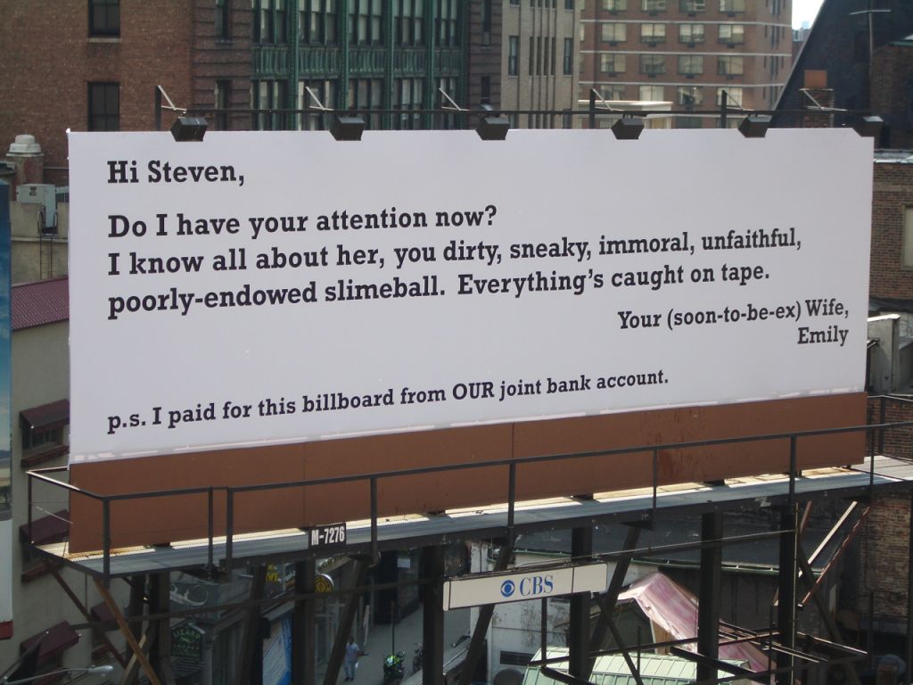
To generate a buzz leading up to the season premiere of Parco PI on the American network Court TV (now truTV), a show that revolved heavily around the subject of adultery, a campaign was conjured up that – at first glance – looked like every cheating man’s worst nightmare. A fictitious character called Emily seemed set on exposing her husband’s adulterous ways for the whole world to see and having her revenge. In a blog Emily drew readers into the story of how she came to realize that her husband was cheating on her. Within several days, the blog had received over a million hits and Emily was getting requests for media appearances at a national level. The narrative laid the foundation for a series of billboards on which Emily declared “Fourteen Days of Wrath” against her cheating husband, Steven. Four of the Fourteen Days of Wrath were actual staged events in New York City. When Emily threw out her cheating husband’s belongings, the drama was captured on a hand-held camcorder and uploaded to video-sharing sites.

The campaign as a whole was covered by over 200 news sources on-air, online and in print.
————————————————————————————————————————————————————————————
Public Hath No Fury, Even When Deceived
From New York Times. By Julie Bosman (July 24, 2006)
It was the pitch-perfect vengeful Dear John letter, blown up on a billboard in the middle of Manhattan by a furious and apparently deep-pocketed spouse.
“Hi Steven,” it began, cheerily enough. “Do I have your attention now? I know all about her, you dirty, sneaky, immoral, unfaithful, poorly endowed slimeball. Everything’s caught on tape. Your (soon-to-be-ex) Wife, Emily.”
The billboard created interest, and not just from an unfaithful Steven. A booking agent from “Good Morning America” sent an e-mail to Emily inviting her on the show. British Glamour wanted to make her the subject of a feature article.
But when pictures of the billboard proliferated on Gawker, Defamer and other blogs, readers quickly dug in. One fact soon emerged, thanks to camera phone pictures: the billboard was identical to others in Brooklyn, Los Angeles and Chicago. Someone else discovered that Emily was keeping a blog, thatgirlemily.blogspot.com, detailing Steven’s infidelities. More digging showed that one Emily blog entry was oddly similar to a synopsis for an episode of “Parco P.I.,” a reality show on Court TV.
Another “source” sent an e-mail to Gawker suggesting that Court TV was behind the signs, pointing out that it was a viral marketing campaign to promote one of its programs. Mystery solved.
The bad news for viral marketers who use these kind of devices: executives at Court TV said they did not really want to be discovered so quickly. The good news is that even after the ruse was discovered, people visited the Emily blog, pushing it to one million hits by the end of Thursday. A fake surveillance video on the blog, supposedly from a private eye capturing Steven holding hands with his paramour, hit YouTube and became one of its most-viewed videos. Did it even matter that Emily was fictitious?
“Emily is really an amalgam of all of us who have been cheated on,” said Marc Juris, general manager for programming and marketing at Court TV. “Clearly, this really resonated with people.”
Whether it resonates into higher ratings for “Parco P.I.” is another matter. The “Emily” ruse was originally intended to be a stunt to help promote the start of the show’s new season on Aug. 15, but Court TV’s marketing group liked the idea so much that they made it a large part of the campaign. The second phase — ads for the show to be stamped over the original billboards — was to start next Monday, but Court TV moved it up to July 26 after all the attention.
Mr. Juris was still marveling: “It’s like a flash investigation took place, and within 24 hours we were busted.”


Advertising Agency: Amalgamated NYC, USA
Copywriter: Tommy Noonan
Copywriter: Jon Yasgur
Account Manager: Judy Goldfarb
Creative Director: JASON GABORIAU
Creative Director: Doug Cameron
Year: 2006
TBWA/Berlin for adidas – A Giant Case History
Posted: December 28, 2012 Filed under: Agency, Ambient, Awards, Cannes Lions, Case History, Event, Germany, Guerilla, Installation, Press/Outdoor, Sportwear | Tags: adidas, Ambient, Boris Schwiedrzik, Cologne Central Station, Emiliano Treierveiler, Erik Gonan, football fresco, Germany, Guerilla, Helge Bloch, Hendrik Scweder, impossible goalkeeper, impossible huddle, Impossible is nothing, Kurt-Georg Dieckert, Marco Bezerra, Oliver Kahn Bridge, Outdoor, Petr Cech, Prater ferris wheel, Stefan Schmidt, TBWA, UEFA, Zurich's Central Station Leave a commentIMPOSSIBLE GOALKEEPER

Just before the start of the UEFA Euro 2008 football tournament, adidas turned one of Vienna’s best-known landmarks, the Prater ferris wheel, into a huge image of the Czech national goalkeeper, Petr Cech. At a whooping 53m tall, this gigantic installation was visible far beyond the Prater entertainment park and the nearby public viewing sites. In the installation, Cech had eight arms that constantly rotated with the ferries wheel. The erection of the metal construction started on May 13 and was finished just before the launch of the tournament on the night of June 5, 2008. This advertising landmark also hosted the official adidas press conference prior to the tournament.

Advertising Agency: TBWA/Berlin
Creative Director: Stefan Schmidt
Creative: Marco Bezerra, Emiliano Treierveiler
————————————————————————————————————————————————————————————
OLIVER KAHN BRIDGE

If you travelled to Munich for the first game of the FIFA World Cup in 2006, chances are you saw this huge installation, which shows an enormous Oliver Kahn (the then German national team goalkeeper) diving across the motorway. The 65-m installation managed to bypass the law forbidding advertising on the German Autobahn, and was the only piece of advertising adidas conducted in Germany during the tournament. Over 4 millions people commuted through the installation and many more saw it in the press. In its first week the Oliver Kahn bridge was displayed on double-page spreads in leading magazines including Focus, Stern, Autobild and Fortune. It was also picked up by newspapers including the New York Times and the Financial Times.


Advertising Agency: TBWA/Berlin
Creative Director: Stefan Schmidt, Kurt-Georg Dieckert
Creative: Helge Bloch, Boris Schwiedrzik
————————————————————————————————————————————————————————————
IMPOSSIBLE HUDDLE

For the duration of the UEFA EURO 2008 football tournament, TBWA/Berlin transformed the main hall of Zurich’s Central Station into a large-scale celebration of team spirit. Eleven European football players (all sponsored by adidas, naturally) formed the Impossible huddle. The bodies of the footballers represented were 3D-scanned as were their faces and hairstyles, to ensure that the sculptures were faithful to the originals. It took 40 trucks to move the installation components from the production sites in southern Germany to Switzerland, where they were assembled in the station.

The Swiss rail authority reported that an estimate 13 million people passed through the station during the three-week period the sculptural installation was in site, and at 17m high and approximately 30m wide, it was impossible to miss. Add to this the fact that various news titles such as the Financial Times, Die Welt, Gazzetta dello Sport, Le Parisien and the BBC featured the campaign on their front pages or online editions, plus the fact that it was picked up by dozens of blog worldwide.


Advertising Agency: TBWA/Berlin
Creative Director: Stefan Schmidt, Markus Ewertz
Creative: Erik Gonan, Hendrik Scweder
————————————————————————————————————————————————————————————
FOOTBALL FRESCO

During the German-hosted 2006 FIFA World Cup, adidas wanted to get across the message that they cooperate with the best football players on the planet. Rather than run a traditional poster campaign, the creatives at TBWA/Berlin decided it would be far more impressive to create a huge Renaissance-style fresco on the ceiling of the main lobby of Cologne Central Station. Within minutes of the fresco’s unveiling, it was featured on national German Television and press covered it throughout the World Cup. More than 8.5 million people saw the frersco in the flesh during the course of the tournament.


Advertising Agency: TBWA/Berlin
Creative Director: Stefan Schmidt, Kurt-Georg Dieckert
Creative: Helge Bloch, Boris Schwiedrzik
Monopoly in advertising
Posted: December 11, 2012 Filed under: Ambient, Awards, Chile, Cliché, Germany, Guerilla, Installation, Portugal, Press/Outdoor, Singapore, Spain, USA | Tags: a real game, advertising, Ambient, DDB Spain, Donald Trump, funny, Germany, Grey Chile, Guerilla, JWT, Monopoly, Own it all, Paris Hilton, TBWA Leave a comment
Monopoly – New York/London/Madrid


Advertising Agency: DDB Spain
Year: 2005
Monopoly – “Own it all” Campaign


Advertising Agency: JWT Frankfurt
Year: 2009
Monopoly – A Real Game


Advertising Agency: DDB Madrid
Year: 2008
Monopoly – Mansion/Jail


Advertising Agency: Grey Chile
Year: 2007
Monopoly – Be careful where you land


Advertising Agency: TBWA Singapore
Year: 2007
Monopoly – Building Branding


Advertising Agency: DDB Lisboa
Year: 2006
Monopoly – Barcelona Edition/New York Edition


Advertising Agency: DDB Madrid
Year: 2006
Monopoly – Before/After Campaign


Advertising Agency: Grey Chile
Year: 2006
Monopoly – The Here & Now Edition


Advertising Agency: Grey New York
Year: 2009
Monopoly – “Be a Player” Campaign


Student project by Alexandra George and Candice Countryman.
Year: 2011
Monopoly – Ambient

Student project by Miami Ad School, Madrid
Year: 2010
